
I’ve given the photo used in Monday’s Shoot it, Sketch it the ‘tilt shift’ lens blur treatment.
P.S. My Blog Awards page has been updated — I’ve just been nominated for the Sunshine Award : )
I’ve given the photo used in Monday’s Shoot it, Sketch it the ‘tilt shift’ lens blur treatment.
P.S. My Blog Awards page has been updated — I’ve just been nominated for the Sunshine Award : )
 Wishing all mothers everywhere a very happy Mother’s Day ― especially mine : )

A photograph of the Hukafalls Jet on the Waikato River. No tourists, tour operators or boats were harmed in the miniaturisation of this image.


Last week, I had one of those ‘so that’s how they do it’ moments. I read about a clever piece of kit called a tilt-shift lens (used by photographers to control the way perspective appears in an image) and a way of mimicking the lens in Photoshop. With the right photo, you can digitally blur and manipulate it to make places and people look like miniatures. Even without the right photo, it’s still an interesting effect.
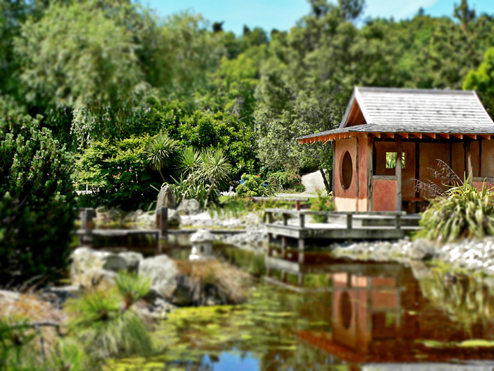

The latest version of Photoshop apparently has a ‘tilt shift’ blur feature but, really, it’s pretty straightforward: apply a reflected gradient and a lens blur so that parts of the image are out of focus, then adjust saturation and contrast to make the colours look more artificial.
The effect tends to work best with photos of people/vehicles/buildings taken from an elevated viewpoint. You don’t have to hire a helicopter to get a suitable photo… but climbing several flights of stairs to get just a little bit higher could make all the difference. With that in mind, I’m now on the hunt for really good photos to miniaturise : )
My thanks to Hovercraftdoggy for their inspirational We make models post (which includes a link to a tilt-shift photography Photoshop tutorial).
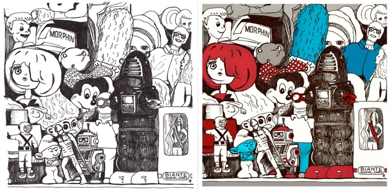
An unexpected outcome doesn’t always add magic to an image. Serendipity is a wonderful thing but, unfortunately, not all accidents are pleasant surprises.
Toy museum is a good example. It’s an ink sketch that I scanned and coloured digitally. While I was drawing it, I realised it would have to be reworked ― a stray line here, an unfortunate expression there ― but rather than starting again (something my tutors at design school would have insisted on), I kept calm, carried on and decided that I would correct modify those bits later. It’s not cheating; it’s a kind of mixed media that includes digital tools : )
If you compare the sketch with the final image, quite a few things haven’t changed at all, but I had trouble with some of the faces and so I edited them in Photoshop. I tweaked a few other things as well but not too much — I didn’t want to take away the personality of the drawing.
Ironically, knowing that I CAN change something later means that I tend to relax and enjoy my art more and then, more often than not, I DON’T NEED TO change anything. And I like it when that happens too.
I entered this design in a logo competition a few months ago. The brief was to create a logo for dog spa Lilac Wolf NZ that was positive and memorable. The concept behind the brand is that every dog dreams of feeling like a wolf and being treated like a king.
My design shows Lilac Wolf surrounded by bubbles. He imagines they are craters on the moon… or snow falling in the forest. He is howling with happiness — or is he blowing/chasing bubbles?
 These are the initial sketches. I really liked the texture of #1 but I decided to work with #2 because of the body shape.

The scanned sketch became a vector trace (flipped and altered slightly).

The traced fur was used as a guide for the coloured vector shading.

I deleted the original fur, continued to edit the shading and the bubbles, and gave the moon a gradient fill. I then redesigned the fur and tweaked a few things for the final logo.
P.S. For those who are curious, I’ve just been told that there was no winning design in the competition.
