CBD

CBD – note card from an original illustration

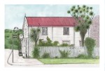
‘CBD’ is another favourite that is now available as a note card. This one sprang from my ‘In the style of…’ drawing experiment and was inspired by the work of Jim Flora. You can read the original post here. It is based on a photograph I took of Christchurch in 2010. The centre of town looks nothing like this now… I really need to go in and take an ‘after’ shot ― I suspect that the only thing still standing will be that tree.

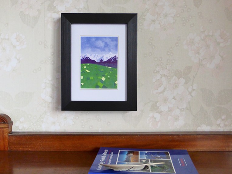
Click on the image to visit my Etsy shop : )

Canterbury

Canterbury art card 2015

‘Canterbury’ is a new note card/art card available from my Etsy shop. The original was painted a couple of years ago and has always been a bit of a favourite. It began life as a digital background for a student project in 2011 (see below) and I liked it so much that I decided to paint it. And print it. And frame it.

The landscape is based on several different photographs rather than a single location but it is still a typical Canterbury scene, even if I did leave out the rivers, the houses, and the sheep.

Canterbury poster background – original digital illustration, 2011
Canterbury – acrylic on canvas, 405 x 305 mm, 2013

Joyous

Violets — ink, watercolour and digital, 2015

“The most joyous painting is not done for the art world, it is done for the inner world.” Michael Leunig

The quote is from Holy Fool, a wonderful book crammed full of Michael Leunig’s art ― not his cartoons but his playful, colourful, joyful paintings and drawings. Highly recommended.

Violets in the kitchen, original photograph, 2015

And about time too

It’s been a long time coming but I’ve finally turned some of my drawings and paintings into note cards. They are all 6” x 4” because that’s a nice size for framing.

The really hard part has been limiting myself to a dozen designs for my first printing. The following are now available from my Etsy shop:


By the time you’ve finished, you’ll know how to do it

This slideshow requires JavaScript.

One of the biggest challenges I faced when painting the ‘Sign of the Times’ triptych was writing the words legibly forwards and backwards. It took a bit of trial and error before I figured out the best way of doing it was to print copies of my handwritten and scanned words (i.e. using my inkjet printer) having first worked out their position and size in Photoshop, paint over the letters and use the painted paper to ‘print’ the writing on the canvas. I filled in any gaps in the letters by hand with a brush. By the time I’d finished, as is so often the way, I knew exactly how to do it.

‘Sign of the Times, Sonya’s Landscape’ — acrylic on canvas, 2015
Sign of the Times — the mirror image

Sign of the times

Sign of the Times, Sonya’s Landscape — acrylic on canvas, 20” x 30” each canvas, 2015
Sign of the Times — the mirror image
Sign of the Times — the mirror image (i.e. as seen in the salon mirror)

Here, at last, are photographs of the commission I painted a few weeks ago for Sonya’s hair salon. We put the paintings up this afternoon and we’re really pleased with how they look. There’s a photo of Sonya with her paintings in the slideshow below.

As I mentioned in my earlier post, the inspiration came from the salon, from nearby Barrington Park and the Cashmere hills, and of course from Sonya herself. Prince’s purple love symbol was a last-minute addition that Sonya requested and although it wasn’t part of the original composition, now I can’t imagine the paintings without it — I like the way it transforms the landscape from something abstract into something more personal.

This slideshow requires JavaScript.