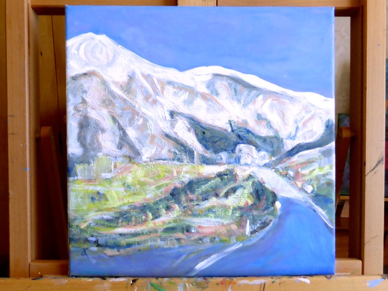
Summer Somewhere – acrylic on canvas, 405 x 405 mm, 2017
“The role of the artist is to ask questions, not answer them.” Anton Chekhov
I found myself asking a lot of questions while painting ‘Summer Somewhere’ — mainly about colour, mood, and about what was essential to the picture. I painted telegraph poles; I took them out. I had the blue road disappearing into the horizon because that’s what it did; I painted over it. It was too cold, all blue and white and green and grey; I mixed an entirely new palette for the middle foreground. And then I stopped…
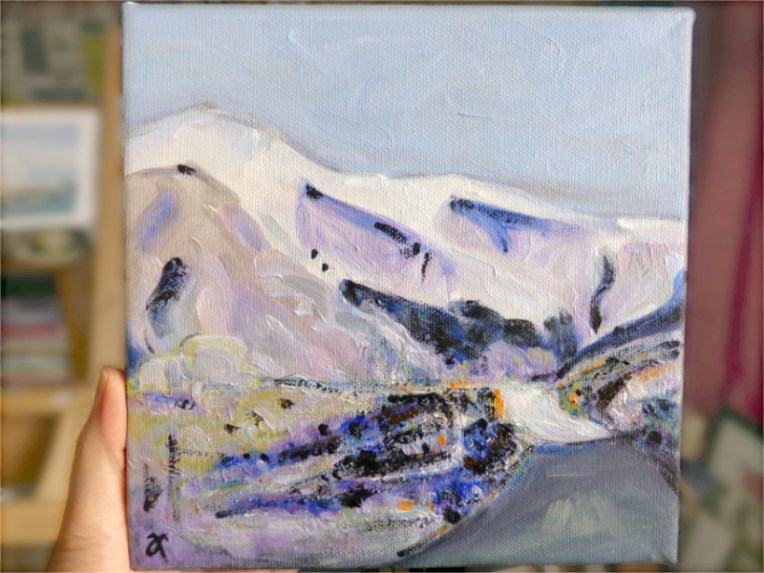
A Road Runs Through It – acrylic on canvas, 205 x 2015 mm, 2017
“The painter knew that color was not something you controlled but something you set free. He believed that color knew its way home.” Thomas Lloyd Qualls
I really like the idea that colour knows where it wants to go and the best thing the painter can do is relax and get out of the way. To not try so hard. To not worry so much about getting it right or wrong.
Looking back at the journey this little study has taken me on, I realise that I actually painted about three different paintings, each one over the top of the other. I’m quite happy with the final version with its blue and purple mountains and dramatic shadows, but I really could have stopped sooner and I would have been happy with those paintings too.
Late last year, I started several larger versions of this landscape but I stopped working on them because I couldn’t quite manage to get the colours I wanted. Putting the paintings to one side and taking time out to do this one has helped me to relax and stop worrying about them. And now I’m finally ready to put them back on the easel, move a bit of paint around and see what happens.
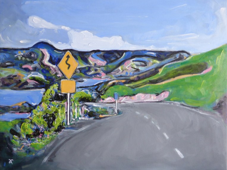
Curves Ahead – acrylic on canvas, 400 x 505 mm, 2016. SOLD
Here is the third in my ‘roads and signs’ series. (Please see my earlier posts for the background story.)
The landscape is typical of the stunning scenery as seen from the road between Christchurch and Akaroa. I’ve posted the original photograph, the study and WIP images below:
This slideshow requires JavaScript.
I didn’t intend to use such a vivid green in the foreground — yes, it’s the same colour that crept into the other two paintings in the series — and now I can’t imagine the painting without it.
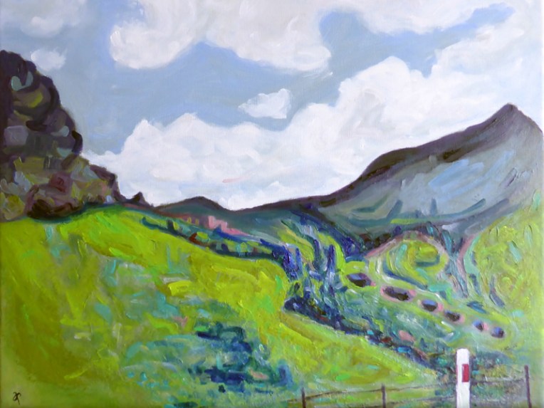
Summer Hills – acrylic on canvas, 400 x 505 mm, 2016. SOLD
Here is the second in my ‘roads and signs’ series of landscapes based on photographs I’ve taken over the years as a passenger, being driven from one place to another along Canterbury’s beautiful winding roads but rarely having the opportunity to stop and take a proper photo. I started turning some of my slightly random through-the-window shots into paintings last year and I suspect I’ll continue to do more again this year.
‘Summer Hills’ is a landscape somewhere on the road from Akaroa to Christchurch and very near the location of the painting in my previous post. I’ve included the original photograph, the initial study and several WIP images below:
This slideshow requires JavaScript.
You may be able to tell from the WIPs that I wasn’t entirely sure what to do with the lower half of the painting — the sky was pretty much there from day one but the foreground was another story. I solved it in the end by mixing a really bright lime green and a vivid blue and just ‘going for it’ (I believe that’s the technical term).
Summer Roads – acrylic on canvas, 400 x 505 mm, 2016
I began a series of landscape studies last year based on some of the many (many) photographs I’ve accumulated over the years as a passenger, being driven from one place to another along Canterbury’s beautiful long and winding roads but rarely having the opportunity to stop and take a proper photo. So I have all these images of roads. And signs. I rather like the perspective of these slightly random through-the-window shots. They’re familiar; more like memories of having been somewhere and less like formal compositions carefully considered before painting (although of course they are that too).
First up is ‘Summer Roads’ which was based on a photo taken as we were driving into Takamatua on the road from Akaroa to Christchurch. I’ve posted the original photograph, the study, and a few WIP images below:
If you’ve read my last two posts, you’ll know that I am now involved in (yet) another social media website… Polyvore, a community that, in Polyvore’s own words, “disrupts the traditional e-commerce model by giving everyone everywhere a voice in shaping today’s trends and influencing purchases”. I discovered the site shortly after Etsy announced that it was going to take treasuries away (click here to see an old post that explains a bit more about treasuries). Over on Etsy, some of us were mad and some of us were sad, but there were also those who wondered what all the fuss was about.
Well, to some of us, the treasury was more than just a marketing tool; it was an art form. As well as promoting each other’s shops, we did things like A bird in the hand…
annacullart.etsy.com
…and I Regret Nothing (one of my last treasuries)…
annacullart.etsy.com
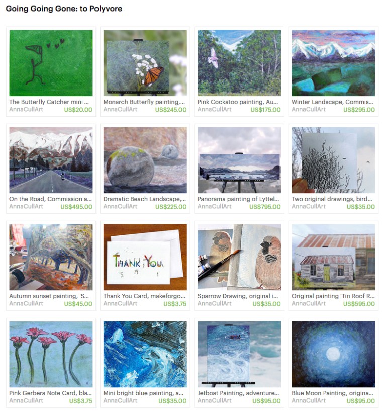
Going Going Gone is one I didn’t make. It was created by a team member in the Flash Mob who made personal treasuries for many of us as a farewell gesture. It features only my art! What an amazing gift. Thank you so much, Donna.
annacullart.etsy.com
At some point during the final days of treasuries, the Flash Mob discovered Polyvore, a place where treasuries are called ‘sets’ and the old familiar 16-square grid looks more than a little old-fashioned. Now we can edit images, resize them, remove backgrounds, and make really, really creative sets. They can be fairly standard magazine-style editorials about fashion, beauty, or home decor, or they can be quirky and arty and just about anything you want them to be.
Like Etsy, Polyvore is very group and community oriented. There are contests with themes and items to feature, and so it’s surprisingly familiar even as we learn new ways of doing things. My first set was based on the ‘in situ’ illustration I drew for my ‘Moon Over the City’ painting:
annacullart.polyvore.com
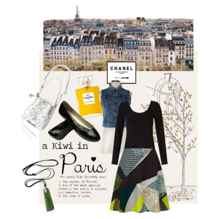
Okay, that’s pretty basic, but I’m happy with it and I love being able to style my art in sets. It’s way too much fun (which goes some way to explaining why there hasn’t been a lot of painting going on in the studio this month). Below is an example of a fashion set for an ‘I Love Paris in the Fall’ contest — I couldn’t resist using my autumn tree drawing in the background:
annacullart.polyvore.com
The opportunities for creativity are endless. You can use the images already on Polyvore — and yes, quite a few are sponsored — or you can import your own from any website (like Pinterest, Polyvore preserves the link to the site that the image came from).
I’ll sign off today with a set that has nothing to do with anything, really. It was for a contest that had to feature our “first device love in the Technological Age” and, for me, that was my trusty old tape deck. Thanks for reading.