This week’s featured artworks are my Cape Leeuwin Lighthouse mini canvas and the Moeraki Boulders paintings. Please click on the images below for more information.
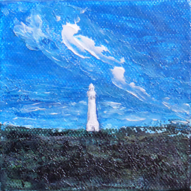
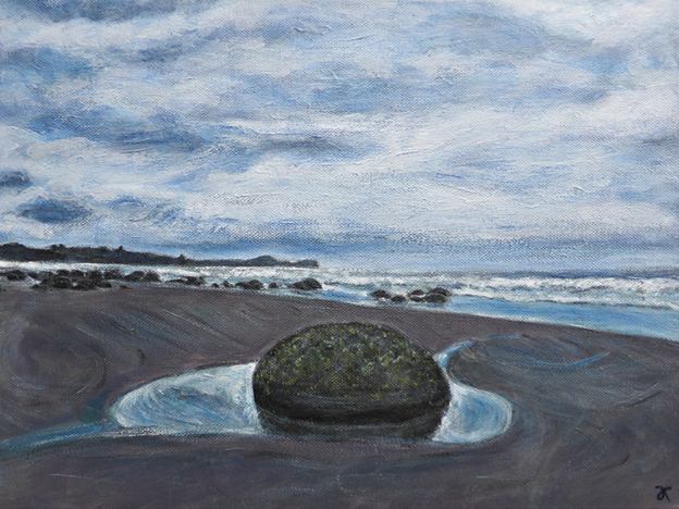
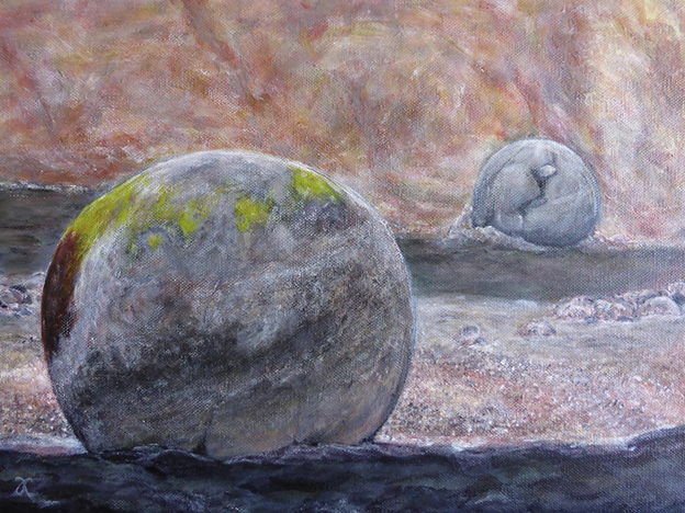
I am offering three paintings every week between now and early December at 40–60% off their original prices. It’s a ‘spring cleaning’ experiment that will hopefully create a bit more space in the art cave. Please click on the images below to visit my Etsy shop.
This week’s featured paintings are:


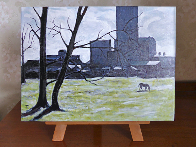
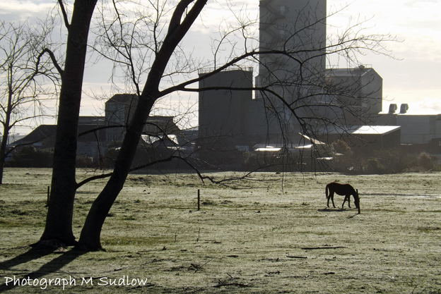
My thanks to Maureen Sudlow of www.kiwis-soar.com for allowing me to use her beautiful photograph of an old dairy factory in Dargaville as a reference for my latest painting. I love the dramatic contrasts, the dark silhouettes against the muted colours of grass and sky, the lone horse on a cold spring morning, the tree branches reaching… reaching…
‘Canterbury’ is a new note card/art card available from my Etsy shop. The original was painted a couple of years ago and has always been a bit of a favourite. It began life as a digital background for a student project in 2011 (see below) and I liked it so much that I decided to paint it. And print it. And frame it.
The landscape is based on several different photographs rather than a single location but it is still a typical Canterbury scene, even if I did leave out the rivers, the houses, and the sheep.


One of the biggest challenges I faced when painting the ‘Sign of the Times’ triptych was writing the words legibly forwards and backwards. It took a bit of trial and error before I figured out the best way of doing it was to print copies of my handwritten and scanned words (i.e. using my inkjet printer) having first worked out their position and size in Photoshop, paint over the letters and use the painted paper to ‘print’ the writing on the canvas. I filled in any gaps in the letters by hand with a brush. By the time I’d finished, as is so often the way, I knew exactly how to do it.


Here, at last, are photographs of the commission I painted a few weeks ago for Sonya’s hair salon. We put the paintings up this afternoon and we’re really pleased with how they look. There’s a photo of Sonya with her paintings in the slideshow below.
As I mentioned in my earlier post, the inspiration came from the salon, from nearby Barrington Park and the Cashmere hills, and of course from Sonya herself. Prince’s purple love symbol was a last-minute addition that Sonya requested and although it wasn’t part of the original composition, now I can’t imagine the paintings without it — I like the way it transforms the landscape from something abstract into something more personal.