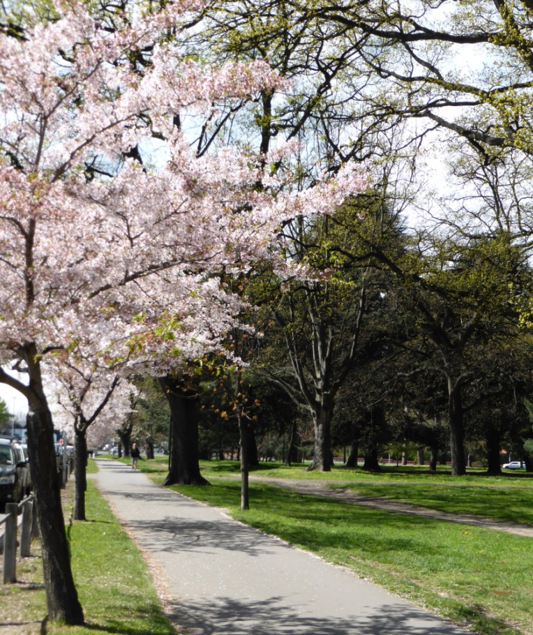
Fluffy pink popcorn
Leaps from ten thousand branches:
Spring in slow motion.
It’s strange to be posting a painting of spring in the first week of winter! (Okay, so it won’t seem at all strange to those of you in the northern hemisphere.) Christchurch’s Hagley Park is always a picture when the blossoms pop. I’ve been meaning to paint this scene for ages… and now here it is.
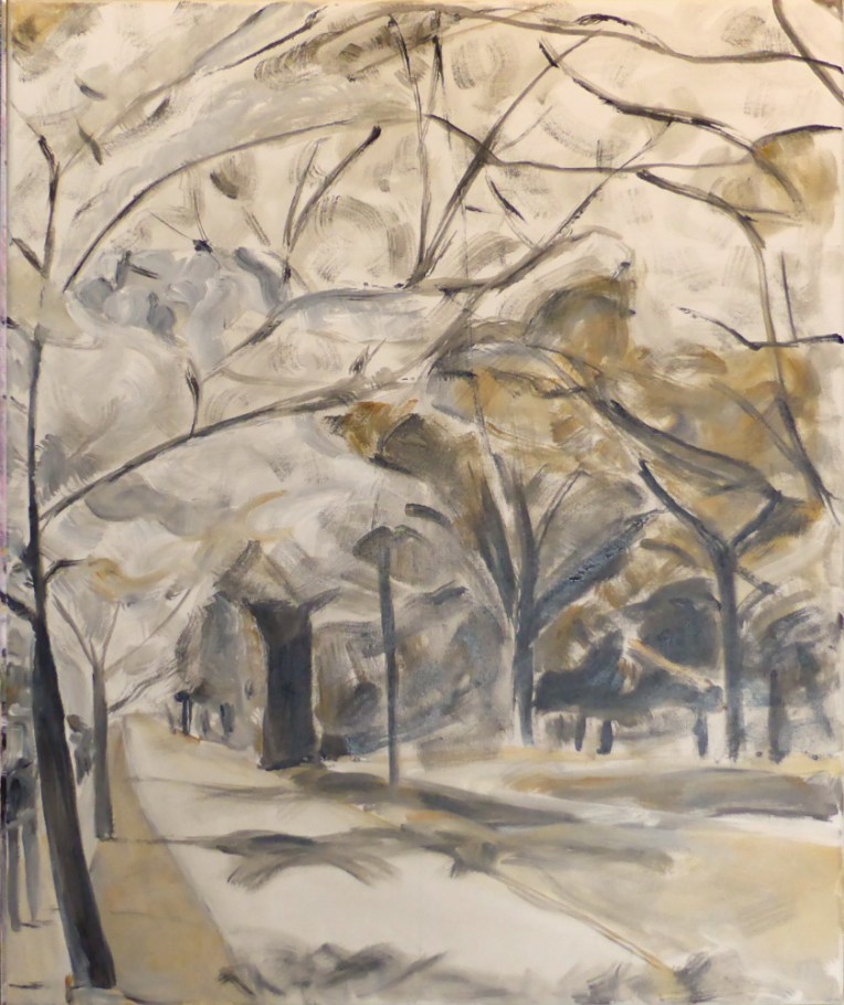

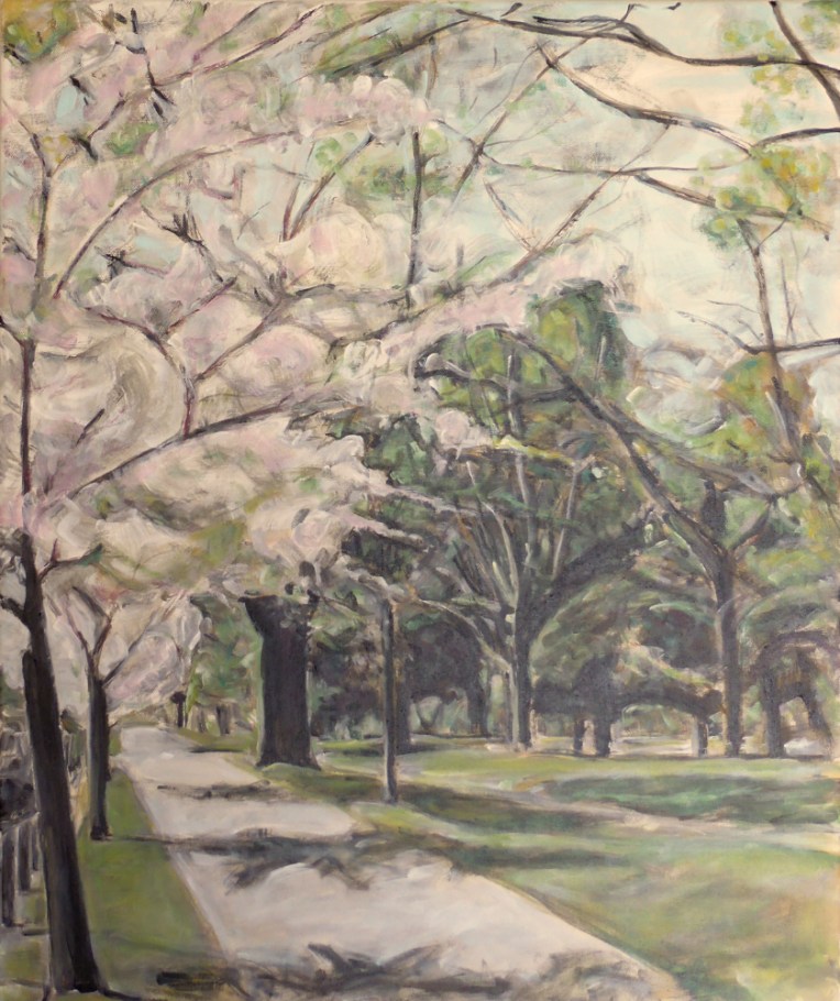
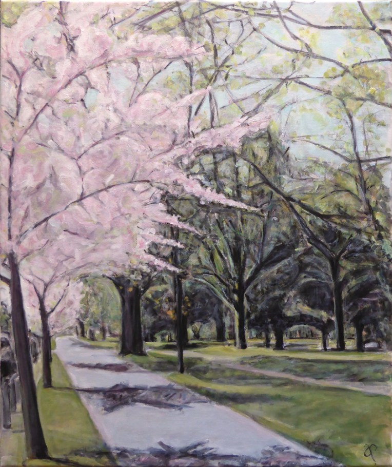
No charcoal sketch this time ~ just straight in with brush and paint. ‘Blossomtime’ will be part of this month’s exhibition at the Down by the Liffey Gallery.
THE REAL AND THE SURREAL EXHIBITION
WEDNESDAY 12TH JUNE — SUNDAY 7TH JULY
DOWN BY THE LIFFEY GALLERY, 1 JAMES STREET, LINCOLN, CANTERBURY, NZ
The other artists exhibiting will be potter Della Goodinson and painter Georgette Thompson.