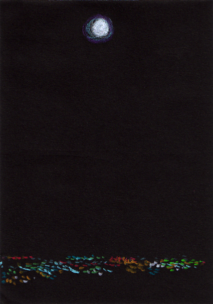
Moon sketch – Neocolor II pastel on black paper, 148 x 105 mm, 2013Moon over the city – original photo, 2006 and edited photo, 2013
For years I’ve been wanting to create something based on this view of Christchurch taken from the Port Hills and now I’m finally getting around to it. I made a couple of little changes to the original photo because a not-quite-full moon just seemed a little sad.
This sketch is the reference for an acrylic painting that I’ll post for next week’s Shoot it, Sketch it.
Stamp design, artwork – mixed media – student project, 2011
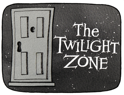
Cue the theme music…
The Twilight Zone (1959-1964): An American anthology series of stand-alone stories with unexpected plot twists. The Twilight Zone became famous for its opening title sequences. “You are travelling through another dimension, a dimension not only of sight and sound but of mind. A journey into a wondrous land of imagination. Next stop, the Twilight Zone.” Two other series were produced from 1985–1989 and 2002–2003.
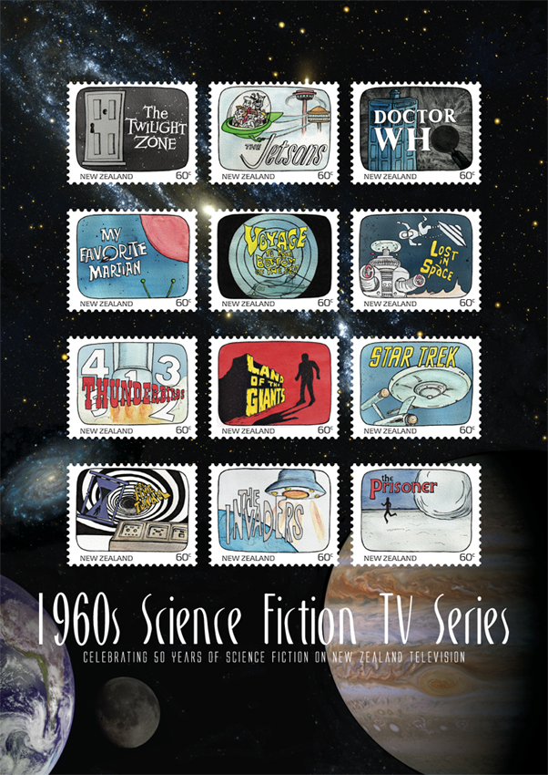
The stamp design, poster and text are from one of my favourite student projects.* Each stamp depicts an iconic science fiction TV series from the 1960s. I’ve decided to post the artwork for the individual stamps ― one every week (or thereabouts) ― to commemorate the 50th anniversary of Doctor Who (later this year). And because sci-fi stamps are cool.
All You Need Is Love, detail – acrylic on canvas, 255 x 305 mm, 2013. Private collection.
I painted this little Beatles record as a test for my new Golden satin varnish — I’m preparing to varnish the Peonies triptych and I read somewhere that dark colours can appear cloudy under satin or matte varnish if not applied correctly. So I bought a cheap stretched canvas and had a bit of fun.
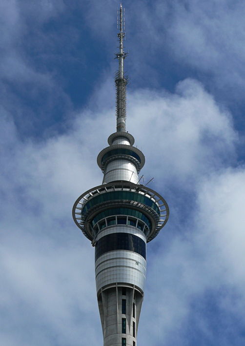
Sky Tower – watercolour and acrylic, 295 x 210 mm, 2013Sky Tower – Auckland, 2007
Here is Auckland’s Sky Tower ― the tallest man-made structure in New Zealand ― surrounded by little fluffy clouds. The sketch was an exercise in simplicity and contrast. Left to my own devices, I would have added more details and shading, but that’s not really the point of this exercise. I used watercolour pencils and my new Molotow acrylic paint markers (oh what a wonderful world we live in!).
I’m a little jealous of American-born artist and designer Edward McKnight Kauffer (1890–1954). He studied in Paris, illustrated several of T. S. Eliot’s books (apparently he was Eliot’s preferred illustrator) and designed posters for the London Underground. Not a bad career.
In the style of… appears occasionally instead of my regular Shoot it, Sketch it posts. Using my own photographs as a starting point, I’m drawing inspiration from some of the world’s greatest illustrators. It’s not about slavishly copying someone else’s art; it’s an experiment in seeing things differently.
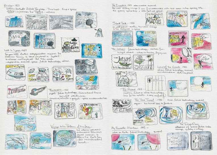
Science Fiction stamp design – sketches Visual diary, two-page spread (student project, 2011)Science Fiction stamp poster (594 x 420 mm) Stars and planets (background collage) courtesy of the Internet Student project, 2011
Another one of my favourite designs at college was this stamp poster (and all of the stamps). Below is the text I wrote as part of the project:
Commemorating 50 years of science fiction on television in New Zealand, this collection features illustrations of some of the 1960s most iconic science fiction programmes.
Television arrived in New Zealand homes at a time when great advances were being made in space exploration. The 1960s was a decade obsessed with the “space race” as the Soviet Union and the United States competed to put a man on the moon. These 12 stamps depict television shows that tapped into our fascination with space and space travel. There were tales of friendly aliens living among us and of hostile alien invasions; journeys into our possible future and into the questionable past; galaxies filled with spaceships, robots and strange new worlds.
This post is the last of my Dear diary series… but I think I’ll start blogging about the artwork for these stamps — because stamps are cool : )
The diary pages are from a journal I designed for my Design & Arts College exhibition in 2012. Two years of research, ideas, word maps and sketches had to be reduced to a mere 72 pages. It was no easy task but I now have a beautiful, professionally bound diary that I’ll always treasure.
I now have a page on Facebook: Anna Cull – Art. To mark the occasion, I’ve updated my avatar (I tweaked a few things and added an acrylic background). The next step will be selling my art on Etsy… but I’m not quite ready for that sort of commitment.