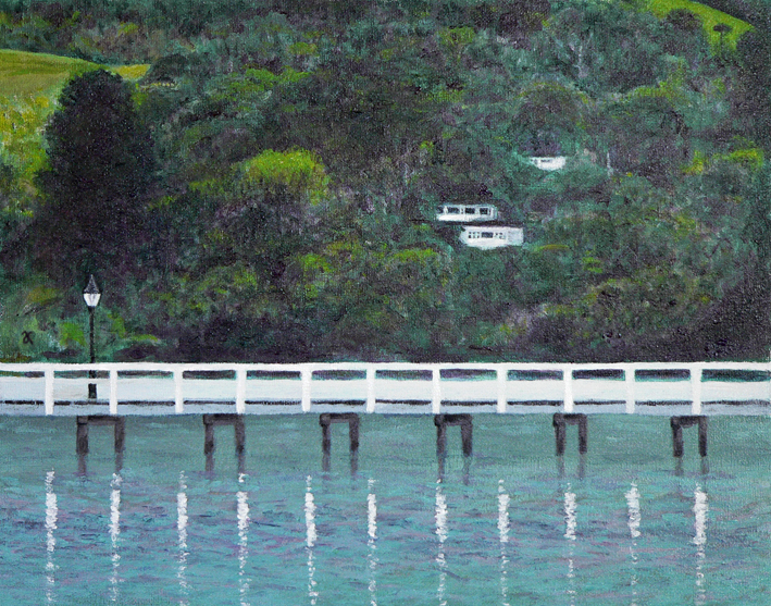
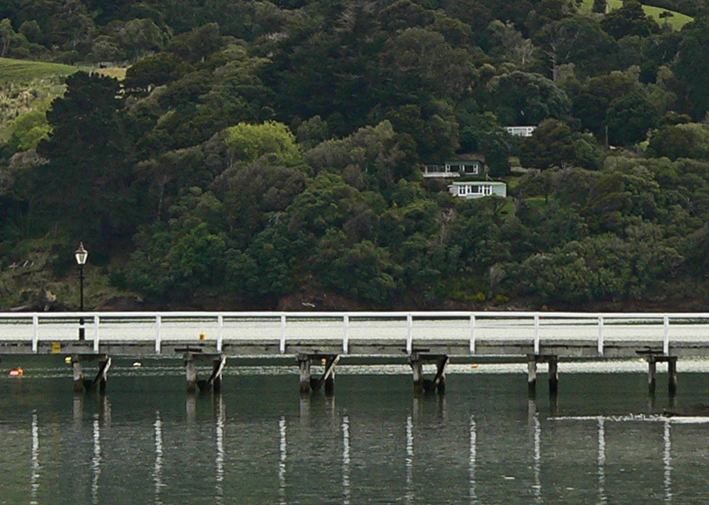
While organising last week’s In the style of… post, I stumbled upon this crop of the Akaroa Harbour photograph ― and now it’s the subject of today’s painting.
I do like happy accidents : )
While organising last week’s In the style of… post, I stumbled upon this crop of the Akaroa Harbour photograph ― and now it’s the subject of today’s painting.
I do like happy accidents : )

Here is a sneak peek at the project I’ll be featuring in Friday’s Dear diary post. Oh how I wish these really existed. Sadly, the beers and the brewery are just figments of my imagination. After exhaustive research ( ! ) I discovered that some beers taste of chocolate, coffee, cherries and honey (although usually not all at the same). Yum!


I had something specific in mind when I started painting the Akaroa Harbour beachfront photo… and this painting isn’t it. Initially I was going to create a highly stylised image using simple shapes and patterns and fairly flat colours ― but sometimes I just can’t help myself… the temptation to layer colours and add texture is just too great. With Louis Rhead’s turn-of-the-century posters in mind (see below), I exaggerated the shape of the trees and the curve of the shoreline. He has also influenced the overall composition, my choice of colours and the romantic styling of the women in the foreground (although mine look more medieval than Art Nouveau).
I may have another go at painting this scene for next week’s Shoot it, Sketch it…

English-born artist Louis Rhead (1857-1926) made a career out of poster design and book illustration in the USA. I love the Art Nouveau influence in these posters dated 1896-1900. The sweeping curves and stylised trees are beautiful. The colours are fantastic too.
In the style of… appears occasionally instead of my regular Shoot it, Sketch it posts. Using my own photographs as a starting point, I’m drawing inspiration from some of the world’s greatest illustrators. It’s not about slavishly copying someone else’s art; it’s an experiment in seeing things differently.

The sketches and final drawing are from my first year at art/design school (2010). We were fortunate that our graphic design course (officially called ‘communication arts and design’) recognised the importance of drawing skills and provided a lot of opportunities to explore different mediums and styles. This was my first foray into pointillism. The composite image on the watercolour background is from the visual diary I put together for my final exhibition in 2012.
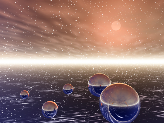
No, not really… although I did make these images more than a decade ago! I’d completely forgotten about them. I rediscovered them when I was backing up some of my old computer files. Hands up if you’ve heard of Bryce, the 3D modelling software. Hands up if you knew about it in 2002. Back then, the program was owned by Corel (it’s now owned by DAZ) and I was teaching myself CorelDraw and PhotoPaint. Corel users were offered a free trial and it sounded like fun…
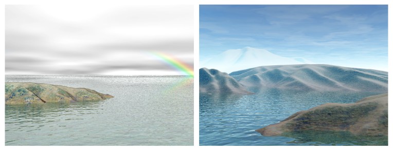
I created seascapes, landscapes, snow-covered mountains and shiny spheres floating in impossible skies. And it was a lot of fun. But rendering the scenes was painfully slow and I seem to remember crashing my computer frequently and often during the process. A month’s trial was quite long enough. Seeing these images again now though, I’ve been wondering about checking out the latest version… but it’s just not possible to do everything — there simply aren’t enough hours in the day!


We encountered these exotic giants on our way to Hamurana Springs. The redwood grove was planted in 1919 and so the tallest tree is only 55 metres high ― they can grow up to 100 metres! Still a pretty good effort though. The painting was made using a ‘wet on dry’ technique: soft pastels were dipped in water and applied to card giving a kind of impasto effect.

