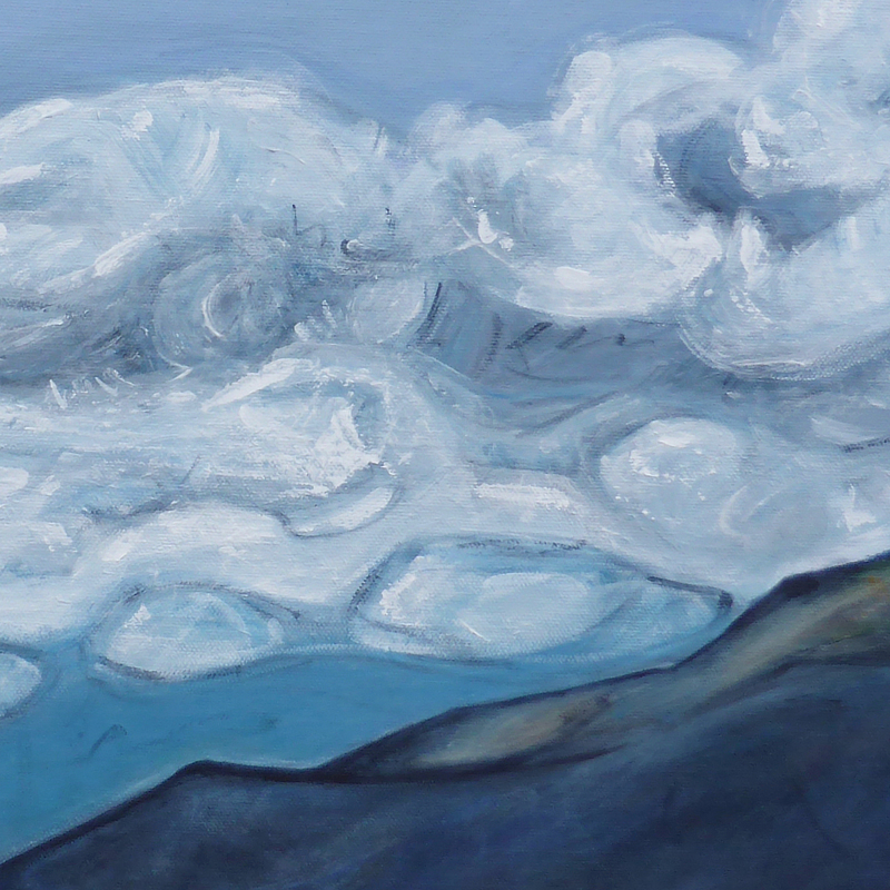
‘Head in the Clouds’ acrylic on canvas, 500 x 500 mm, 2021. Available.
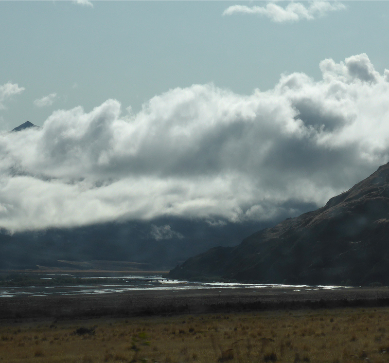
Don’t ask me where this is. It’s not important. It was late summer, early in the morning. The air was damp and the mountains were obscured by low cloud. We didn’t mind; there was beauty around every corner and we weren’t in a hurry. As the clouds began to lift and catch the light, the mood began to shift and the river tumbled on as if this had been nothing extraordinary.
Reference photo ~ somewhere in the South Island‘Head in the Clouds’ detail‘Head in the Clouds’ detail
This is excellent advice and I feel a painting spree coming on : ) Meanwhile here are a couple of small paintings that I finished this week…
As much as I love black canvases, they can be tricky to photograph ~ ‘Night Garden’ has gold and silver highlights and a texture that makes it look wonderfully 3D in certain lights and ‘Hearts of Gold’ has gold lines that accidentally (or not) ended up looking like hearts ~ both paintings catch the light in ways that a single picture can’t really show.
‘Night Garden’ acrylic on canvas, 150 x 150 mm, 2020‘Hearts of Gold’ acrylic on canvas, 100 x 100 mm, 2020
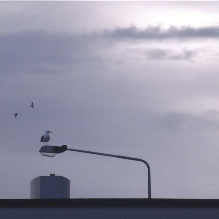
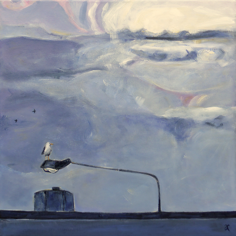
I love the way seagulls park on street lights. What views they must have! I gave this painting the working title ‘Seagull Parking’ but I always knew that was a little too obscure to be a keeper. The inspiration was a photo I took in a carpark ~ in the golden hour before the sun sets ~ while we were waiting to collect our pizza. Yes, inspiration is everywhere : )
reference photo
work in progress
final painting
The original plan was to create something more like the reference photo, quite subdued and almost monotone with the seagull as the focal point, but the purple/grey underpainting took it in a different direction ~ one which was more in keeping with how spectacular the sky really looked that evening ~ and that meant rethinking the title.
‘A Break in the Weather’ acrylic on canvas, 500 x 500 mm, 2020. Private collection.
P.S. I’m particularly pleased with those two birds flying in the background. The simpler it is, the harder it is.
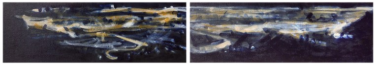
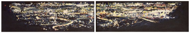
‘The View from Here’ diptych — acrylic on canvas, 100 x 305 mm each canvas, 2020. SOLD
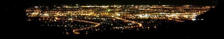
Fresh off the easel: the lights of Christchurch as seen from the Port Hills. The paintings are lightly textured and best seen from a bit of a distance. I was going to varnish them but I am really liking the subtle shifts in colour and texture of the unvarnished canvas and so I’m not going to risk it.
reference photo ~ Christchurch 2019work in progressfinal diptych
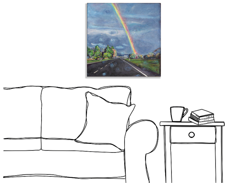
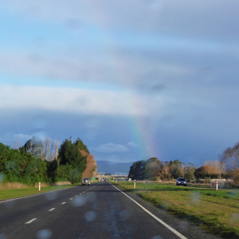
I have been thinking about painting this landscape for a little over six years. When I took the reference photo, the rainbow appeared to be shining directly into our neighbourhood, showing us the way home. I liked that : ) The only thing that made me reluctant to tackle it was also one of the things that made me want to paint it in the first place: the out-of-focus raindrops on the car windscreen. I wasn’t sure I could do what I had in mind ~ something representational but not too realistic. I needn’t have worried; the raindrops almost painted themselves (at least they look like raindrops to me). No, it was the painting of the rainbow that was the most difficult thing because I wanted to paint a rainbow that was not too ‘rainbowy’ (i.e. to paint a painterly painted rainbow and not an emoji 🌈 ).
‘After the Rain’ rainbow detail
I got there in the end by overlapping layers of translucent rainbow colours, blending the cooler colours with the clouds and sky (which is why some of the colours have almost disappeared), and using subtle lines to suggest reflected and refracted light.
reference photo
work in progress
final painting
‘After the Rain’ acrylic on canvas, 405 x 405 mm, 2020. SOLD
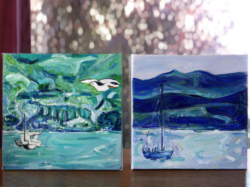
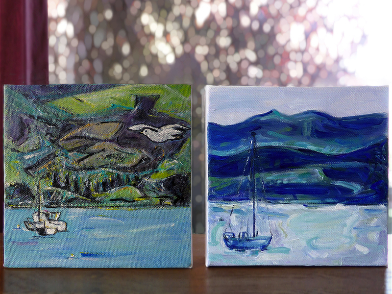
‘Bird’s-eye View’ — acrylic on canvas, 150 x 150mm, 2020. SOLD
Here is another reworking of an old painting. You can compare it with the original below…
‘Bird’s-eye View’ old and new versions for comparison ~ seen here alongside ‘On the Harbour’
There were elements I liked in the original version but, two years on, that background now looked like an embarrassing mess to me. So I painted over it with green, gold, purple and turquoise, redefining the hill shapes and tree lines. The seagull and little boats were also tweaked a little to put them more ‘in’ the painting. I had planned to leave the water untouched (I really liked the original water) but having changed everything else, it needed to be warmer and simpler to work with the other elements. Overall, I think it’s an improvement, and even if you disagree… it’s too late now!
Fortunately the new version still looks good alongside the other little Akaroa study. Both paintings* (sold separately) are currently available on Trade Me (NZ) as I continue with the Big Spring Clean of 2020.