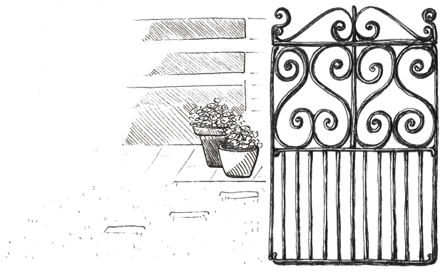
The brief was to design a business card to advertise a self-contained studio flat for rent in Cashmere, one of Christchurch’s prettiest suburbs. The flat is separated from the main property by a fabulous wrought iron gate. I was asked to make this gate the main feature of the design.
One of my photographs of the property.
For the curious, this is what the gate and geranium sketch looked like prior to adding the red and green watercolours (painted, scanned and edited) in Photoshop:
And for those wanting to visit Christchurch and stay in a beautiful location with friendly hosts, here is the link to the Cashmere Road Studio Flat.
Dianne asked for her logo and business card design to be feminine with a certain ‘shabby’ or ‘cottage chic’ elegance. It also had to communicate the style and quality of her handmade jewellery, and to have girly and vintage elements without being overcomplicated. And yes, it had to be pink.
The logo earrings (based on the pair in the photograph below) are hand-drawn except for the ‘beads’ which are the D, A and O of a particular font. The vintage doily that completes the design was my grandmother’s. Yes, I am a magpie… after all, you never know what’s going to come in handy for a project.
Divine Adornments is also taking part in the Art & Crafts pop-up mini market. We are having two more this year: Saturday 13th and Saturday 20th December. Please visit my Facebook page for more information about these events.
During my break from blogging last month, I was given the opportunity to create a couple of logos. One client wanted a design based on water, the other client asked for a ‘rising sun’ graphic — and this is what I came up with:
Ruth wanted her Relax Restore Massage logo (above) to be simple and modern and to represent the soothing and healing aspects of her massage therapy business. The river lines were hand-drawn, scanned and converted into a vector graphic. They also became the background pattern for Ruth’s gift vouchers and Facebook cover.
Julian asked for his design (below) to communicate potential, strength, growth, moving through obstacles and breaking new ground to become unstuck. He says that the services he offers can be quite challenging for people and not always ‘relaxing’ in the traditional sense. He also wanted a dramatic panorama for his website banner. The banner landscape is an acrylic painting which I scanned and adjusted slightly (for dramatic effect) in Photoshop. I was so happy with the end result that I used it on the business cards and gift vouchers too.
Sally’s logo and business card were a joy to design. The brief was to incorporate a blossoming flower (a lotus or a dahlia) and a dark-to-light-blue gradient (symbolising transformation) to give a sense of the personality and coaching style of the client ― who has a very positive, playful kind of energy. Several sketches, watercolour paintings and brainstorming sessions later, we had the Amazing You blue lotus logo ― and an entire blue lotus forest!