Six hundred followers? Wow, that was fast! My thanks to all of you out there in cyberspace… you creative commentators, lovely likers and fabulous followers. And a special thank you to those who’ve liked me on Facebook — you’ve given my little blog a bit of a boost.
You can check out my Facebook art page here: Anna Cull – Art.
Stamp design, artwork – mixed media – student project, 2011
My Favorite Martian (1963-1966): An American sitcom about a professor of anthropology from Mars who crash-lands on Earth somewhere near Los Angeles. He is befriended by Tim, a newspaper reporter, who passes off the stranded Martian as his Uncle Martin.
By the way, the newspaper reporter was played by Bill Bixby who went on to star as David Banner in The Incredible Hulk TV series (1977-1982): “Don’t make me angry. You wouldn’t like me when I’m angry.”
The stamp design, poster and text are from one of my favourite student projects. Each stamp depicts an iconic science fiction TV series from the 1960s. For a recap on the project, click here.
Stamp design, artwork – mixed media – student project, 2011
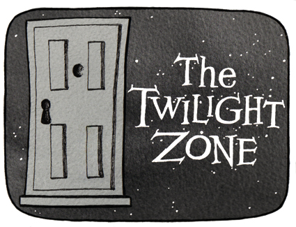
Cue the theme music…
The Twilight Zone (1959-1964): An American anthology series of stand-alone stories with unexpected plot twists. The Twilight Zone became famous for its opening title sequences. “You are travelling through another dimension, a dimension not only of sight and sound but of mind. A journey into a wondrous land of imagination. Next stop, the Twilight Zone.” Two other series were produced from 1985–1989 and 2002–2003.
The stamp design, poster and text are from one of my favourite student projects.* Each stamp depicts an iconic science fiction TV series from the 1960s. I’ve decided to post the artwork for the individual stamps ― one every week (or thereabouts) ― to commemorate the 50th anniversary of Doctor Who (later this year). And because sci-fi stamps are cool.
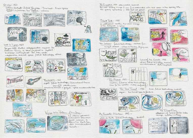
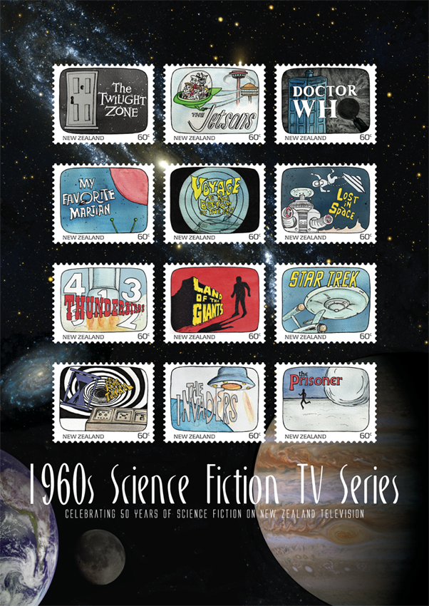
Science Fiction stamp design – sketches Visual diary, two-page spread (student project, 2011)Science Fiction stamp poster (594 x 420 mm) Stars and planets (background collage) courtesy of the Internet Student project, 2011
Another one of my favourite designs at college was this stamp poster (and all of the stamps). Below is the text I wrote as part of the project:
Commemorating 50 years of science fiction on television in New Zealand, this collection features illustrations of some of the 1960s most iconic science fiction programmes.
Television arrived in New Zealand homes at a time when great advances were being made in space exploration. The 1960s was a decade obsessed with the “space race” as the Soviet Union and the United States competed to put a man on the moon. These 12 stamps depict television shows that tapped into our fascination with space and space travel. There were tales of friendly aliens living among us and of hostile alien invasions; journeys into our possible future and into the questionable past; galaxies filled with spaceships, robots and strange new worlds.
This post is the last of my Dear diary series… but I think I’ll start blogging about the artwork for these stamps — because stamps are cool : )
The diary pages are from a journal I designed for my Design & Arts College exhibition in 2012. Two years of research, ideas, word maps and sketches had to be reduced to a mere 72 pages. It was no easy task but I now have a beautiful, professionally bound diary that I’ll always treasure.
I now have a page on Facebook: Anna Cull – Art. To mark the occasion, I’ve updated my avatar (I tweaked a few things and added an acrylic background). The next step will be selling my art on Etsy… but I’m not quite ready for that sort of commitment.
Chef logo, labels and rebranding campaign – concept development and final logo design Visual diary, two-page spread (student project, 2011)
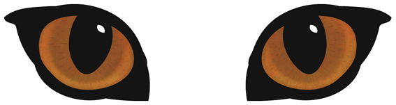
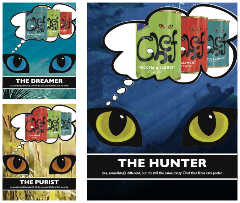
A full-on design challenge, this student project was all about the relaunch of one of New Zealand’s favourite pet foods: Chef. The secret life of the domestic cat was my inspiration — house cats are predators who, although wild at heart, always come home for Chef. I used a simple line drawing for the logo/body and Photoshopped the eyes (in detail below).
My Chef logo, labels and magazine advertising campaign. The background images used in the ads are courtesy of the Internet.
The diary pages are from a journal I designed for my Design & Arts College exhibition in 2012. Two years of research, ideas, word maps and sketches had to be reduced to a mere 72 pages. It was no easy task but I now have a beautiful, professionally bound diary that I’ll always treasure.