
Visual diary, two-page spread (student project, 2011)
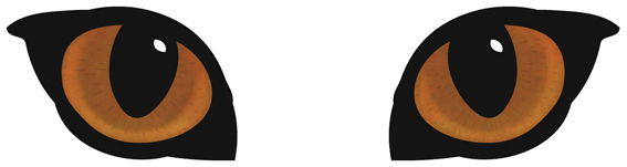
A full-on design challenge, this student project was all about the relaunch of one of New Zealand’s favourite pet foods: Chef. The secret life of the domestic cat was my inspiration — house cats are predators who, although wild at heart, always come home for Chef. I used a simple line drawing for the logo/body and Photoshopped the eyes (in detail below).

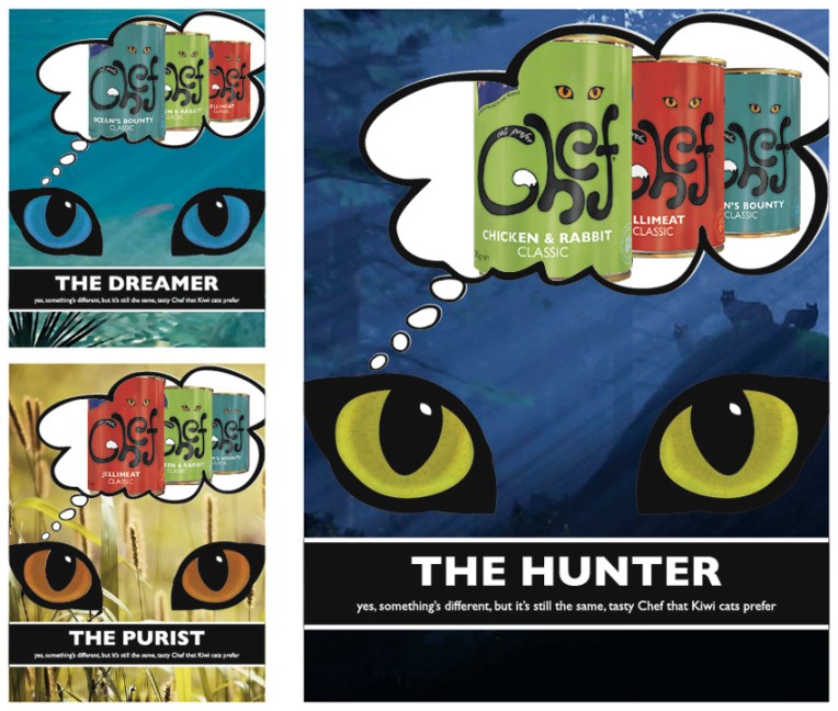
My Chef logo, labels and magazine advertising campaign. The background images used in the ads are courtesy of the Internet.
The diary pages are from a journal I designed for my Design & Arts College exhibition in 2012. Two years of research, ideas, word maps and sketches had to be reduced to a mere 72 pages. It was no easy task but I now have a beautiful, professionally bound diary that I’ll always treasure.

very eye-catching (excuse the pun!)
Lovely to see the full story from draft to finished image. I think the tins look fabulous. Cheers.
Anna, I know this was a student project but did the company ever get to see these concepts? If not, why not?!! 🙂
Er, no they haven’t seen them. Why not? That’s a very good question… to which I don’t have a very good answer. If I stop being slack and ever get around to contacting Chef, I’ll let you know. Thanks for the vote of confidence : )
Go for it…you have nothing to lose. 🙂