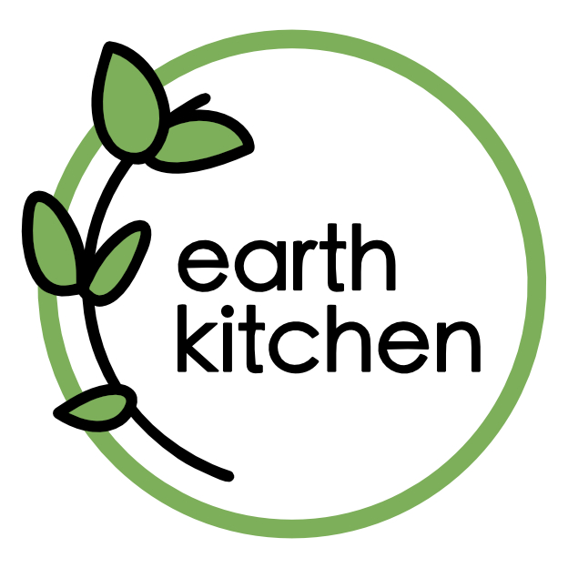
The logo was hand-drawn and then tidied up in Affinity Photo. I wanted the letters to retain an ‘organic’ quality and so I resisted the temptation to turn it into a black and white vector image.
tree-line sketch in progresscompleted trees ~ ink and acrylic
The tree-line sketch (or, if you prefer, tree line-sketch) was drawn in black ink. I painted over some areas to boost the shadows and highlights prior to scanning. I then edited the trees (ever so slightly) to ensure that the tree heights looked good underneath the text.
This slideshow requires JavaScript.
As well as the pine/light brown colour, we also considered green and blue. Happily, the client went with pine brown which not only fits the brand identity beautifully, it also enables the finer details of the drawn elements to really stand out (the other colours were significantly darker when printed). And even though I was working on this right up until Christmas, I didn’t mind one bit because it just seemed so wonderfully 🌲🎄🌲 seasonally appropriate : )
The Earth Kitchen logo is a project I have been working on for a vegan and organic private dining restaurant in Kajang, Malaysia. The final logo, above, is entirely vector (which is a little unusual for me), although the leaves were drawn on paper and then reproduced in Affinity Designer to add something organic to the design. The circle represents the Earth as well as a dining plate, the colours are fresh, and I’m particularly happy with the circular e, a and c because they go so well with the other elements. Mmm, yes, designing logos is still one of my favourite things to do.
“Design is the method of putting form and content together. Design, just as art, has multiple definitions; there is no single definition. Design can be art. Design can be aesthetics. Design is so simple, that’s why it is so complicated.” Paul Rand
Friday will be the third anniversary of my little blog. My, how time flies!
Three years ago, I graduated from Design and Arts College NZ with a Diploma in Communication Arts and Design (graphic design). I started this blog as a way of putting my student projects online ― and then I wondered what to do next:
‘The Great Job Hunt’ 2012 (click on image to embiggen)
There were graphic design jobs (logos, business cards, posters), a couple of research projects (when I considered becoming a children’s book illustrator), and I even entered a few design competitions (which I didn’t win):
Love the shape you’re in – mixed media, poster design competition, 2012Lilac Wolf NZ – mixed media, logo design competition, 2012
Nothing motivated me quite like my blog, though, to experiment and really explore my options. In particular, there were the ‘Shoot it, Sketch it’ posts…
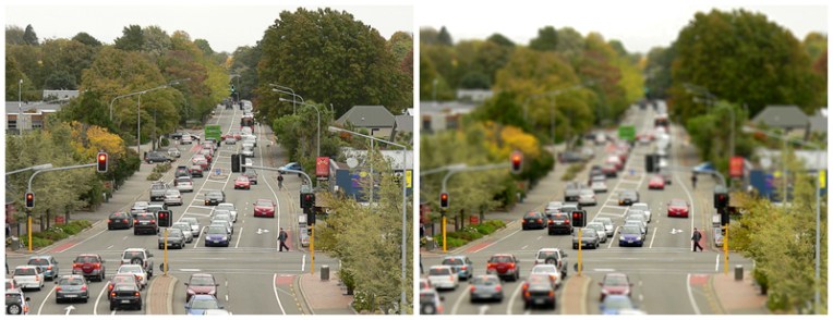
Straven Road photograph with ‘tilt shift’ effect – Christchurch, 2013A letter to my teenage self, 2012
Two years ago, I started getting more serious about painting. I taught myself about underpainting and painted on canvas for the first time:
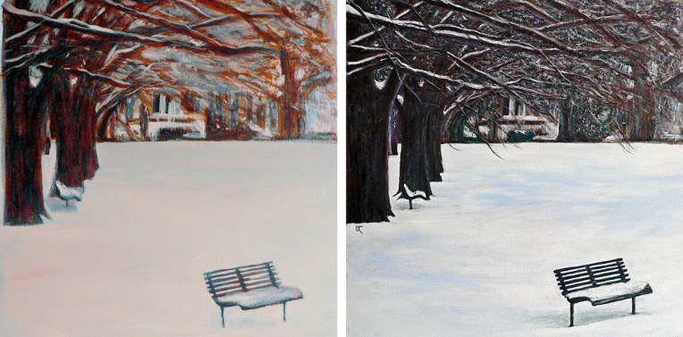
The colour of snow – underpainting and final painting, 2013
I began my ‘In the Style of…’ posts and was inspired by some of my favourite artists and illustrators to experiment and see things differently:
Gold – acrylic on paper, 2013. Inspired by André François.Tram – ink and digital, 2013. Inspired by Fougasse.
I was thrilled when, out of the blue, I got my first commission…
Peonies triptych – acrylic on canvas, 2013
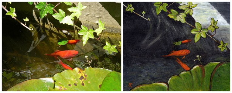
…and over the moon when someone asked to buy one of my ‘Shoot it, Sketch it’ paintings:
Sparkle and shine – acrylic on canvas, 2013
About a year ago, I opened my Etsy shop… and sold my first painting online!
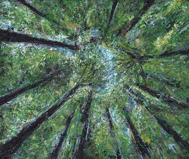
Redwoods – acrylic on canvas, 2013
2014 was also, rather astonishingly, the year I passed the ‘1000 followers’ milestone on WordPress:
Thank You, 1000 followers, 2014
Since then, it’s been more of the same, really ― I’ve painted and sketched, posted ‘Wordless Wednesday’ photographs and inspirational quotes, I participated in my first craft market late last year…
Art and crafts mini market, Christmas 2014
…and I’m still happily working from home as a graphic designer:
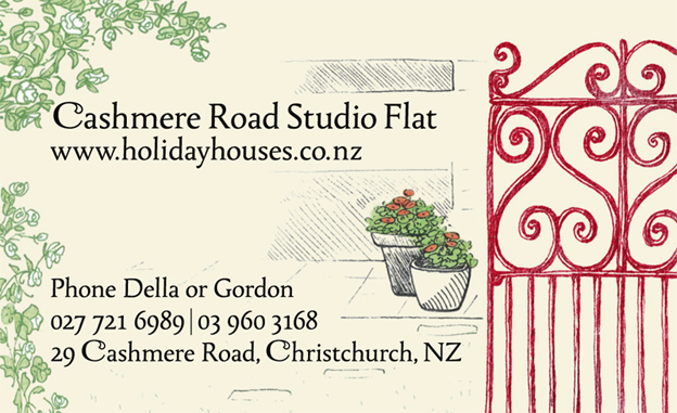
Cashmere Road Studio Flat, business card design, 2014
Phew!
Now I’m getting ready for my first big (proper big) art show… but I’ll tell you more about that next week. Thanks for reading : )
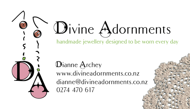
Dianne asked for her logo and business card design to be feminine with a certain ‘shabby’ or ‘cottage chic’ elegance. It also had to communicate the style and quality of her handmade jewellery, and to have girly and vintage elements without being overcomplicated. And yes, it had to be pink.
The logo earrings (based on the pair in the photograph below) are hand-drawn except for the ‘beads’ which are the D, A and O of a particular font. The vintage doily that completes the design was my grandmother’s. Yes, I am a magpie… after all, you never know what’s going to come in handy for a project.
Divine Adornments is also taking part in the Art & Crafts pop-up mini market. We are having two more this year: Saturday 13th and Saturday 20th December. Please visit my Facebook page for more information about these events.
One of my old sketches has been given a new lease of life. It is now the logo for community organisation the Thank You Club in California. I created the original image a couple of years ago to thank people for following and liking my WordPress blog. The words have been repainted for the logo (to keep the colours consistent), there is a new family of stick figures (the Bamfords) and I rearranged some of the original figures to accommodate the new layout. I’m very thankful that my little stick figures are being put to such good use.
During my break from blogging last month, I was given the opportunity to create a couple of logos. One client wanted a design based on water, the other client asked for a ‘rising sun’ graphic — and this is what I came up with:
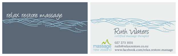
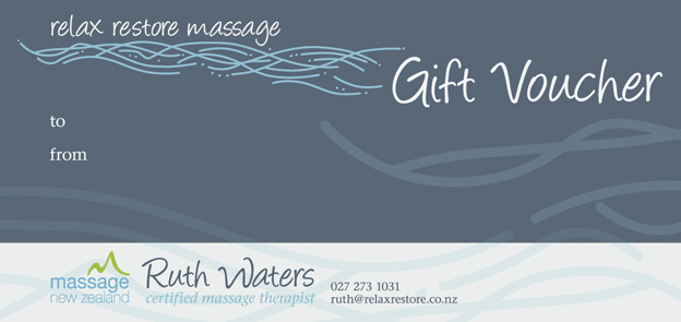
Ruth wanted her Relax Restore Massage logo (above) to be simple and modern and to represent the soothing and healing aspects of her massage therapy business. The river lines were hand-drawn, scanned and converted into a vector graphic. They also became the background pattern for Ruth’s gift vouchers and Facebook cover.
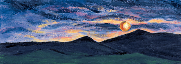
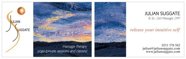
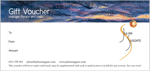
Julian asked for his design (below) to communicate potential, strength, growth, moving through obstacles and breaking new ground to become unstuck. He says that the services he offers can be quite challenging for people and not always ‘relaxing’ in the traditional sense. He also wanted a dramatic panorama for his website banner. The banner landscape is an acrylic painting which I scanned and adjusted slightly (for dramatic effect) in Photoshop. I was so happy with the end result that I used it on the business cards and gift vouchers too.