My online profile picture has been the same since 2013! It really was time for a change…
original
2013
2020
The original illustration was drawn in 2010 in the comic book style made famous by American pop artist Roy Lichtenstein:
Pop art self-portrait, vector illustration, 2010
In 2012, I replaced the dots with plain colours, added a background pattern and used it for the first and last pages of my Design & Arts College Diary:
It has been my profile pic ever since (with the occasional tweak now and then). And in case you’re wondering… yes, the new look was inspired by a recent real-life makeover : )
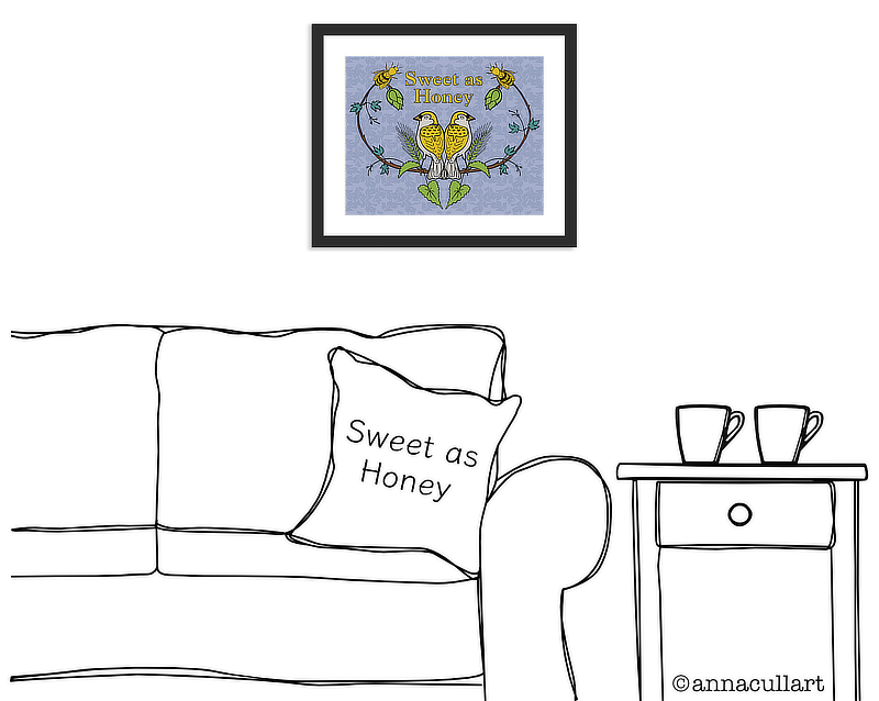
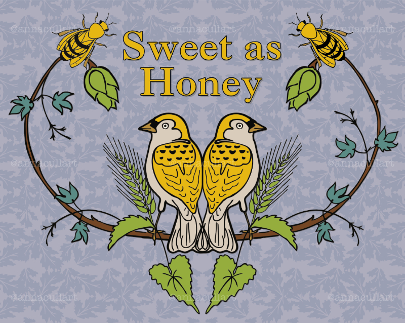
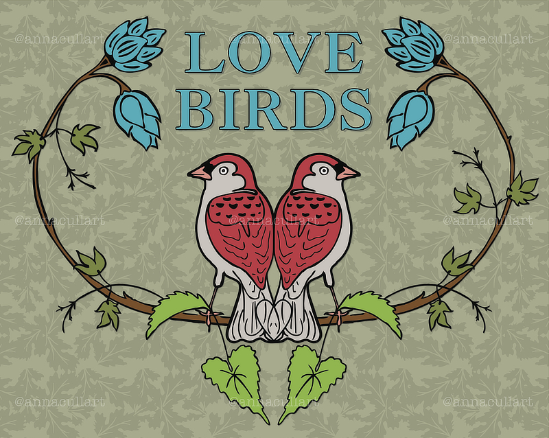
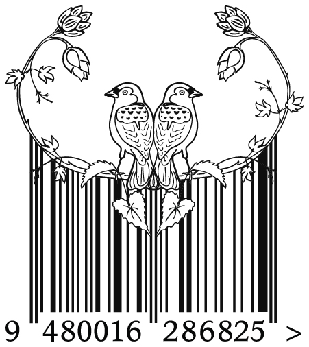
This ‘Love Birds’ design was originally created for a student project in 2011. It was part of a boutique brewery branding campaign (yes, really) and was inspired by the textiles of William Morris. With a few minor tweaks and new text, it is now a quirky little art print.
‘Love Birds’ art print
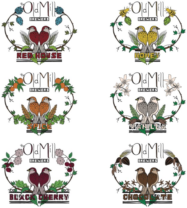
Below are some of the original images that I created for the completely fictional Old Mill Brewers. The idea behind the campaign was that the brewery was located in a converted textile mill, a sophisticated venue where boutique beer is savoured like good wine. As well as coming up with the name of the brewery and designing the logo and bottle labels…
…I also invented the six flavours: Red House (pilsner), Honey (lager), Vanilla (pale ale), Spice (witbier), Black Cherry (porter) and Chocolate (stout). Yum!
Boutique brewery logos (student project, 2011, Design & Arts College)
I even added the bird logo to the barcode on the back of the labels : ) It really was one of my favourite projects (as you can probably tell).
Barcode design (student project, 2011, Design & Arts College)
The logo was hand-drawn and then tidied up in Affinity Photo. I wanted the letters to retain an ‘organic’ quality and so I resisted the temptation to turn it into a black and white vector image.
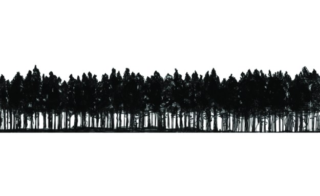
tree-line sketch in progress
completed trees ~ ink and acrylic
The tree-line sketch (or, if you prefer, tree line-sketch) was drawn in black ink. I painted over some areas to boost the shadows and highlights prior to scanning. I then edited the trees (ever so slightly) to ensure that the tree heights looked good underneath the text.
This slideshow requires JavaScript.
As well as the pine/light brown colour, we also considered green and blue. Happily, the client went with pine brown which not only fits the brand identity beautifully, it also enables the finer details of the drawn elements to really stand out (the other colours were significantly darker when printed). And even though I was working on this right up until Christmas, I didn’t mind one bit because it just seemed so wonderfully 🌲🎄🌲 seasonally appropriate : )
The Earth Kitchen logo is a project I have been working on for a vegan and organic private dining restaurant in Kajang, Malaysia. The final logo, above, is entirely vector (which is a little unusual for me), although the leaves were drawn on paper and then reproduced in Affinity Designer to add something organic to the design. The circle represents the Earth as well as a dining plate, the colours are fresh, and I’m particularly happy with the circular e, a and c because they go so well with the other elements. Mmm, yes, designing logos is still one of my favourite things to do.
“Design is the method of putting form and content together. Design, just as art, has multiple definitions; there is no single definition. Design can be art. Design can be aesthetics. Design is so simple, that’s why it is so complicated.” Paul Rand
They finally arrived in the post… my samples of ‘Canterbury in Pink Light’ as a paper cup! My painting of the Canterbury Plains and Southern Alps was chosen to be one of the artworks in the current BioCup Art Series. I was thrilled when they contacted me earlier in the year and asked me to be part of the project. And now here they are, and they’ve started popping up all over the place… so far I’ve seen photos on Instagram of my cup design in Sydney and Brisbane. I can’t wait to see where they turn up next!
The Art Series is produced by BioPak, an Australian-owned environmentally responsible packaging company that supports and promotes New Zealand and Australian artists by printing their work on BioCups. The cups are available from cafés around New Zealand and Australia. Click here to see the current BioCup Art Series and read about the artists and their artworks.
‘Canterbury in Pink Light’ ~ sold
And here’s a new feature image of the painting on my trusty travel easel