
What? Five hundred followers? No way!
Thank you all so very much. I really appreciate your lovely comments, likes and follows. Onward and upward : )
What? Five hundred followers? No way!
Thank you all so very much. I really appreciate your lovely comments, likes and follows. Onward and upward : )

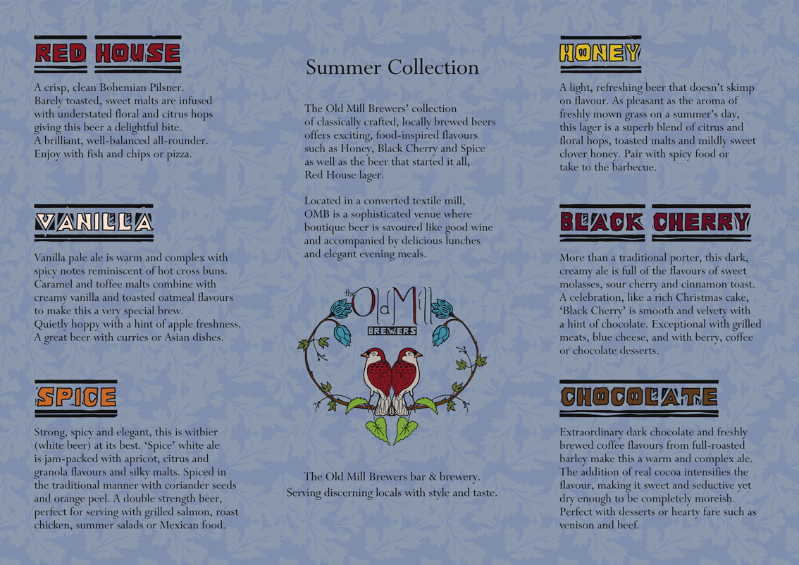
The design aesthetic for this student project owes much to the textiles of William Morris. My campaign evolved from the idea that the Old Mill could have been a converted textile mill. You can see the individual logo designs in my previous post.

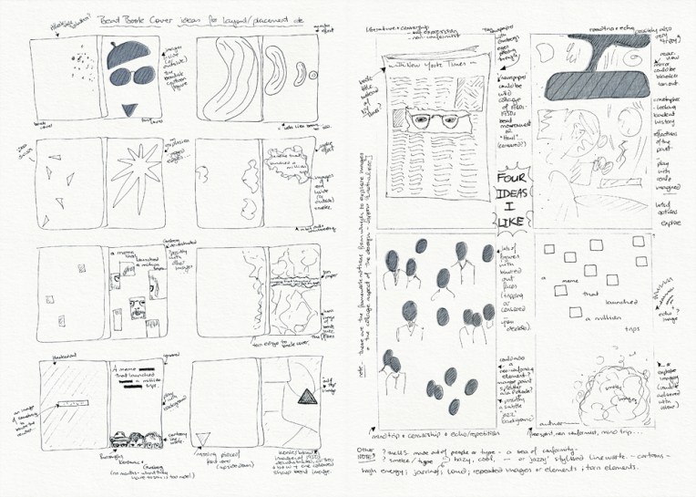
The diary pages are from a journal I designed for my Design & Arts College exhibition in 2012. Two years of research, ideas, word maps and sketches had to be reduced to a mere 72 pages. It was no easy task but I now have a beautiful, professionally bound diary that I’ll always treasure.

I worked on this logo while I was at design school and so I included it in my exhibition but, really, it was a freelance project that I did in my ‘spare’ time. Access Broadcast News is a media-monitoring company based in Wellington. They wanted their logo to be vibrant, dynamic and creative. I liked the idea of putting a new spin on the more traditional images of news communication such as radio waves and old television sets (which is why they appear in the sketches). My final solution is a cheeky nod to the RKO radio tower. I brought it into the 21st Century by adding multi-coloured dots to represent modern fibre-optic cables.
The diary pages are from a journal I designed for my Design & Arts College exhibition in 2012. Two years of research, ideas, word maps and sketches had to be reduced to a mere 72 pages. It was no easy task but I now have a beautiful, professionally bound diary that I’ll always treasure.

For this project we had to use found images and a limited colour palette to design the cover of a book about the beat poets. My cover is a paper collage of photographs, censored texts and deconstructed poetry. The background features excerpts from the works of Allen Ginsberg, Jack Kerouac and William S. Burroughs that I have retyped, rearranged, printed, torn into pieces and transferred on to paper using an acetone printing technique (the same technique I used for my book without boundaries). The acetone transfer produced a wonderful, imperfect, aged sort of effect which you can see in more detail below.

The diary pages are from a journal I put together for my Design & Arts College exhibition in 2012. Two years of research, ideas, word maps and sketches had to be reduced to a mere 72 pages. It was no easy task but I now have a beautiful, professionally bound diary that I’ll always treasure.

The green background texture is an acrylic painting. The images are ink drawings. I really do enjoy designing logos and business cards!

Visual diary, two-page spread (student project, 2011)
Student project, 2011
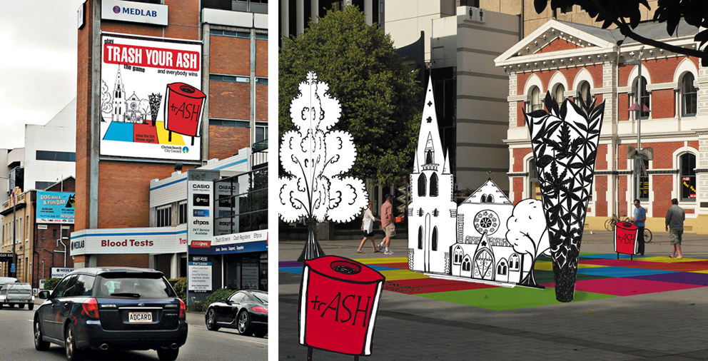
The brief for this project was to design an anti-cigarette-litter billboard and public installation for the city council’s ‘Future Vision of a Clean City’ campaign. The focus had to be on anti-not-thinking rather than anti-smoking. For the installation, I turned my drawing of Christchurch’s Anglican Cathedral and Chalice sculpture into a pop-up board game that could be played in public spaces around the city. It was a lot of fun putting my illustration into the photo ― I wonder why I don’t do that more often?
The diary pages are from a journal I designed for my Design & Arts College exhibition in 2012. Two years of research, ideas, word maps and sketches had to be reduced to a mere 72 pages. It was no easy task but it’s something I’ll always treasure.
