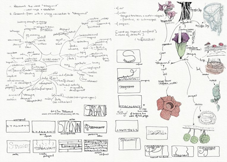
Visual diary, two-page spread (student project, 2011)

Visual diary, two-page spread (student project, 2011)
This was one of my favourite projects at design school: an illustration of flora depicting the word ‘stagnant’ (for a billboard advertising an online dictionary). It had to be linework only (no colour) which meant making the most of tone and texture. My word is deliberately stuck in the mud and claustrophobic. I’m especially fond of the strangler fig around the tree and the tiny mushrooms on the text. The final illustration is a 205 x 405 mm ink drawing and I have no idea how long it took to complete (so please don’t ask) ― the black background alone took about four hours. Madness. Utter madness.
These pages are from the diary I designed for my Design & Arts College exhibition in 2012. Two years of research, ideas, word maps and sketches had to be reduced to a mere 72 pages. It was no easy task but I now have a beautiful, professionally bound journal that I’ll always treasure.
you have a beautiful style – this is stunning!
I love this
I really like the way you’ve used the whole page here
I love your sketches and the way you lay out your thoughts! They’re so easy to relate to and such a nice way to communicate. 🙂