In the style of… Nancy Ekholm Burkert

Lake Taupo – graphite and charcoal, 205 x 255 mm, 2013
Lake Taupo, 2013
Lake Taupo, 2013

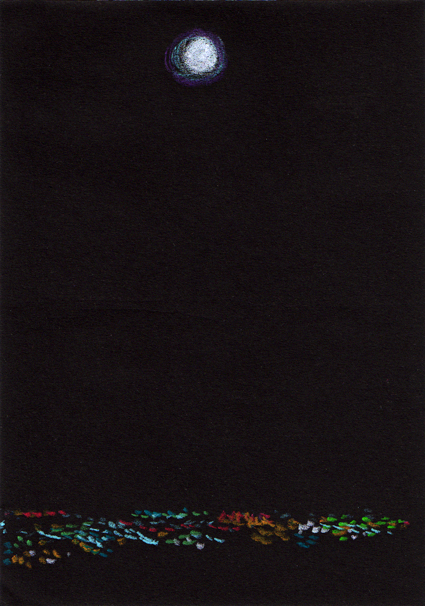
Today’s In the style of… drawing was an excuse to test my Derwent tinted charcoal pencils. Some of the colours are VERY similar (especially the darker tints) but they do have lovely names: Driftwood, Glowing Embers, Ocean Deep, Sunset Pink). I wonder how they’d respond to water…

Nancy Ekholm Burkert

Nancy Ekholm Burkert – illustrations from James and the Giant Peach Images from http://myvintagebookcollectioninblogform.blogspot.co.nz
Nancy Ekholm Burkert – illustrations from James and the Giant Peach
Images from http://myvintagebookcollectioninblogform.blogspot.co.nz

Roald Dahl’s classic story James and the Giant Peach has been illustrated a number of times. The original illustrations (and possibly my favourites) were by Nancy Ekholm Burkert in 1961.

In the style of… appears occasionally instead of my regular Shoot it, Sketch it posts. Using my own photographs as a starting point, I’m drawing inspiration from some of the world’s greatest illustrators. It’s not about slavishly copying someone else’s art; it’s an experiment in seeing things differently.

Double take (pen vs earthquake)

Pen vs earthquake #1 – Mona Vale, 2013

Mona Vale restaurant and function centre was damaged quite badly in the February 2011 earthquakes. The 5.5 hectares of gardens are still open to the public but the beautiful historic homestead needs a lot of TLC to restore it to its former glory. Mona Vale used to be one of our favourite places for special occasions and we miss it dearly.

The idea for this photo shoot came from Ben Heine’s ingenious Pencil Vs Camera images. I have a number of sketches I’d like to photograph in situ like this ― all are from this student project (click on the link and scroll down).

Anna Cull Pen vs earthquake Mona Vale

The sketch is from my time at art college (2011). I took the photographs last week.

Shoot it, Sketch it: Waxing the moon

Moon sketch – Neocolor II pastel on black paper, 148 x 105 mm, 2013.
Moon sketch – Neocolor II pastel on black paper, 148 x 105 mm, 2013
Moon over Christchurch – original photo, 2006 and edited photo, 2013.
Moon over the city – original photo, 2006 and edited photo, 2013

For years I’ve been wanting to create something based on this view of Christchurch taken from the Port Hills and now I’m finally getting around to it. I made a couple of little changes to the original photo because a not-quite-full moon just seemed a little sad.

This sketch is the reference for an acrylic painting that I’ll post for next week’s Shoot it, Sketch it.

In the style of… Edward McKnight Kauffer

Sky Tower – watercolour and acrylic, 295 x 210 mm, 2013.
Sky Tower – watercolour and acrylic, 295 x 210 mm, 2013
Sky Tower – Auckland, 2007.
Sky Tower – Auckland, 2007

Here is Auckland’s Sky Tower ― the tallest man-made structure in New Zealand ― surrounded by little fluffy clouds. The sketch was an exercise in simplicity and contrast. Left to my own devices, I would have added more details and shading, but that’s not really the point of this exercise. I used watercolour pencils and my new Molotow acrylic paint markers (oh what a wonderful world we live in!).

Edward McKnight Kauffer

Posters from 1923,1932 and 1934  Images from www.pickmix.co.uk
Posters from 1923, 1932 and 1934
Images from www.pickmix.co.uk

I’m a little jealous of American-born artist and designer Edward McKnight Kauffer (1890–1954). He studied in Paris, illustrated several of T. S. Eliot’s books (apparently he was Eliot’s preferred illustrator) and designed posters for the London Underground. Not a bad career.

In the style of… appears occasionally instead of my regular Shoot it, Sketch it posts. Using my own photographs as a starting point, I’m drawing inspiration from some of the world’s greatest illustrators. It’s not about slavishly copying someone else’s art; it’s an experiment in seeing things differently.

In the style of… Jim Flora

CBD 2010 – ink and digital, 280 x 355 mm, 2013.
CBD 2010 – ink and digital, 280 x 355 mm, 2013
Bikes – Christchurch, 2010.
Bikes – Christchurch, 2010

Although I’ve always liked the composition of this photograph, I really wanted to have a bit of fun with the sketch. What better way than by utilising Jim Flora’s dynamic and colourful style?! The linework is ink on illustration board, coloured in Photoshop.

Jim Flora

Images (1954, 1955, 1957) from www.jimflora.com
Images (1954, 1955, 1957) from http://www.jimflora.com

American artist James (Jim) Flora (1914–1998) is probably best known for his jazz and classical album covers from the 1940s and 1950s. His work includes children’s books, paintings, woodcuts and commercial illustrations. If you’re not familiar with his art, I recommend checking out www.jimfloraart.com and www.jimflora.com. But be warned, his art is not only colourful and humorous, it has also been described as diabolic, sinister and mischievous!

In the style of… appears occasionally instead of my regular Shoot it, Sketch it posts. Using my own photographs as a starting point, I’m drawing inspiration from some of the world’s greatest illustrators. It’s not about slavishly copying someone else’s art; it’s an experiment in seeing things differently.