The Prisoner (1968-1969): The prisoner is a former British spy who, having abruptly resigned from the secret service, has been abducted and imprisoned in a strange village…and he has no idea who his captors are. “I am not a number, I am a free man” was the catchphrase of the series. The stamp depicts the prisoner being apprehended by a large, white, mysterious bouncing bubble called ‘Rover’.
Those bouncing bubbles used to give me nightmares!
The stamp design, poster and text are from one of my favourite student projects. Each stamp depicts an iconic science fiction TV series from the 1960s. For a recap on the project, click here.
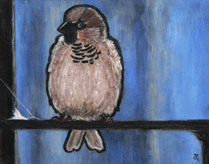
These photos show the progress of Sparrow (Monday’s In the style of…) painting. I started with an underpainting of Ultramarine Blue and Burnt Umber ― I’ve fallen in love with these two colours because they blend together to make the most beautiful black (see the note below about chromatic blacks).
Work in progress #2 – painting the background and the bodyWork in progress #3 – filling in detailsWork in progress #4 – adding black and white
I’m a big fan of chromatic blacks (made using colour rather than a specific black pigment). It’s so satisfying to mix your own ‘black’ and achieve subtle variations of colour — it’s much more fun than simply reaching for a tube of Ivory Black (although I do that too). I’ve used both kinds of black in my little sparrow painting.
Work in progress #5 – no no no no no
I got a bit carried away adding white to his feathers and ended up with a colour I didn’t like ― a sort of pale grey-brown ― so I waited for the unfortunate, dreary colour to dry and painted a more cheerful pinky-brown over it (see below).
Sparrow – acrylic on canvas, 200 x 255 mm, 2013
I also made him a little bit fatter and a whole lot fluffier. And I still really like that strand of spider silk in the corner.
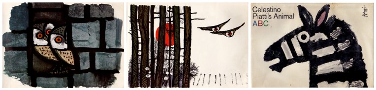
Prolific Swiss artist and designer Celestino Piatti (1922–2007) has an instantly recognisable style. I may be wrong but I’m pretty sure I’m one of his biggest fans. My favourite Piatti quote: “You can draw an owl a thousand times, and never find out its secret”.
In the style of… appears occasionally instead of my regular Shoot it, Sketch it posts. Using my own photographs as a starting point, I’m drawing inspiration from some of the world’s greatest illustrators. It’s not about slavishly copying someone else’s art; it’s an experiment in seeing things differently.
Canterbury – acrylic on canvas, 405 x 305 mm, 2013. Private collection.Canterbury – in detail
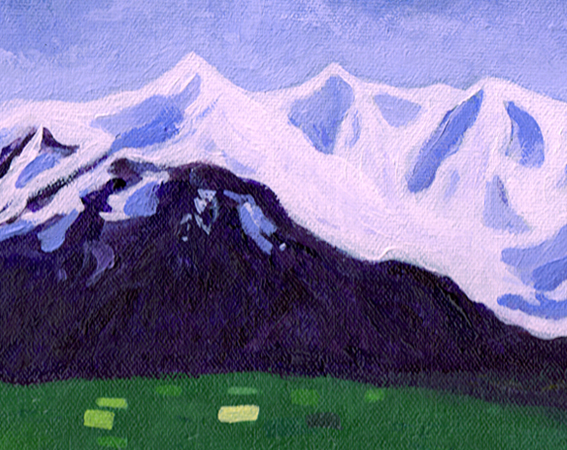
I originally created this landscape as a digital illustration (it’s the background of this poster). The scene is based on a number of different photographs and even though it is not an actual location, it is typical of the scenery here in Mid Canterbury ― the snow-covered Southern Alps, the colourful Canterbury Plains ― except that I omitted the rivers… and the houses… and the sheep…
Stamp design, artwork – mixed media – student project, 2011
The Jetsons (1962-1963): Hanna-Barbera’s animated sitcom about an American family living in the year 2062 featured flying cars, floating cities and a robot named Rosey. A second series was produced in the 1980s.
Which means that we only have to wait another 49 years for flying cars!
The stamp design, poster and text are from one of my favourite student projects. Each stamp depicts an iconic science fiction TV series from the 1960s. For a recap on the project, click here.
Moon Over the City – acrylic on canvas, 405 x 305 mm, 2013. Private collection.
Here is the finished painting based on last week’s photo and sketch. In real life, the texture of the night sky is quite subtle and, in some lights, the surface looks smooth and the dark purple appears almost black. I wouldn’t mind painting a few more of these : )