
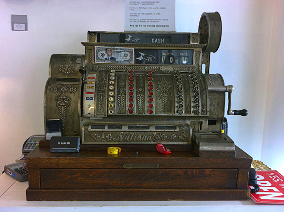
We discovered this beautiful antique in an art gallery while we were away on holiday. The till and its owner used to live in Christchurch but moved because of recent events (such as earthquakes) ― the sign says it’s still in good working order!
We discovered this beautiful antique in an art gallery while we were away on holiday. The till and its owner used to live in Christchurch but moved because of recent events (such as earthquakes) ― the sign says it’s still in good working order!
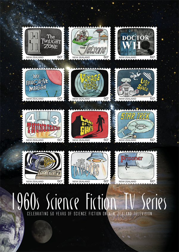
Another one of my favourite designs at college was this stamp poster (and all of the stamps). Below is the text I wrote as part of the project:
Commemorating 50 years of science fiction on television in New Zealand, this collection features illustrations of some of the 1960s most iconic science fiction programmes.
Television arrived in New Zealand homes at a time when great advances were being made in space exploration. The 1960s was a decade obsessed with the “space race” as the Soviet Union and the United States competed to put a man on the moon. These 12 stamps depict television shows that tapped into our fascination with space and space travel. There were tales of friendly aliens living among us and of hostile alien invasions; journeys into our possible future and into the questionable past; galaxies filled with spaceships, robots and strange new worlds.
This post is the last of my Dear diary series… but I think I’ll start blogging about the artwork for these stamps — because stamps are cool : )
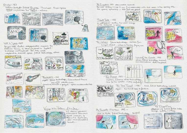
The diary pages are from a journal I designed for my Design & Arts College exhibition in 2012. Two years of research, ideas, word maps and sketches had to be reduced to a mere 72 pages. It was no easy task but I now have a beautiful, professionally bound diary that I’ll always treasure.

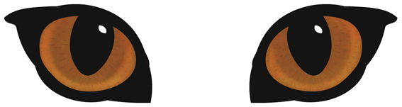
A full-on design challenge, this student project was all about the relaunch of one of New Zealand’s favourite pet foods: Chef. The secret life of the domestic cat was my inspiration — house cats are predators who, although wild at heart, always come home for Chef. I used a simple line drawing for the logo/body and Photoshopped the eyes (in detail below).

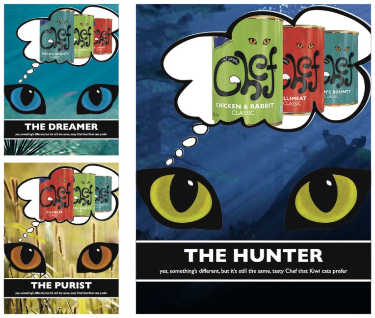
My Chef logo, labels and magazine advertising campaign. The background images used in the ads are courtesy of the Internet.
The diary pages are from a journal I designed for my Design & Arts College exhibition in 2012. Two years of research, ideas, word maps and sketches had to be reduced to a mere 72 pages. It was no easy task but I now have a beautiful, professionally bound diary that I’ll always treasure.

What? Five hundred followers? No way!
Thank you all so very much. I really appreciate your lovely comments, likes and follows. Onward and upward : )
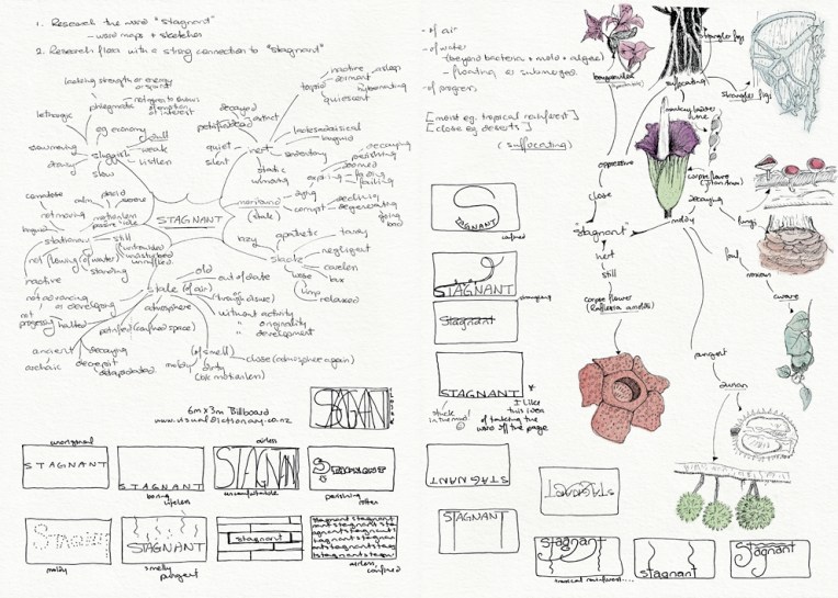

This was one of my favourite projects at design school: an illustration of flora depicting the word ‘stagnant’ (for a billboard advertising an online dictionary). It had to be linework only (no colour) which meant making the most of tone and texture. My word is deliberately stuck in the mud and claustrophobic. I’m especially fond of the strangler fig around the tree and the tiny mushrooms on the text. The final illustration is a 205 x 405 mm ink drawing and I have no idea how long it took to complete (so please don’t ask) ― the black background alone took about four hours. Madness. Utter madness.
These pages are from the diary I designed for my Design & Arts College exhibition in 2012. Two years of research, ideas, word maps and sketches had to be reduced to a mere 72 pages. It was no easy task but I now have a beautiful, professionally bound journal that I’ll always treasure.

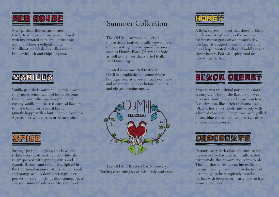
The design aesthetic for this student project owes much to the textiles of William Morris. My campaign evolved from the idea that the Old Mill could have been a converted textile mill. You can see the individual logo designs in my previous post.

The diary pages are from a journal I designed for my Design & Arts College exhibition in 2012. Two years of research, ideas, word maps and sketches had to be reduced to a mere 72 pages. It was no easy task but I now have a beautiful, professionally bound diary that I’ll always treasure.
