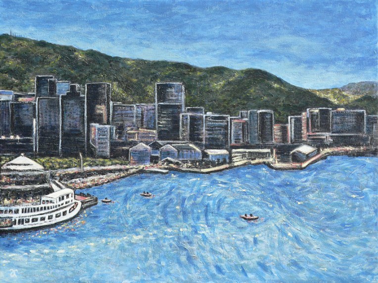
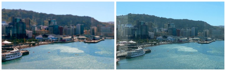
Wellington Harbour – acrylic on canvas, 455 x 610 mm, 2014. SOLDWellington Harbour — edited photograph (left), 2013 and original photograph (right), 2008
Today’s painting was inspired by my photograph of Wellington Harbour on a sunny, summer afternoon originally posted here. I also referred to the unedited image (prior to giving it the tilt-shift treatment and cropping it to remove the reflections from the hotel window) for some of the details.
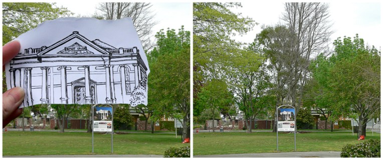
Built in 1881, the Oxford Terrace Baptist Church was one of the many buildings conspicuously absent from the landscape when we flew over Christchurch last month. I’ve circled the relevant piece of dirt in the photograph below (click on the photo for a closer look). The building was badly damaged by the September 2010 earthquakes and then completely collapsed in the February 2011 earthquake. It was famous for having a sign out the front which read: “Our building is cracked, the Church is fine!” Although the neoclassical structure (an unusual style for Christchurch) is not going to be rebuilt, there are reports that the damaged Oamaru stone is to be used in a sculpture ― what a wonderful way of honouring the spirit and tenacity of its congregation.
Where Oxford Terrace Baptist Church isn’t, Christchurch, 2013
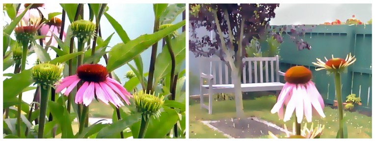
I have no idea where my original photographs are but these are the arty versions (created quite a few years ago using Corel Photo-Paint) that inspired the diptych below. How I wish our garden still looked this good!
Purple coneflower diptych – acrylic on textured card, 205 x 305 mm each, 2014
A loose, sketchy style seemed the thing for these two studies. I also used less intense, more natural colours and resisted the urge to define all the edges. In some ways they feel a little unfinished, like a work still in progress, and yet I can’t bring myself to add any more paint.
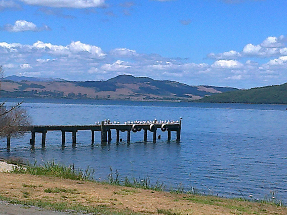
The convention – ink and watercolour, 205 x 255 mm, 2013Seagulls at Lake Rotorua, 2013
I’ve only recently discovered Evaline Ness (although the illustrations in Sam, Bangs and Moonshine do seem curiously familiar). Her work is delightful and quirky across a wide range of styles and mediums. I particularly like the bold lines and restricted use of colour in the illustrations below. The reference photo is yet another one taken using my nothing-special cellphone ― which explains the appalling quality ― but it’s still good enough for sketching purposes. I’ve said it before and I’ll say it again (and I’m quoting photographer Chase Jarvis here), the best camera is the one you have with you. I’m starting to think it may be time to invest in a better phone… or a smaller camera.
American artist Evaline Ness (1911–1986) has several claims to fame. As well as being an extremely versatile illustrator and author of children’s books, she was also a fashion model, a fashion illustrator and was, at one time, married to FBI investigator Elliot Ness. It sounds like a movie just waiting to happen.
In the style of… appears occasionally instead of my regular Shoot it, Sketch it posts. Using my own photographs as a starting point, I’m drawing inspiration from some of the world’s greatest illustrators. It’s not about slavishly copying someone else’s art; it’s an experiment in seeing things differently.