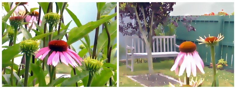
I have no idea where my original photographs are but these are the arty versions (created quite a few years ago using Corel Photo-Paint) that inspired the diptych below. How I wish our garden still looked this good!

A loose, sketchy style seemed the thing for these two studies. I also used less intense, more natural colours and resisted the urge to define all the edges. In some ways they feel a little unfinished, like a work still in progress, and yet I can’t bring myself to add any more paint.

but somehow the light is missing…
Hmmm… perhaps I could’ve added more highlights… but the blown-out whites on the petals in the photos seemed too harsh for the paintings. And what is a purple coneflower without the purple? Let’s just say it’s more early morning now than midday : )
🙂 true…
Lovely pincushion centres and drooping petals ! Perhaps your garden has matured Anna 😉
I like the one on the left, especially its muted colour scheme and the natural jungle.
Lovely painting and lovely garden , Anna!
Beautifully done Anna!
Lovely texture on your cone flower Anna and I like the muted colours too.