In the style of… Fougasse

Tram – ink and digital, 297 x 210 mm, 2013
Tram (edited and unedited photos) – Christchurch, 2010
Tram (edited and original photos) – Christchurch, 2010

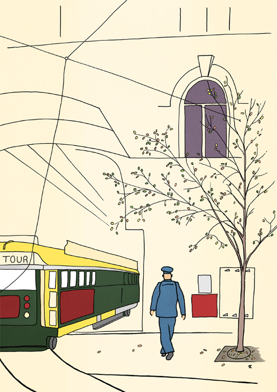
Simple lines and a few splashes of colour. I really enjoyed this one — does it show?
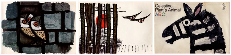
Fougasse

Posters from 1944 Images from www.pickmix.co.uk
Posters from 1944
Images from www.pickmix.co.uk

Fougasse was the nom de plume of London-born cartoonist Cyril Kenneth Bird (1887–1965). I’m a big fan of the posters he designed for the London Underground. I love the simplicity of these illustrations — and the humour.

In the style of… appears occasionally instead of my regular Shoot it, Sketch it posts. Using my own photographs as a starting point, I’m drawing inspiration from some of the world’s greatest illustrators. It’s not about slavishly copying someone else’s art; it’s an experiment in seeing things differently.

In the style of… Nancy Ekholm Burkert

Lake Taupo – graphite and charcoal, 205 x 255 mm, 2013
Lake Taupo, 2013
Lake Taupo, 2013

Today’s In the style of… drawing was an excuse to test my Derwent tinted charcoal pencils. Some of the colours are VERY similar (especially the darker tints) but they do have lovely names: Driftwood, Glowing Embers, Ocean Deep, Sunset Pink). I wonder how they’d respond to water…

Nancy Ekholm Burkert

Nancy Ekholm Burkert – illustrations from James and the Giant Peach Images from http://myvintagebookcollectioninblogform.blogspot.co.nz
Nancy Ekholm Burkert – illustrations from James and the Giant Peach
Images from http://myvintagebookcollectioninblogform.blogspot.co.nz

Roald Dahl’s classic story James and the Giant Peach has been illustrated a number of times. The original illustrations (and possibly my favourites) were by Nancy Ekholm Burkert in 1961.

In the style of… appears occasionally instead of my regular Shoot it, Sketch it posts. Using my own photographs as a starting point, I’m drawing inspiration from some of the world’s greatest illustrators. It’s not about slavishly copying someone else’s art; it’s an experiment in seeing things differently.

A sparrow’s tale

Work in progress #1 – the underpainting

These photos show the progress of Sparrow (Monday’s In the style of…) painting. I started with an underpainting of Ultramarine Blue and Burnt Umber ― I’ve fallen in love with these two colours because they blend together to make the most beautiful black (see the note below about chromatic blacks).

Work in progress #2 – painting the background and the body
Work in progress #3 – filling in details
Work in progress #4 – adding black and white

I’m a big fan of chromatic blacks (made using colour rather than a specific black pigment). It’s so satisfying to mix your own ‘black’ and achieve subtle variations of colour — it’s much more fun than simply reaching for a tube of Ivory Black (although I do that too). I’ve used both kinds of black in my little sparrow painting.

Work in progress #5 – no no no no no

I got a bit carried away adding white to his feathers and ended up with a colour I didn’t like ― a sort of pale grey-brown ― so I waited for the unfortunate, dreary colour to dry and painted a more cheerful pinky-brown over it (see below).

Sparrow – acrylic on canvas, 200 x 255 mm, 2013

I also made him a little bit fatter and a whole lot fluffier. And I still really like that strand of spider silk in the corner.

Thanks for reading.

In the style of… Celestino Piatti

Sparrow – acrylic on canvas, 200 x 255 mm, 2013
Sparrow – Akaroa, 2012

It may seem a strange thing for an arachnophobe to say… but my favourite thing about this painting is the thread of spider silk.

I’ll post my work-in-progress photos later in the week.

Celestino Piatti

The Happy Owls, 1964 and Animal ABC, 1966 Images from http://onceuponabookshelf.com
The Happy Owls, 1964 and Animal ABC, 1966
Images from http://onceuponabookshelf.com

Prolific Swiss artist and designer Celestino Piatti (1922–2007) has an instantly recognisable style. I may be wrong but I’m pretty sure I’m one of his biggest fans. My favourite Piatti quote: “You can draw an owl a thousand times, and never find out its secret”.

In the style of… appears occasionally instead of my regular Shoot it, Sketch it posts. Using my own photographs as a starting point, I’m drawing inspiration from some of the world’s greatest illustrators. It’s not about slavishly copying someone else’s art; it’s an experiment in seeing things differently.

In the style of… Edward McKnight Kauffer

Sky Tower – watercolour and acrylic, 295 x 210 mm, 2013.
Sky Tower – watercolour and acrylic, 295 x 210 mm, 2013
Sky Tower – Auckland, 2007.
Sky Tower – Auckland, 2007

Here is Auckland’s Sky Tower ― the tallest man-made structure in New Zealand ― surrounded by little fluffy clouds. The sketch was an exercise in simplicity and contrast. Left to my own devices, I would have added more details and shading, but that’s not really the point of this exercise. I used watercolour pencils and my new Molotow acrylic paint markers (oh what a wonderful world we live in!).

Edward McKnight Kauffer

Posters from 1923,1932 and 1934  Images from www.pickmix.co.uk
Posters from 1923, 1932 and 1934
Images from www.pickmix.co.uk

I’m a little jealous of American-born artist and designer Edward McKnight Kauffer (1890–1954). He studied in Paris, illustrated several of T. S. Eliot’s books (apparently he was Eliot’s preferred illustrator) and designed posters for the London Underground. Not a bad career.

In the style of… appears occasionally instead of my regular Shoot it, Sketch it posts. Using my own photographs as a starting point, I’m drawing inspiration from some of the world’s greatest illustrators. It’s not about slavishly copying someone else’s art; it’s an experiment in seeing things differently.