There was quite a bit of work behind the scenes before the brush ever touched the canvas. My client knew the subject and the colour that she wanted but hadn’t been able to find a painting or print to match her vision. I was commissioned to create an artwork ― any medium, any style ― of three red peony roses. Wow. Really? Okay.
I opted for an acrylic painting on stretched canvas. But what size should it be?
Mock-ups showing various options – the client chose the bottom left triptych
Because I was able to take photographs of the room, I decided to make several mock-ups of the canvas sizes that I thought would suit the space. My client chose a triptych measuring 100 x 100 cm. A sketch was approved and three canvases were ordered…
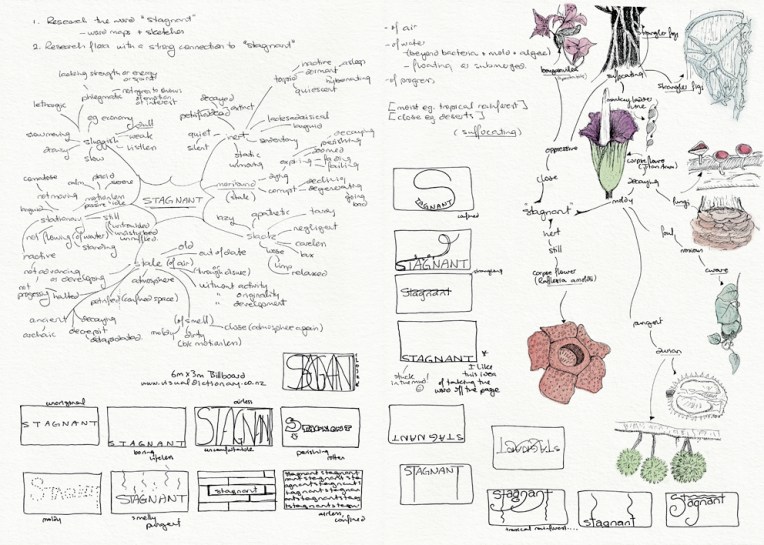
‘Stagnant’ billboard design – word map and sketches Visual diary, two-page spread (student project, 2011)‘Stagnant’ billboard design – composition sketches and final illustration Visual diary, two-page spread (student project, 2011)
This was one of my favourite projects at design school: an illustration of flora depicting the word ‘stagnant’ (for a billboard advertising an online dictionary). It had to be linework only (no colour) which meant making the most of tone and texture. My word is deliberately stuck in the mud and claustrophobic. I’m especially fond of the strangler fig around the tree and the tiny mushrooms on the text. The final illustration is a 205 x 405 mm ink drawing and I have no idea how long it took to complete (so please don’t ask) ― the black background alone took about four hours. Madness. Utter madness.
These pages are from the diary I designed for my Design & Arts College exhibition in 2012. Two years of research, ideas, word maps and sketches had to be reduced to a mere 72 pages. It was no easy task but I now have a beautiful, professionally bound journal that I’ll always treasure.
Rendezvous – acrylic and pigment gel ink, 280 x 400 mm, 2013.Rendezvous – detailAkaroa Harbour beachfront, 2012.
I had something specific in mind when I started painting the Akaroa Harbour beachfront photo… and this painting isn’t it. Initially I was going to create a highly stylised image using simple shapes and patterns and fairly flat colours ― but sometimes I just can’t help myself… the temptation to layer colours and add texture is just too great. With Louis Rhead’s turn-of-the-century posters in mind (see below), I exaggerated the shape of the trees and the curve of the shoreline. He has also influenced the overall composition, my choice of colours and the romantic styling of the women in the foreground (although mine look more medieval than Art Nouveau).
I may have another go at painting this scene for next week’s Shoot it, Sketch it…
English-born artist Louis Rhead (1857-1926) made a career out of poster design and book illustration in the USA. I love the Art Nouveau influence in these posters dated 1896-1900. The sweeping curves and stylised trees are beautiful. The colours are fantastic too.
In the style of… appears occasionally instead of my regular Shoot it, Sketch it posts. Using my own photographs as a starting point, I’m drawing inspiration from some of the world’s greatest illustrators. It’s not about slavishly copying someone else’s art; it’s an experiment in seeing things differently.
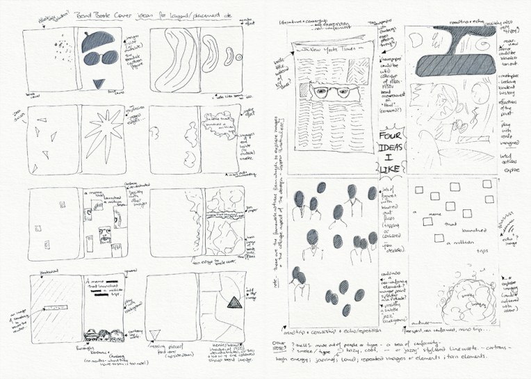
Beat book cover design – sketches and layout ideas Visual diary, two-page spread (student project, 2011)‘A meme that launched a millions trips’ – final cover design
For this project we had to use found images and a limited colour palette to design the cover of a book about the beat poets. My cover is a paper collage of photographs, censored texts and deconstructed poetry. The background features excerpts from the works of Allen Ginsberg, Jack Kerouac and William S. Burroughs that I have retyped, rearranged, printed, torn into pieces and transferred on to paper using an acetone printing technique (the same technique I used for my book without boundaries). The acetone transfer produced a wonderful, imperfect, aged sort of effect which you can see in more detail below.
Final cover design, detail
The diary pages are from a journal I put together for my Design & Arts College exhibition in 2012. Two years of research, ideas, word maps and sketches had to be reduced to a mere 72 pages. It was no easy task but I now have a beautiful, professionally bound diary that I’ll always treasure.
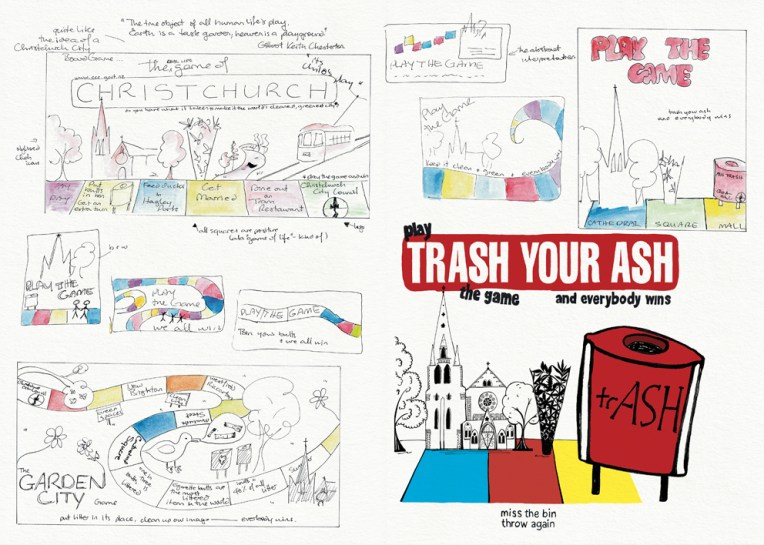
‘Trash your ash – play the game and everybody wins’ – sketches and final illustration Visual diary, two-page spread (student project, 2011)‘Trash your ash’ mock-ups (billboard and installation) – ink, photography and digital Student project, 2011
The brief for this project was to design an anti-cigarette-litter billboard and public installation for the city council’s ‘Future Vision of a Clean City’ campaign. The focus had to be on anti-not-thinking rather than anti-smoking. For the installation, I turned my drawing of Christchurch’s Anglican Cathedral and Chalice sculpture into a pop-up board game that could be played in public spaces around the city. It was a lot of fun putting my illustration into the photo ― I wonder why I don’t do that more often?
The diary pages are from a journal I designed for my Design & Arts College exhibition in 2012. Two years of research, ideas, word maps and sketches had to be reduced to a mere 72 pages. It was no easy task but it’s something I’ll always treasure.