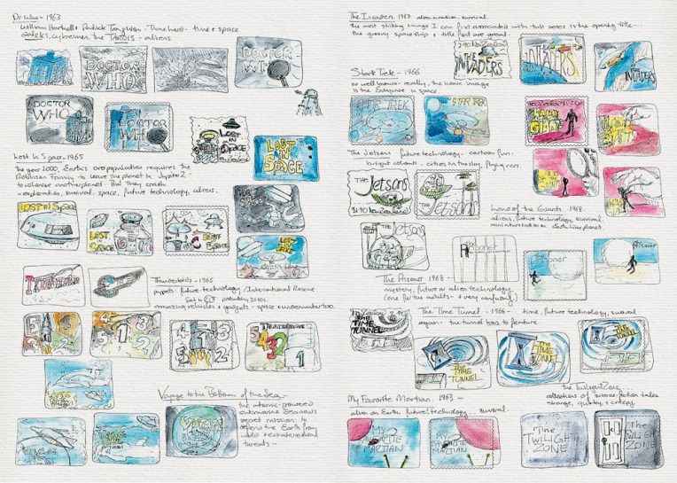
Visual diary, two-page spread (student project, 2011)
Stars and planets (background collage) courtesy of the Internet
Student project, 2011
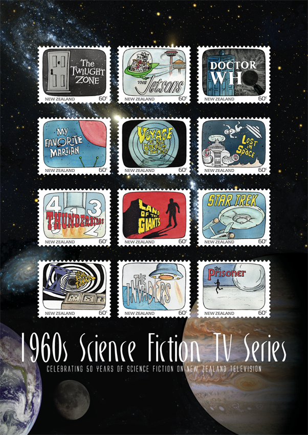
Another one of my favourite designs at college was this stamp poster (and all of the stamps). Below is the text I wrote as part of the project:
Commemorating 50 years of science fiction on television in New Zealand, this collection features illustrations of some of the 1960s most iconic science fiction programmes.
Television arrived in New Zealand homes at a time when great advances were being made in space exploration. The 1960s was a decade obsessed with the “space race” as the Soviet Union and the United States competed to put a man on the moon. These 12 stamps depict television shows that tapped into our fascination with space and space travel. There were tales of friendly aliens living among us and of hostile alien invasions; journeys into our possible future and into the questionable past; galaxies filled with spaceships, robots and strange new worlds.
This post is the last of my Dear diary series… but I think I’ll start blogging about the artwork for these stamps — because stamps are cool : )
The diary pages are from a journal I designed for my Design & Arts College exhibition in 2012. Two years of research, ideas, word maps and sketches had to be reduced to a mere 72 pages. It was no easy task but I now have a beautiful, professionally bound diary that I’ll always treasure.