Blue (seagull #2) – mixed media, 205 x 290 mm, 2013
Seagull #2 – Akaroa, 2012
I hope you like this week’s Shoot it, Sketch it. The water and the seagull standing on the wall are two different paintings that have been combined in Photoshop. The gull was sketched in graphite and then painted using acrylics thinned with a gloss medium. The background and wall are thicker acrylics that have been applied with a palette knife.
You’ll be seeing a few more paintings over the next month as I come to terms with my new artists’ acrylics and the knowledge that I’ve just accepted a commission to do a large peony rose on stretched canvas! I do love a challenge : )
This week’s Shoot it, Sketch it photograph was taken around the corner from our house last autumn. You can just make out the curve of the little footbridge in the blurry distance. Is it just me or does the light shining through the willows look like fairylights?
Smartlea Street Bridge – ink, watercolour and digital, 215 x 175 mm, 2013.
Smartlea Street Bridge, detail – ink, watercolour and digital, 2013.
The short story ~ the sketch is an ink and watercolour painting that has been altered using a kind of digital-resist effect (a combination of Photoshop filters that mimic the wax-resist technique used in making batik).
The long story ~ I’m going through an experimental phase. I’m curious to see what happens when I venture out of my comfort zone (ink drawings with lots of fiddly details and carefully considered watercolour and acrylic paintings) — I want to explore different ways of seeing things and be less concerned about the end result. What if…? That’s what happened in A trip down memory lane and it’s what happened here. Smartlea Street Bridge began as an ink and watercolour sketch which I then drew over with a brush pen to thicken the lines and make some areas inky black. The final image was created in Photoshop by inverting a scanned copy of the painting and applying various filters. The batik effect was discovered through trial and error.
Being out of my comfort zone does have one little drawback — it’s not very comfortable. I’m having to resist the urge to edit the light and dark areas to make them look more like the original photo. But so far, so good…
An unexpected outcome doesn’t always add magic to an image. Serendipity is a wonderful thing but, unfortunately, not all accidents are pleasant surprises.
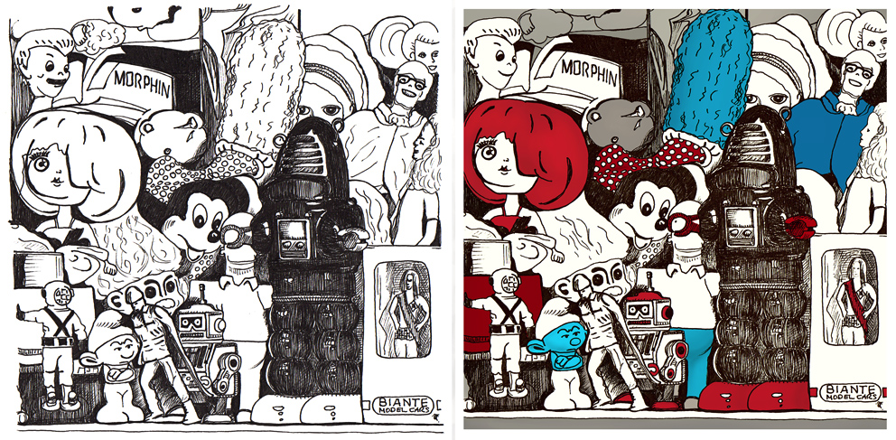
Toy museum is a good example. It’s an ink sketch that I scanned and coloured digitally. While I was drawing it, I realised it would have to be reworked ― a stray line here, an unfortunate expression there ― but rather than starting again (something my tutors at design school would have insisted on), I kept calm, carried on and decided that I would correct modify those bits later. It’s not cheating; it’s a kind of mixed media that includes digital tools : )
If you compare the sketch with the final image, quite a few things haven’t changed at all, but I had trouble with some of the faces and so I edited them in Photoshop. I tweaked a few other things as well but not too much — I didn’t want to take away the personality of the drawing.
Ironically, knowing that I CAN change something later means that I tend to relax and enjoy my art more and then, more often than not, I DON’T NEED TO change anything. And I like it when that happens too.
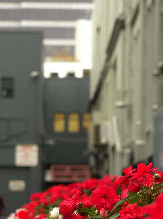
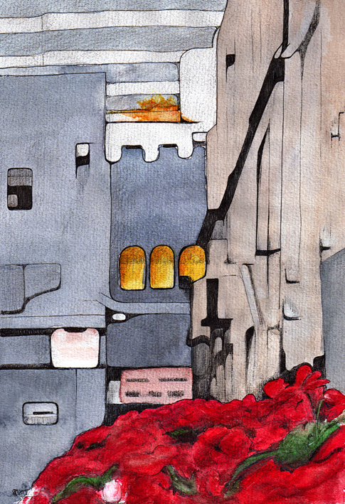
I was looking for photographs to put on my new portfolio site over the weekend when I came across an image I’d completely forgotten about. It’s a picture of Press Lane in central Christchurch taken a few months before the September 2010 earthquake.
Press Lane – mixed media, 290 x 205 mm, 2013.
I wish it wasn’t quite so hard to tell what the image is (you’re looking over a flower box, down the lane and seeing the buildings in the next street). My husband took a long, hard look at it and announced that I had drawn a kitchen ― and I can see it too now! It was still an interesting exercise… putting my own spin on the out-of-focus shapes and shadows.
The sketch is mainly ink and watercolour with touches of gouache and graphite. I’m not sure what the splash of orange is at the top (I’m sure the building wasn’t on fire) but it was in the photo, so it’s in the sketch : )
Some people call them mistakes. I like to call them unexpected outcomes.
It can be very frustrating when a drawing doesn’t turn out as planned. Why can’t I draw a straight line? Why isn’t the perspective right? The figures are flat. The colours are wrong. The ink has dripped onto the paper and now the sky is frowning.
Personally, I don’t think there’s anything wrong with this kind of creative struggle. Quite the opposite. I believe that unexpected outcomes are an essential part of the creative process. They’re an indication that we’re exploring possibilities, stretching ourselves and continuing to grow as artists.
You start with a blank piece of paper. You draw. After ten minutes (or an hour or a day), you’ve created something that NOBODY ELSE IN THE WORLD has created. Something new exists because of you. Okay, so it’s not what you imagined it would be and maybe you’re a bit disappointed. But sometimes, sometimes it takes your breath away. I did that? How did I do that? I wonder if I could do that again?
Sometimes the very thing that we didn’t intend is where the magic happens.
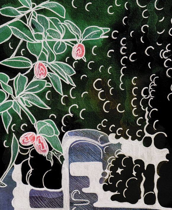
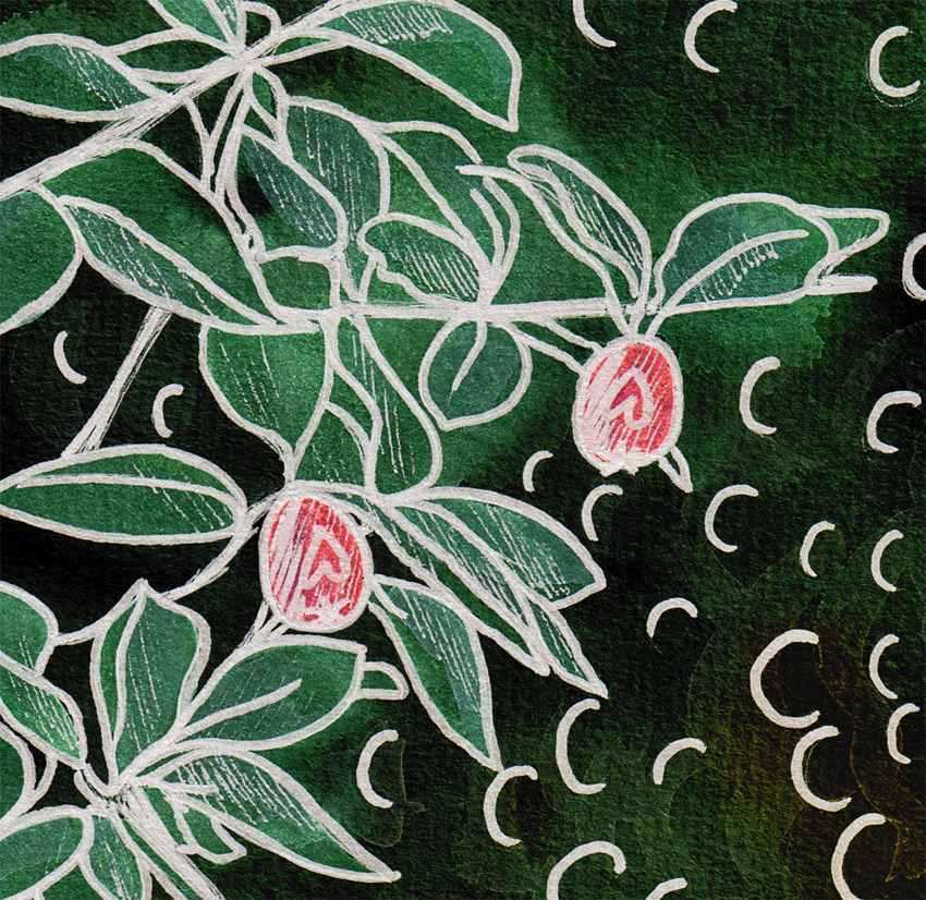
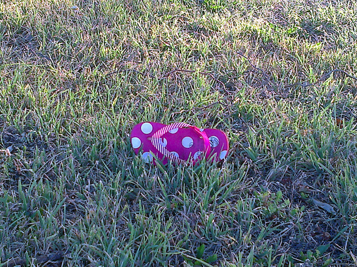
I spotted this abandoned accessory on a riverbank and thought it would be a good subject for Shoot it, Sketch it. The quality of the photo isn’t great (it’s another camera-phone photo) but it’s more than good enough for sketching purposes. After all, to quote photographer Chase Jarvis, the best camera is the one you have with you.
I was inspired to take the photo because the artificial pink and white looked wonderfully eccentric against the natural green. The black/white/pink image is the one I set out to create — and I’m very happy with it — but I also really like the emphasis on texture in the ink and graphite image (shown below, before I added the colour in Photoshop). And now, becuase I don’t know which one I prefer, I’ve posted both.