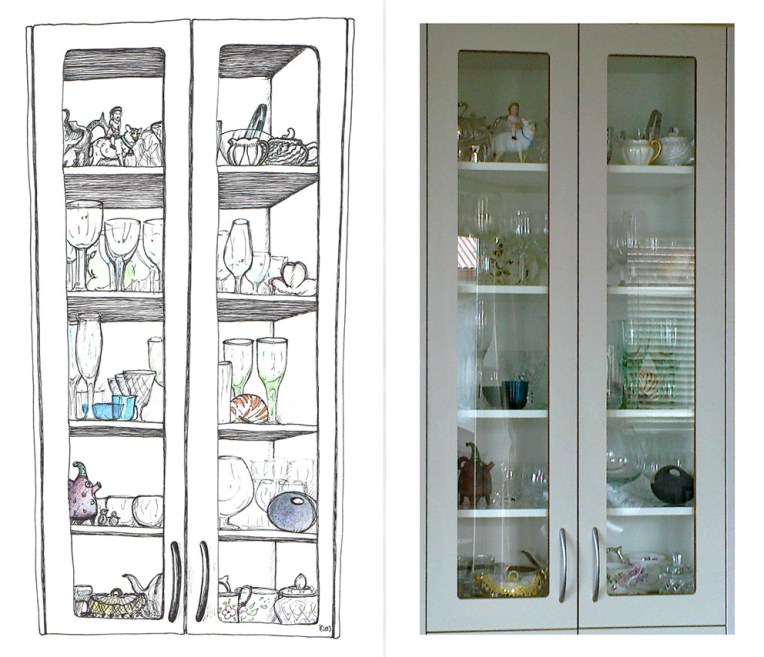
I enjoyed a little sketchbook time while away on holiday last month and thought I’d use one of the pages for this week’s Shoot it, Sketch it ― although it’s really a Sketch it, Shoot it. The drawing I originally planned to post today is still a long way from being finished. Why, oh why do I tackle such complicated illustrations? You’ll see what I mean next week.
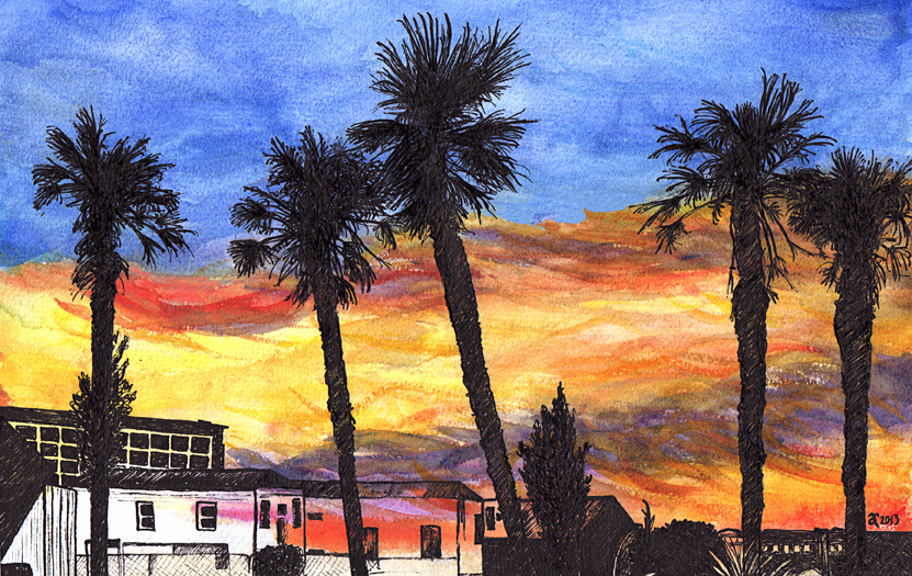
Red Sky at Night – mixed media, 187 x 297 mm, 2013.
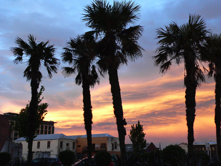
Red sky at night, original photo – Christchurch, 2012.
This is my second sketch based on photos I took on my way to LUXcity in Christchurch last year. It is the companion piece to City Lights. The end result is not quite what I had in mind when I started sketching. It’s full of unexpected outcomes — and I’m okay with that.
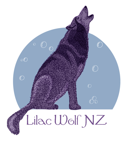
Lilac Wolf NZ logo design, competition entry, 2012.
I entered this design in a logo competition a few months ago. The brief was to create a logo for dog spa Lilac Wolf NZ that was positive and memorable. The concept behind the brand is that every dog dreams of feeling like a wolf and being treated like a king.
My design shows Lilac Wolf surrounded by bubbles. He imagines they are craters on the moon… or snow falling in the forest. He is howling with happiness — or is he blowing/chasing bubbles?
These are the initial sketches. I really liked the texture of #1 but I decided to work with #2 because of the body shape.
The scanned sketch became a vector trace (flipped and altered slightly).
The traced fur was used as a guide for the coloured vector shading.
I deleted the original fur, continued to edit the shading and the bubbles, and gave the moon a gradient fill. I then redesigned the fur and tweaked a few things for the final logo.
P.S. For those who are curious, I’ve just been told that there was no winning design in the competition.
I posted the artwork for Tim Gallant’s business card a couple of months ago but needed to finalise a few details before completing the design. Tim has a longbow-making business and is a talented drum teacher/musician.
The two finger salute included in the design is a gesture sometimes referred to as the Longbowman Salute and may or may not date back to the 1415 Battle of Agincourt. I drew the ‘salute’ as a medieval gauntlet and added a couple of other elements to create a logo that is, I hope, more humorous than offensive. The colours and layout were inspired by the Gallant Family coat of arms.
The background (below) was serendipity at its best. I painted it on a piece of nothing-special cardboard using some acrylic paint left over from another project. I thought it would be quite a smooth surface but, instead, the paint accentuated every little bump and ridge…but it scanned beautifully. I tweaked the colours in Photoshop to better suit the business card and voilà. Where would we be without happy accidents?
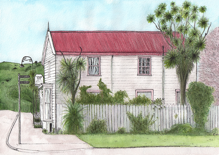
Windermere, Akaroa – ink and watercolour, 210 x 295 mm, 2013
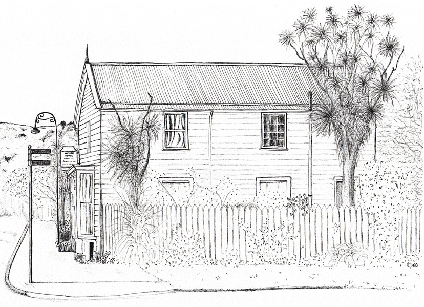
Windermere, Akaroa – ink on watercolour paper, 2013
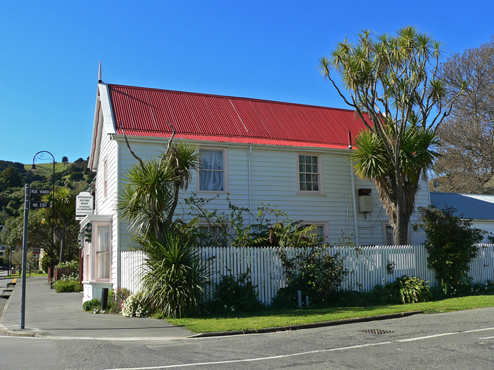
Windermere historic house, Rue Lavaud, Akaroa, 2012
I drew a quick sketch of this historic Akaroa house a couple of years ago (see below) and thought it might be fun to revisit it — figuratively and literally. The photo was taken a few months ago with this Shoot it, Sketch it project in mind. Windermere was built as a boarding house in 1877.
Akaroa – sketches, 2010
Can you spot the subtle difference? The house no longer has a chimney (the earthquakes that have rattled the Canterbury region over the last couple of years are probably to blame — an awful lot of chimneys and brick buildings were damaged in 2011).
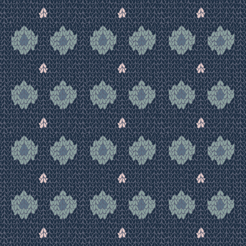
Cozy Knit (spots and stripes) #1 – surface pattern.
Cozy Knit (spots and stripes) #2 – surface pattern.
Cozy Knit (spots and stripes) #3 – surface pattern.
Cozy Knit (spots and stripes) #4 – surface pattern.
Cozy Knit (spots and stripes) #5 – surface pattern.
These were my entries for the recent Tigerprint Spots and Stripes design competition. The brief was to come up with a fresh take on surface patterns featuring spots and stripes and to follow key colour trends for spring/summer 2014.
The main pattern was taken from the little angel I drew for Shoot it, Sketch it a few weeks ago. I scanned the original ink drawing and edited it as a vector illustration. I ended up with quite a few combinations I really liked but had to narrow it down to just five. I picked a couple of the brighter patterns, a couple in some rather yummy grey-blue tones and one that looks a bit like knitted brown paper.
No, they didn’t win, but that’s not why I enter competitions. I do it for the challenge, for the experience and because it’s fun to have a go. Anything more than that is a bonus : )