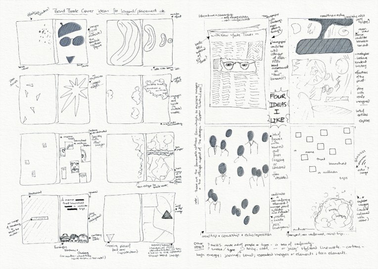
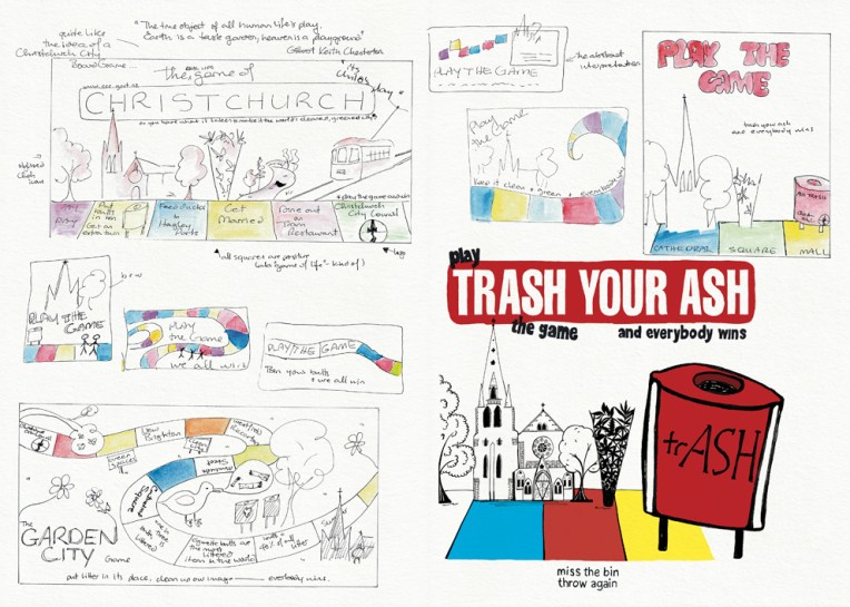
Visual diary, two-page spread (student project, 2011)
I worked on this logo while I was at design school and so I included it in my exhibition but, really, it was a freelance project that I did in my ‘spare’ time. Access Broadcast News is a media-monitoring company based in Wellington. They wanted their logo to be vibrant, dynamic and creative. I liked the idea of putting a new spin on the more traditional images of news communication such as radio waves and old television sets (which is why they appear in the sketches). My final solution is a cheeky nod to the RKO radio tower. I brought it into the 21st Century by adding multi-coloured dots to represent modern fibre-optic cables.
The diary pages are from a journal I designed for my Design & Arts College exhibition in 2012. Two years of research, ideas, word maps and sketches had to be reduced to a mere 72 pages. It was no easy task but I now have a beautiful, professionally bound diary that I’ll always treasure.