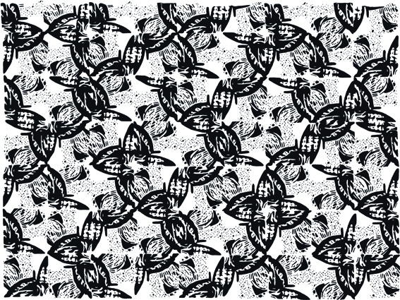
After the Foundation course, I decided to try my hand at graphic design (also at D&A). Drawing turned out to be a significant part of the course.
We spent a lot of time hand-drawing patterns, using the work of other illustrators for inspiration. We created about a dozen patterns (no computer manipulation allowed). Several were completed in an hour or so. Some took much, much longer. Madness.


It wasn’t all about drawing though. We also explored typography, logos, editorials, advertising, billboards and large-scale public installations.

Student project for a set of playing cards based on the word ‘arcane’.

Our first live brief was to design a logo for an interior design student. My client asked for something modern, professional, creative and organic. The tree/leaf design is based on Erin’s initials.

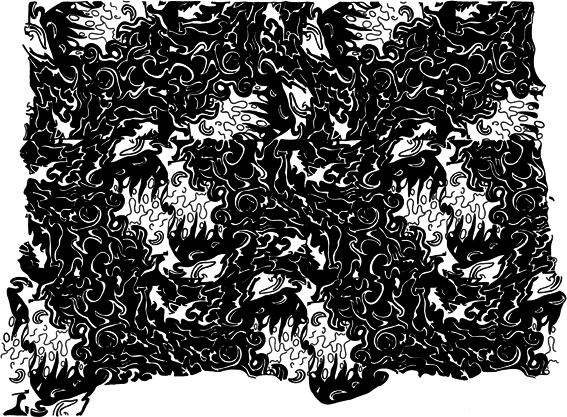
This illustration was created for a fictional online dictionary. The word ‘stagnant’ is deliberately claustrophobic and stuck in the mud. The dark background alone took four hours to draw. It will be part of our graduate exhibition (being held tomorrow night).
One thought on “Design detour, part one”