Skip to content

Anna Cull ~ Art & Music

  • About
  • Art
  • Gallery
  • Moving Pictures
  • Music
  • Contact
  • Blog

logo

Coat of arms… or coat of fingers?

December 14, 2012June 24, 2020 | Anna Cull
© Tim Gallant, 2012
© 2012 Tim Gallant

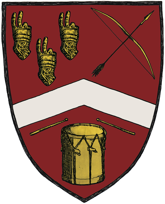
This cheeky coat of arms is part of a business card I designed for Tim Gallant. He originally asked me to design two business cards — one for his longbow-making business Pre-modern Industries and one to promote him as a drum teacher/musician. It was my suggestion to put everything on a single card by creating a coat of arms.

Tim specifically asked for a two-fingered salute to be included in the design (an insult that is also known as the Longbowman Salute, with some claiming the gesture dates back to the 1415 Battle of Agincourt). So I combined the ‘salute’ with a few other elements to create a logo that is, I hope, more humorous than offensive. The colours and placement of the elements were inspired by the Gallant coat of arms and a medieval illustration style seemed the very thing to tie it all together.

Barcode

August 8, 2012July 7, 2013 | Anna Cull

A recent post by seattleinspired reminded me of a barcode I designed for a student project this time last year. The brief was to design a logo and six labels (previously posted here — underneath the Chef labels) for a boutique bar and brewery. I imagined the bar, The Old Mill Brewers, as an old, converted textile mill and decided to make women my target market (and why not?). I looked at a lot of William Morris textiles before drawing the finches and ingredient illustrations which became the logos and menu pattern. For example, those are hops that the little birds are sitting on.

Della’s Pots

August 5, 2012September 16, 2014 | Anna Cull

© Della’s Pots, 2012

A business card for a local potter. The main image is based on a photograph of one of Della’s teapots which I’ve reinterpreted and layered over a hand-painted background. The Della’s Pots logo has been created using the client’s own handwriting.

Della’s Pots background – acrylic on artboard, 105 x 160 mm, 2012.

The background is acrylic paint applied to artboard with a palette knife. The plan was to make a texture reminiscent of the turquoise glaze Della uses on her pots.

Jacobean style

July 16, 2012June 24, 2020 | Anna Cull
© 2012 Sandra Fleck

Sandra’s logo and floral design — I must admit, I was having so much fun designing it that the project kind of got away on me. The brief was to design a product tag (and logo) that Sandra could attach to the bags she makes (and having designed the tag, it seemed a shame not to design a business card too). I gave Sandra a choice of bordeaux red or olive green… and green was the winner on the day.

Sandra’s Jacobean pattern – watercolour on paper, 190 x 270 mm, 2012.

Sandra requested a Jacobean-style pattern and this is what I came up with. It took quite a bit of experimentation with my watercolour paints to make the texture look embroidered. I’ve never used watercolour without pen and ink before (strange though that may sound) and I really enjoyed the challenge. We’re both very happy with the results.

Update: you can now visit Sandra’s blog at my bagirl world.

It’s a sign

July 6, 2012September 16, 2014 | Anna Cull

sign © Health & Awareness Centre, 2012

sign (detail) © Health & Awareness Centre, 2012

It was exciting to see the Health & Awareness Centre‘s new sign go up this week. I’m responsible for creating the logo, slogan and overall design. I kept it simple so that it would stand out from its surroundings and I’m really pleased with how it’s turned out.

D&A Fairtrade Exhibition 2012

May 5, 2012July 7, 2013 | Anna Cull

There is currently an exhibition of Fairtrade coffee projects by Design and Arts College graphic design graduates at Addington Coffee Co-op in Christchurch. The exhibition marks Fairtrade Fortnight and will run from 5–20 May.

Student project. Fairtrade logo © Fairtrade, 2012

Student project: Fairtrade branding campaign – logo, in-store poster and coffee cups.

The idea behind my campaign is that Fairtrade Fortnight is a celebration of fair play. With this in mind, I decided to play with the word ‘fair’. The sun motif refers to a fair day while bright colours and cheerful flags suggest all the fun of the fair.

Posts navigation

Previous
Next

Anna Cull

Unknown's avatar

I love to paint and draw, take photographs and make things. And did I mention music...

All content © 2010–2025 Anna Cull unless otherwise indicated. All rights reserved.

Looking for something?

Time Travel

Enter your email address to subscribe to this blog and receive notifications of new posts by email.

Join 2,227 other subscribers
Create a website or blog at WordPress.com
  • Subscribe Subscribed
    • Anna Cull ~ Art & Music
    • Join 1,952 other subscribers
    • Already have a WordPress.com account? Log in now.
    • Anna Cull ~ Art & Music
    • Subscribe Subscribed
    • Sign up
    • Log in
    • Report this content
    • View site in Reader
    • Manage subscriptions
    • Collapse this bar