Client project: logo design and poster for Willie’s Open Mic. Student project: branding campaign (newspaper ads, mail out and promotional brochure).
Student project: photography (and digital) — making use of my illustrations.
Student project: Fairtrade Fortnight branding campaign — logo, coffee cups and poster. The tee-shirt was just for fun. This was the final project for the D&A graphic design course.
Student project: Chef logo, labels and magazine advertising campaign. Background images used in the ads are courtesy of the Internet.
Student project to design the logos, labels and menu (among other things) for a fictional bar and brewery. My campaign evolved from the idea of the Old Mill being a converted textile mill. The illustrations were inspired by the textiles of William Morris.
Client project: logo for Access Broadcast News, a media-monitoring company in Wellington. Website by Ocular.
Student project: photography, incorporating various drawing projects.
One of my favourite projects was a booklet based on Stefan Sagmeister’s ‘Things I have learned in my life so far’ book. My lesson: “You don’t have to be like everybody else”. ELSE was written using an LED torch, a tripod and an eight-second exposure.
P.S. You can read more about this booklet in my more recent posts: WORDS, WORDS, WORDS
After the Foundation course, I decided to try my hand at graphic design (also at D&A). Drawing turned out to be a significant part of the course.
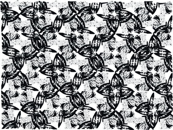
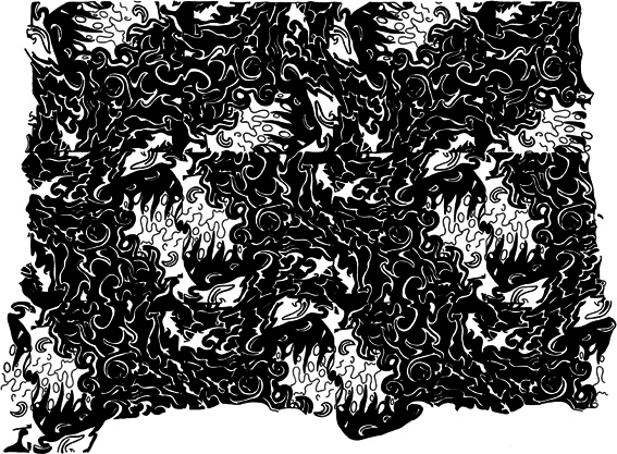
We spent a lot of time hand-drawing patterns, using the work of other illustrators for inspiration. We created about a dozen patterns (no computer manipulation allowed). Several were completed in an hour or so. Some took much, much longer. Madness.
Inspired by an illustration by Eduardo Recife.
Inspired by an illustration by WON ABC.
It wasn’t all about drawing though. We also explored typography, logos, editorials, advertising, billboards and large-scale public installations.
Student project for a set of playing cards based on the word ‘arcane’.
Our first live brief was to design a logo for an interior design student. My client asked for something modern, professional, creative and organic. The tree/leaf design is based on Erin’s initials.
This illustration was created for a fictional online dictionary. The word ‘stagnant’ is deliberately claustrophobic and stuck in the mud. The dark background alone took four hours to draw. It will be part of our graduate exhibition (being held tomorrow night).