Six hundred followers? Wow, that was fast! My thanks to all of you out there in cyberspace… you creative commentators, lovely likers and fabulous followers. And a special thank you to those who’ve liked me on Facebook — you’ve given my little blog a bit of a boost.
You can check out my Facebook art page here: Anna Cull – Art.
Stamp design, artwork – mixed media – student project, 2011
My Favorite Martian (1963-1966): An American sitcom about a professor of anthropology from Mars who crash-lands on Earth somewhere near Los Angeles. He is befriended by Tim, a newspaper reporter, who passes off the stranded Martian as his Uncle Martin.
By the way, the newspaper reporter was played by Bill Bixby who went on to star as David Banner in The Incredible Hulk TV series (1977-1982): “Don’t make me angry. You wouldn’t like me when I’m angry.”
The stamp design, poster and text are from one of my favourite student projects. Each stamp depicts an iconic science fiction TV series from the 1960s. For a recap on the project, click here.
Stamp design, artwork – mixed media – student project, 2011
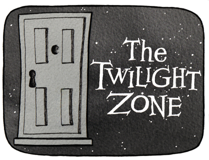
Cue the theme music…
The Twilight Zone (1959-1964): An American anthology series of stand-alone stories with unexpected plot twists. The Twilight Zone became famous for its opening title sequences. “You are travelling through another dimension, a dimension not only of sight and sound but of mind. A journey into a wondrous land of imagination. Next stop, the Twilight Zone.” Two other series were produced from 1985–1989 and 2002–2003.
The stamp design, poster and text are from one of my favourite student projects.* Each stamp depicts an iconic science fiction TV series from the 1960s. I’ve decided to post the artwork for the individual stamps ― one every week (or thereabouts) ― to commemorate the 50th anniversary of Doctor Who (later this year). And because sci-fi stamps are cool.
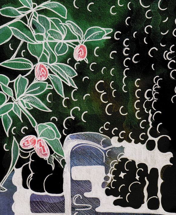
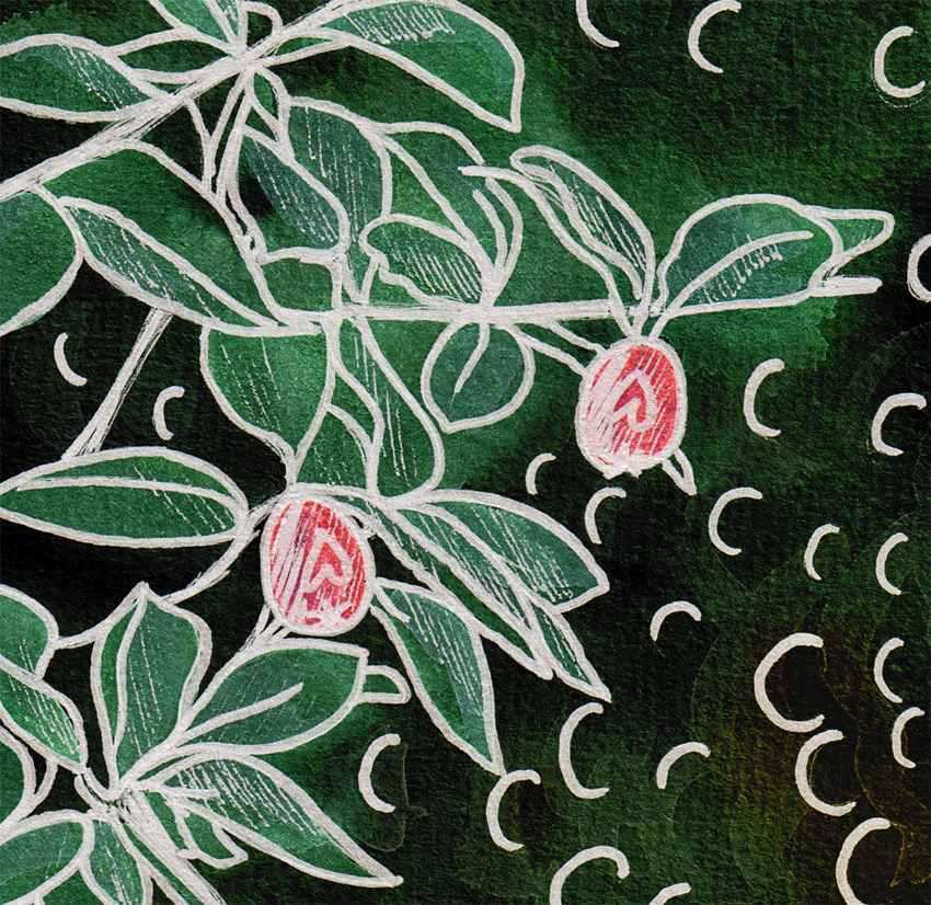
Rendezvous – acrylic and pigment gel ink, 280 x 400 mm, 2013.Rendezvous – detailAkaroa Harbour beachfront, 2012.
I had something specific in mind when I started painting the Akaroa Harbour beachfront photo… and this painting isn’t it. Initially I was going to create a highly stylised image using simple shapes and patterns and fairly flat colours ― but sometimes I just can’t help myself… the temptation to layer colours and add texture is just too great. With Louis Rhead’s turn-of-the-century posters in mind (see below), I exaggerated the shape of the trees and the curve of the shoreline. He has also influenced the overall composition, my choice of colours and the romantic styling of the women in the foreground (although mine look more medieval than Art Nouveau).
I may have another go at painting this scene for next week’s Shoot it, Sketch it…
English-born artist Louis Rhead (1857-1926) made a career out of poster design and book illustration in the USA. I love the Art Nouveau influence in these posters dated 1896-1900. The sweeping curves and stylised trees are beautiful. The colours are fantastic too.
In the style of… appears occasionally instead of my regular Shoot it, Sketch it posts. Using my own photographs as a starting point, I’m drawing inspiration from some of the world’s greatest illustrators. It’s not about slavishly copying someone else’s art; it’s an experiment in seeing things differently.
Blue (seagull #2) – mixed media, 205 x 290 mm, 2013
Seagull #2 – Akaroa, 2012
I hope you like this week’s Shoot it, Sketch it. The water and the seagull standing on the wall are two different paintings that have been combined in Photoshop. The gull was sketched in graphite and then painted using acrylics thinned with a gloss medium. The background and wall are thicker acrylics that have been applied with a palette knife.
You’ll be seeing a few more paintings over the next month as I come to terms with my new artists’ acrylics and the knowledge that I’ve just accepted a commission to do a large peony rose on stretched canvas! I do love a challenge : )
This week’s Shoot it, Sketch it photograph was taken around the corner from our house last autumn. You can just make out the curve of the little footbridge in the blurry distance. Is it just me or does the light shining through the willows look like fairylights?
Smartlea Street Bridge – ink, watercolour and digital, 215 x 175 mm, 2013.
Smartlea Street Bridge, detail – ink, watercolour and digital, 2013.
The short story ~ the sketch is an ink and watercolour painting that has been altered using a kind of digital-resist effect (a combination of Photoshop filters that mimic the wax-resist technique used in making batik).
The long story ~ I’m going through an experimental phase. I’m curious to see what happens when I venture out of my comfort zone (ink drawings with lots of fiddly details and carefully considered watercolour and acrylic paintings) — I want to explore different ways of seeing things and be less concerned about the end result. What if…? That’s what happened in A trip down memory lane and it’s what happened here. Smartlea Street Bridge began as an ink and watercolour sketch which I then drew over with a brush pen to thicken the lines and make some areas inky black. The final image was created in Photoshop by inverting a scanned copy of the painting and applying various filters. The batik effect was discovered through trial and error.
Being out of my comfort zone does have one little drawback — it’s not very comfortable. I’m having to resist the urge to edit the light and dark areas to make them look more like the original photo. But so far, so good…