
By the way, 2002 is not a typo ― I’ve been raiding the vaults again : )
By the way, 2002 is not a typo ― I’ve been raiding the vaults again : )

The Prisoner (1968-1969): The prisoner is a former British spy who, having abruptly resigned from the secret service, has been abducted and imprisoned in a strange village…and he has no idea who his captors are. “I am not a number, I am a free man” was the catchphrase of the series. The stamp depicts the prisoner being apprehended by a large, white, mysterious bouncing bubble called ‘Rover’.
Those bouncing bubbles used to give me nightmares!
The stamp design, poster and text are from one of my favourite student projects. Each stamp depicts an iconic science fiction TV series from the 1960s. For a recap on the project, click here.


I painted this little Beatles record as a test for my new Golden satin varnish — I’m preparing to varnish the Peonies triptych and I read somewhere that dark colours can appear cloudy under satin or matte varnish if not applied correctly. So I bought a cheap stretched canvas and had a bit of fun.

I posted the artwork for Tim Gallant’s business card a couple of months ago but needed to finalise a few details before completing the design. Tim has a longbow-making business and is a talented drum teacher/musician.
The two finger salute included in the design is a gesture sometimes referred to as the Longbowman Salute and may or may not date back to the 1415 Battle of Agincourt. I drew the ‘salute’ as a medieval gauntlet and added a couple of other elements to create a logo that is, I hope, more humorous than offensive. The colours and layout were inspired by the Gallant Family coat of arms.
The background (below) was serendipity at its best. I painted it on a piece of nothing-special cardboard using some acrylic paint left over from another project. I thought it would be quite a smooth surface but, instead, the paint accentuated every little bump and ridge…but it scanned beautifully. I tweaked the colours in Photoshop to better suit the business card and voilà. Where would we be without happy accidents?

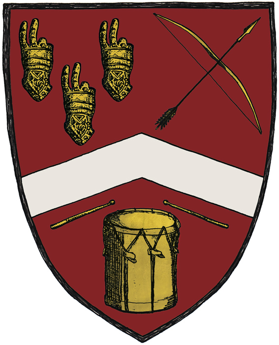
This cheeky coat of arms is part of a business card I designed for Tim Gallant. He originally asked me to design two business cards — one for his longbow-making business Pre-modern Industries and one to promote him as a drum teacher/musician. It was my suggestion to put everything on a single card by creating a coat of arms.
Tim specifically asked for a two-fingered salute to be included in the design (an insult that is also known as the Longbowman Salute, with some claiming the gesture dates back to the 1415 Battle of Agincourt). So I combined the ‘salute’ with a few other elements to create a logo that is, I hope, more humorous than offensive. The colours and placement of the elements were inspired by the Gallant coat of arms and a medieval illustration style seemed the very thing to tie it all together.

Poster design for an acoustic evening next month in Timaru (and also on Saturday 18th August at the Darkroom in Christchurch). Tessa, Shayna and Scott are three talented singer-songwriters based in the South Island (of New Zealand). My thanks to Kevin Allison, owner/producer of Angels Gate Recording Studio, for supplying the photographs and for allowing me to go a bit crazy with the vine border.
