

A full-on design challenge, this student project was all about the relaunch of one of New Zealand’s favourite pet foods: Chef. The secret life of the domestic cat was my inspiration — house cats are predators who, although wild at heart, always come home for Chef. I used a simple line drawing for the logo/body and Photoshopped the eyes (in detail below).

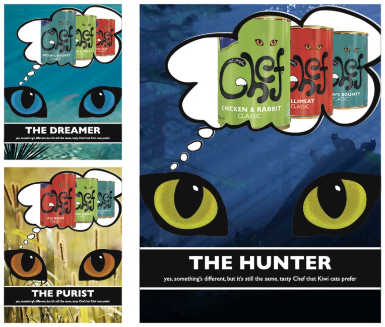
My Chef logo, labels and magazine advertising campaign. The background images used in the ads are courtesy of the Internet.
The diary pages are from a journal I designed for my Design & Arts College exhibition in 2012. Two years of research, ideas, word maps and sketches had to be reduced to a mere 72 pages. It was no easy task but I now have a beautiful, professionally bound diary that I’ll always treasure.


Although I’ve always liked the composition of this photograph, I really wanted to have a bit of fun with the sketch. What better way than by utilising Jim Flora’s dynamic and colourful style?! The linework is ink on illustration board, coloured in Photoshop.

American artist James (Jim) Flora (1914–1998) is probably best known for his jazz and classical album covers from the 1940s and 1950s. His work includes children’s books, paintings, woodcuts and commercial illustrations. If you’re not familiar with his art, I recommend checking out www.jimfloraart.com and www.jimflora.com. But be warned, his art is not only colourful and humorous, it has also been described as diabolic, sinister and mischievous!
In the style of… appears occasionally instead of my regular Shoot it, Sketch it posts. Using my own photographs as a starting point, I’m drawing inspiration from some of the world’s greatest illustrators. It’s not about slavishly copying someone else’s art; it’s an experiment in seeing things differently.
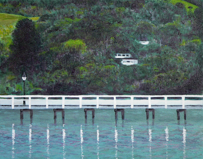
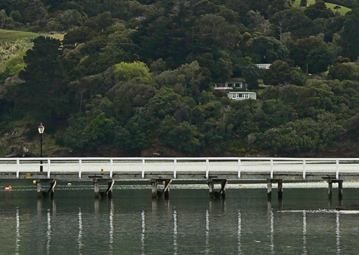
While organising last week’s In the style of… post, I stumbled upon this crop of the Akaroa Harbour photograph ― and now it’s the subject of today’s painting.
I do like happy accidents : )


I had something specific in mind when I started painting the Akaroa Harbour beachfront photo… and this painting isn’t it. Initially I was going to create a highly stylised image using simple shapes and patterns and fairly flat colours ― but sometimes I just can’t help myself… the temptation to layer colours and add texture is just too great. With Louis Rhead’s turn-of-the-century posters in mind (see below), I exaggerated the shape of the trees and the curve of the shoreline. He has also influenced the overall composition, my choice of colours and the romantic styling of the women in the foreground (although mine look more medieval than Art Nouveau).
I may have another go at painting this scene for next week’s Shoot it, Sketch it…

English-born artist Louis Rhead (1857-1926) made a career out of poster design and book illustration in the USA. I love the Art Nouveau influence in these posters dated 1896-1900. The sweeping curves and stylised trees are beautiful. The colours are fantastic too.
In the style of… appears occasionally instead of my regular Shoot it, Sketch it posts. Using my own photographs as a starting point, I’m drawing inspiration from some of the world’s greatest illustrators. It’s not about slavishly copying someone else’s art; it’s an experiment in seeing things differently.


We encountered these exotic giants on our way to Hamurana Springs. The redwood grove was planted in 1919 and so the tallest tree is only 55 metres high ― they can grow up to 100 metres! Still a pretty good effort though. The painting was made using a ‘wet on dry’ technique: soft pastels were dipped in water and applied to card giving a kind of impasto effect.

