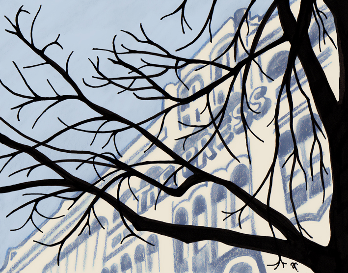
In the style of… Aubrey Hammond

The Press – ink, watercolour pencil and digital, 190 x 140 mm, 2014
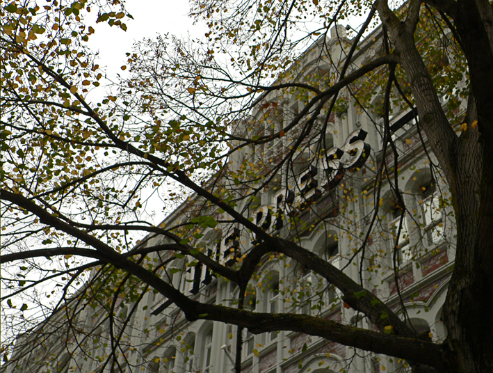
The Press, Christchurch, 2010

Getting inspired by the 1920s…

Aubrey Hammond
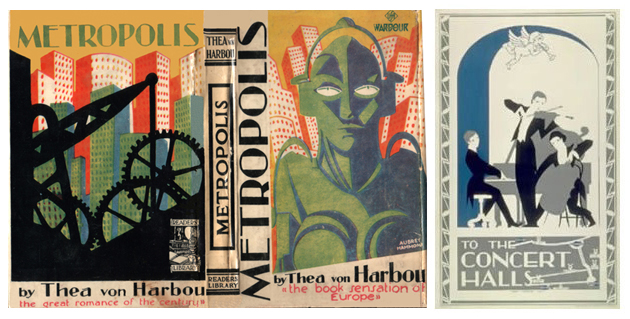
Book cover (1927) and London Underground poster (1923) Images from www.sf-foundation.org and www.ltmuseumshop.co.uk
Aubrey Hammond – book cover (1927) and London Underground poster (1923)
Images from www.sf-foundation.org and www.ltmuseumshop.co.uk

British artist Aubrey Hammond (1894–1940) is responsible some of my favourite1920s London Underground posters. He also illustrated several books and taught commercial and theatrical design. I think his cover for Metropolis, Thea von Harbou’s novel designed to complement the movie (co-written with husband Fritz Lang), is simply stunning.

In the style of… appears occasionally instead of my regular Shoot it, Sketch it posts. Using my own photographs as a starting point, I’m drawing inspiration from some of the world’s greatest illustrators. It’s not about slavishly copying someone else’s art; it’s an experiment in seeing things differently.
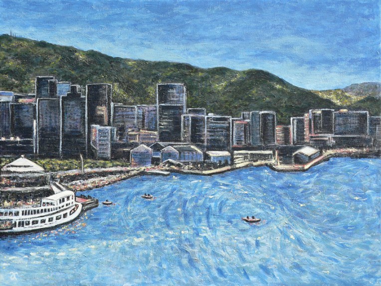
Shoot it, Sketch it: Wellington Harbour

Wellington Harbour – acrylic on canvas, 455 x 610 mm, 2014
Wellington Harbour – acrylic on canvas, 455 x 610 mm, 2014. SOLD
Wellington Harbour — edited photograph (left), 2013 and original photograph (right), 2008

Today’s painting was inspired by my photograph of Wellington Harbour on a sunny, summer afternoon originally posted here. I also referred to the unedited image (prior to giving it the tilt-shift treatment and cropping it to remove the reflections from the hotel window) for some of the details.

This slideshow requires JavaScript.

Shoot it, Sketch it: First impressions

Dunedin, photo montage, 2013
Work in progress # 1 – underpainting

I was so impressed with Dunedin’s gorgeous architecture when we were there on holiday last month that I went mad taking photographs ― but then I couldn’t decide which one to paint first… So I arranged a few favourites based on a nine-square grid (editing it in Photoshop and adding a few extra cabbage trees here and there). And now I’m painting it. This may take a while.

Happy anniversary, Doctor Who!

Stamp design, artwork – mixed media – student project, 2011

Doctor Who theme music

Doctor Who (1963-1989): The BBC originally promoted the classic series as an educational programme for children. It follows the adventures of a time-travelling alien known as the Doctor. The stamp depicts the opening titles, the Doctor’s TARDIS (a spaceship which looks like a British police box but has the ability to travel through space and time), and the first appearance of the alien race known as the Daleks (the episode aired 21/12/1963). Doctor Who went into production again in 2005 and has become the longest-running science fiction TV show in history.

The stamp design, poster and text are from one of my favourite student projects. Each stamp depicts an iconic science fiction TV series from the 1960s. I’ve been posting the stamps to commemorate the 50th anniversary of Doctor Who. Happy anniversary, Doctor!

Science Fiction stamp poster (594 x 420 mm) Stars and planets (background collage) courtesy of the Internet Student project, 2011
Science Fiction stamp poster – student project, 2011

Thunderbirds

Stamp design, artwork – mixed media – student project, 2011

Five…  four…  three…  two…  one…  Thunderbirds are go!!! (Click here to listen to the theme music.)

Thunderbirds (1965-1966): A marionette puppet series (dubbed ‘supermarionation’ by the show’s creator, Gerry Anderson) set in the then-future of the 21st Century. It follows the adventures of the secret organisation International Rescue. The stamp is inspired by the countdown in the opening title sequence.

The stamp design, poster and text are from one of my favourite student projects. Each stamp depicts an iconic science fiction TV series from the 1960s. For a recap on the project, click here.

Science Fiction stamp poster (594 x 420 mm) Stars and planets (background collage) courtesy of the Internet Student project, 2011
Science Fiction stamp poster – student project, 2011

Voyage to the Bottom of the Sea

Stamp design, artwork – mixed media – student project, 2011

The future seems like only yesterday…

Voyage to the Bottom of the Sea (1964-1968): Set in the future of the 1970s/1980s, the series centres on the atomic submarine Seaview and its crew whose secret mission is to defend the Earth. It was based on the 1961 film of the same name.

The stamp design, poster and text are from one of my favourite student projects. Each stamp depicts an iconic science fiction TV series from the 1960s. For a recap on the project, click here.

Science Fiction stamp poster (594 x 420 mm) Stars and planets (background collage) courtesy of the Internet Student project, 2011
Science Fiction stamp poster – student project, 2011