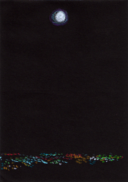
Moon sketch – Neocolor II pastel on black paper, 148 x 105 mm, 2013Moon over the city – original photo, 2006 and edited photo, 2013
For years I’ve been wanting to create something based on this view of Christchurch taken from the Port Hills and now I’m finally getting around to it. I made a couple of little changes to the original photo because a not-quite-full moon just seemed a little sad.
This sketch is the reference for an acrylic painting that I’ll post for next week’s Shoot it, Sketch it.
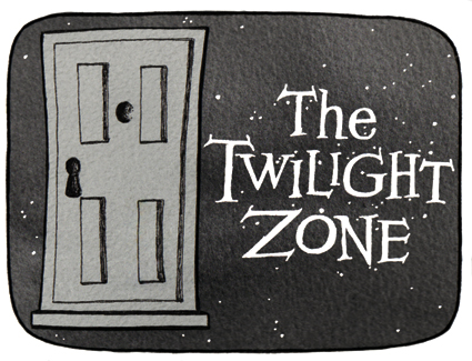
Stamp design, artwork – mixed media – student project, 2011
Cue the theme music…
The Twilight Zone (1959-1964): An American anthology series of stand-alone stories with unexpected plot twists. The Twilight Zone became famous for its opening title sequences. “You are travelling through another dimension, a dimension not only of sight and sound but of mind. A journey into a wondrous land of imagination. Next stop, the Twilight Zone.” Two other series were produced from 1985–1989 and 2002–2003.
The stamp design, poster and text are from one of my favourite student projects.* Each stamp depicts an iconic science fiction TV series from the 1960s. I’ve decided to post the artwork for the individual stamps ― one every week (or thereabouts) ― to commemorate the 50th anniversary of Doctor Who (later this year). And because sci-fi stamps are cool.
I now have a page on Facebook: Anna Cull – Art. To mark the occasion, I’ve updated my avatar (I tweaked a few things and added an acrylic background). The next step will be selling my art on Etsy… but I’m not quite ready for that sort of commitment.
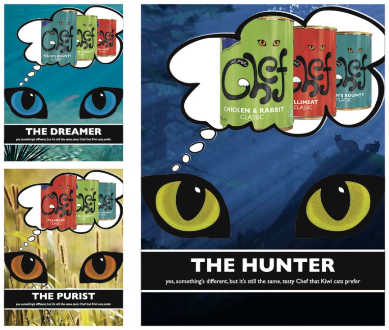
Chef logo, labels and rebranding campaign – concept development and final logo design Visual diary, two-page spread (student project, 2011)
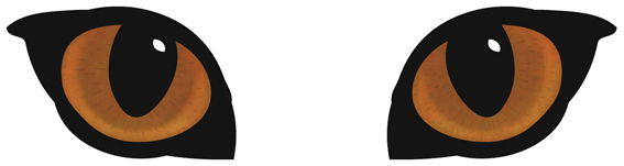
A full-on design challenge, this student project was all about the relaunch of one of New Zealand’s favourite pet foods: Chef. The secret life of the domestic cat was my inspiration — house cats are predators who, although wild at heart, always come home for Chef. I used a simple line drawing for the logo/body and Photoshopped the eyes (in detail below).
My Chef logo, labels and magazine advertising campaign. The background images used in the ads are courtesy of the Internet.
The diary pages are from a journal I designed for my Design & Arts College exhibition in 2012. Two years of research, ideas, word maps and sketches had to be reduced to a mere 72 pages. It was no easy task but I now have a beautiful, professionally bound diary that I’ll always treasure.
There was quite a bit of work behind the scenes before the brush ever touched the canvas. My client knew the subject and the colour that she wanted but hadn’t been able to find a painting or print to match her vision. I was commissioned to create an artwork ― any medium, any style ― of three red peony roses. Wow. Really? Okay.
I opted for an acrylic painting on stretched canvas. But what size should it be?
Mock-ups showing various options – the client chose the bottom left triptych
Because I was able to take photographs of the room, I decided to make several mock-ups of the canvas sizes that I thought would suit the space. My client chose a triptych measuring 100 x 100 cm. A sketch was approved and three canvases were ordered…
CBD 2010 – ink and digital, 280 x 355 mm, 2013Bikes – Christchurch, 2010
Although I’ve always liked the composition of this photograph, I really wanted to have a bit of fun with the sketch. What better way than by utilising Jim Flora’s dynamic and colourful style?! The linework is ink on illustration board, coloured in Photoshop.
American artist James (Jim) Flora (1914–1998) is probably best known for his jazz and classical album covers from the 1940s and 1950s. His work includes children’s books, paintings, woodcuts and commercial illustrations. If you’re not familiar with his art, I recommend checking out www.jimfloraart.com and www.jimflora.com. But be warned, his art is not only colourful and humorous, it has also been described as diabolic, sinister and mischievous!
In the style of… appears occasionally instead of my regular Shoot it, Sketch it posts. Using my own photographs as a starting point, I’m drawing inspiration from some of the world’s greatest illustrators. It’s not about slavishly copying someone else’s art; it’s an experiment in seeing things differently.