
Please visit last Monday’s post to see the work-in-progress photos (and if you’re wondering about the heading).
Please visit last Monday’s post to see the work-in-progress photos (and if you’re wondering about the heading).
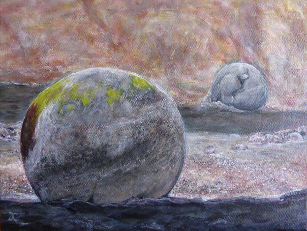
I’ve been working on Moeraki boulders (two) over the last week and thought it would make a good WIP slideshow. The photographs (below) show inspiration, evaluation, exuberance, regret, pity and perseverance. I’ll post the last stage, abandonment, next week.
“Here is a truth: often a painting is done just so the artist can get to do a small favorite thing, or idea. Entire paintings are done just to get to put highlights on a glass, or shadows on a lemon or sunbursts in the distance. Whole landscapes are painted just to show a small flower in the foreground, or a water drop about to fall from a rose petal. A moment of inspiration to render an idea, so simple a truth that it cannot be rendered simply, but surrounded by complexity of seeing our world, lest the idea be lost. When done, often the original intention of the painting goes unperceived to the casual viewer, but it is there.” Eight Decades blogging on StoryDoors
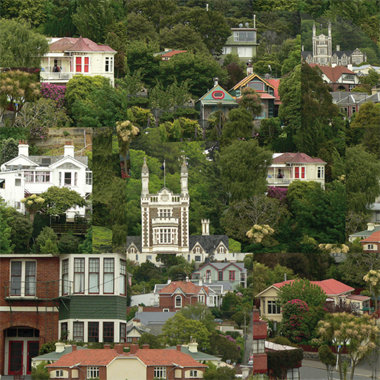

I was so impressed with Dunedin’s gorgeous architecture when we were there on holiday last month that I went mad taking photographs ― but then I couldn’t decide which one to paint first… So I arranged a few favourites based on a nine-square grid (editing it in Photoshop and adding a few extra cabbage trees here and there). And now I’m painting it. This may take a while.

These photos show the progress of Sparrow (Monday’s In the style of…) painting. I started with an underpainting of Ultramarine Blue and Burnt Umber ― I’ve fallen in love with these two colours because they blend together to make the most beautiful black (see the note below about chromatic blacks).


I’m a big fan of chromatic blacks (made using colour rather than a specific black pigment). It’s so satisfying to mix your own ‘black’ and achieve subtle variations of colour — it’s much more fun than simply reaching for a tube of Ivory Black (although I do that too). I’ve used both kinds of black in my little sparrow painting.

I got a bit carried away adding white to his feathers and ended up with a colour I didn’t like ― a sort of pale grey-brown ― so I waited for the unfortunate, dreary colour to dry and painted a more cheerful pinky-brown over it (see below).

I also made him a little bit fatter and a whole lot fluffier. And I still really like that strand of spider silk in the corner.
Thanks for reading.


To see the photograph that inspired the painting and the poem, visit last week’s post.
