I started experimenting with underpainting a few weeks ago and I have to say I’m thrilled with the results. It’s given a beautiful depth and richness to my art. Colours seem to glow from within the picture making my acrylics look like oils. I wonder what oils would look like? I’ve been using the technique to establish my compositions (what goes where) and to work out the tonal values (light and dark) before building up the colour.
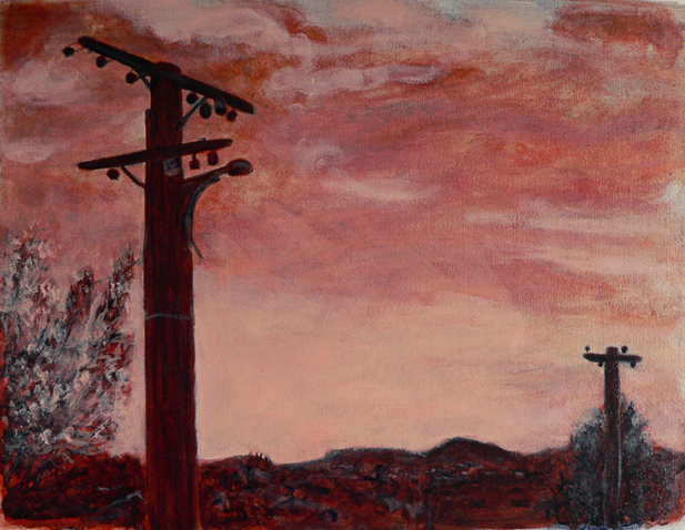
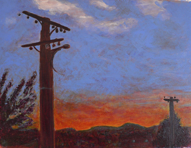
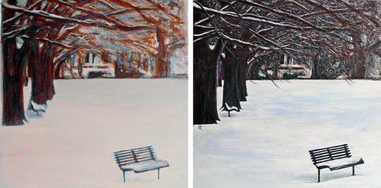
I read somewhere that underpainting can also make the final artwork more vibrant. The earthy orange I used gave a lovely warm glow to the trees in The colour of snow and helped to produce a wonderfully dramatic sky in Between the lines.

I haven’t put all of them to the test (yet) but these are the traditional underpainting colours:
- grey-green makes skin tones more vibrant
- blue-grey works well for landscapes
- a monochromatic underpainting, usually shades of grey, helps to achieve a more realistic painting
- warm browns such as burnt umber or raw umber are good for high contrast
Adding colour in transparent glazes allows the underpainting to influence the final colour while opaque colours can be used to obscure the underpainting. As far as I can see, there really is only one downside ― it takes a lot of time to build up the layers of colour. A LOT OF TIME. But I’m convinced it’s worth it.