My painting Between the lines has taken me on quite a journey over the last couple of weeks. Some time ago (at the end of posting Paradise), I asked: How CAN you tell when something is finished? Fellow blogger/artist Gabriel Garbow commented: ‘…at some point you have to say, “I’ve taken this as far as I can. I’ve learned all this painting has to teach me.” That’s when you sign it and *move on*.’
I’ve taken Gabriel’s words to heart. Asking if a painting has anything more to teach you really is a useful way of telling when something is finished (with the definition of ‘finished’ being ‘it’s okay to stop now’). I’m happy to declare that Between the lines is finished. And it has taught me a lot…
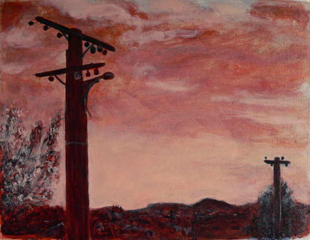
WIP #1 I used an earthy orange colour (a mixture of yellow ochre and naphthol red) for the underpainting because I wanted the sky to be dramatic and the sunset to glow. I added ultramarine blue (almost everywhere except the sky) and titanium white.
WIP #2 I was tempted to stop at this point because I really liked the simplicity of it and the colours looked stunning. But I felt there was more to learn, so I kept going…

WIP #3 I added more layers ― experimenting with transparency/opacity ― and ended up adding so much white that I lost a large chunk of the sunset. I kept going…

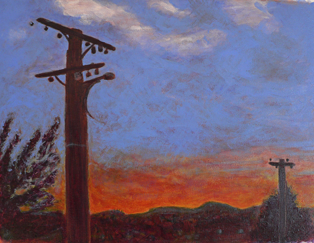
WIP #4 I began putting lights over darks and darks over lights ― which, rather predictably, kept turning the sky green and so it needed to be repainted ― and slowly, something magical began to happen. Encouraged, I went on to paint the power lines (thank you rigger brush #2), made a few adjustments to the trees and the cityscape… and signed it.

This is only the second time I’ve used an underpainting (the first was The colour of snow) and I love the results. The way the colours glow is not just a trick of the light coming from the computer screen. Underpainting really does add depth and luminosity.

Thanks for sharing your process Anna, very instructive. The end result was worth the journey. :0)
There’s a lot more there than meets the eye… 🙂
Love your images and the artistic journey !! Tks for stopping by ! 😊
I love this painting, and have similarly been experimenting with underpainting techniques to create more depth and luminosity. It is such an exciting process, and great to see how you have tackled it. I must admit though, my painting titles are a little less inspired! Thanks for checking out my blog – I’m still very new to the blogging world and it’s so encouraging to receive likes.
Thanks. It seems we have a few things in common — underpainting, experimenting, light, landscapes… And likes are encouraging no matter how long you’ve been blogging : ) Thanks for visiting.
It is a real treat to see your process, thank you! I’m not sure what it is about telephone poles, there is an odd attraction to them — railroad tracks, radio antennas, cell phone towers, all nag at my attention for whatever reason. Very nice work and description, thanks again.
…and street lights. Don’t forget street lights!
ahh yes! 🙂
Gosh Anna I would have had no idea about the underpainting colour in this !
Glad you kept on going ! Yes – your painting ‘The colour of Snow’ was magical I thought.
Thanks, Poppy. I’m a little obsessed with my acrylics at the moment and the whole underpainting thing is only making it worse : ) BTW I’m posting a photo of ‘The colour of snow’ underpainting tomorrow.
When I started looking at your process pictures I wondered what would your final project turn out. The last picture has some great depth and colors, you would not get those colors if you planned it, right? All in all..the last picture pulls me in..I just can’t explain it.
A plan? Well, yes, I had a plan… but part of the plan was to play and experiment — I knew what colours and textures I wanted but I wasn’t quite sure how best to achieve them. It was the effect of the underpainting that really surprised me. I’ll be posting a little more about that tomorrow.
Como lo explicas parece fácil, pero no lo es, ya que al añadir capas y capas es muy fácil llegar a perder la idea que tenías al principio. Lo principal es tener bien claro como se combinan los colores, y en eso tu no tienes ningún problema. La pintura acrílica tiene la virtud de poder utilizar la superposición de capas al no ser tan densa como el óleo.
Me encanta.
Un saludo desde España.
Muchas gracias (that’s about the extent of my Spanish, sorry — but Google did a great job of translating your comment for me).