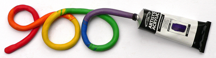
Nine hundred followers? That’s crazy! (Almost as crazy as photographing plasticine coming out of a paint tube!)
At this rate, I’d better start thinking of something suitably BIG for the next milestone!
Don’t forget to visit my Facebook page Anna Cull ~ Art from time to time. It occasionally has news, WIP (work in progress) updates and photographs that aren’t posted here.
These photos show the progress of Sparrow (Monday’s In the style of…) painting. I started with an underpainting of Ultramarine Blue and Burnt Umber ― I’ve fallen in love with these two colours because they blend together to make the most beautiful black (see the note below about chromatic blacks).
Work in progress #2 – painting the background and the bodyWork in progress #3 – filling in detailsWork in progress #4 – adding black and white
I’m a big fan of chromatic blacks (made using colour rather than a specific black pigment). It’s so satisfying to mix your own ‘black’ and achieve subtle variations of colour — it’s much more fun than simply reaching for a tube of Ivory Black (although I do that too). I’ve used both kinds of black in my little sparrow painting.
Work in progress #5 – no no no no no
I got a bit carried away adding white to his feathers and ended up with a colour I didn’t like ― a sort of pale grey-brown ― so I waited for the unfortunate, dreary colour to dry and painted a more cheerful pinky-brown over it (see below).
Sparrow – acrylic on canvas, 200 x 255 mm, 2013
I also made him a little bit fatter and a whole lot fluffier. And I still really like that strand of spider silk in the corner.
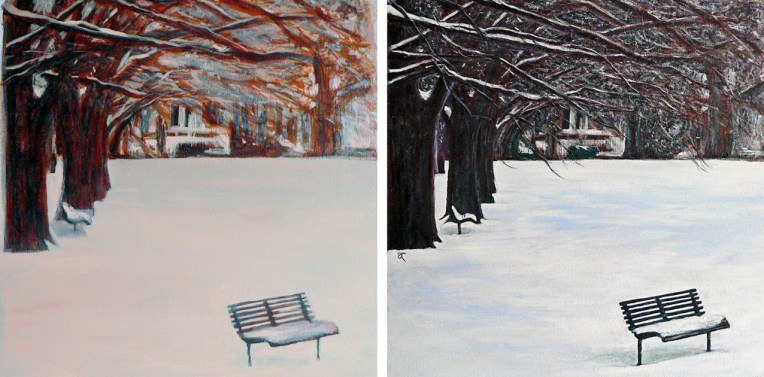
The colour of snow – underpainting and final painting.
I started experimenting with underpainting a few weeks ago and I have to say I’m thrilled with the results. It’s given a beautiful depth and richness to my art. Colours seem to glow from within the picture making my acrylics look like oils. I wonder what oils would look like? I’ve been using the technique to establish my compositions (what goes where) and to work out the tonal values (light and dark) before building up the colour.
I read somewhere that underpainting can also make the final artwork more vibrant. The earthy orange I used gave a lovely warm glow to the trees in The colour of snow and helped to produce a wonderfully dramatic sky in Between the lines.
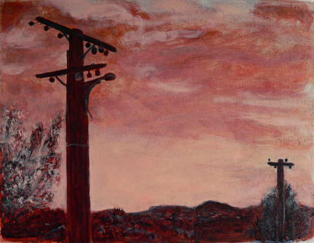
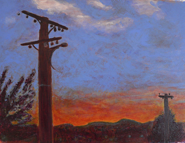
Between the lines – underpainting and final painting.
I haven’t put all of them to the test (yet) but these are the traditional underpainting colours:
grey-green makes skin tones more vibrant
blue-grey works well for landscapes
a monochromatic underpainting, usually shades of grey, helps to achieve a more realistic painting
warm browns such as burnt umber or raw umber are good for high contrast
Adding colour in transparent glazes allows the underpainting to influence the final colour while opaque colours can be used to obscure the underpainting. As far as I can see, there really is only one downside ― it takes a lot of time to build up the layers of colour. A LOT OF TIME. But I’m convinced it’s worth it.
My painting Between the lines has taken me on quite a journey over the last couple of weeks. Some time ago (at the end of posting Paradise), I asked: How CAN you tell when something is finished? Fellow blogger/artist Gabriel Garbow commented: ‘…at some point you have to say, “I’ve taken this as far as I can. I’ve learned all this painting has to teach me.” That’s when you sign it and *move on*.’
I’ve taken Gabriel’s words to heart. Asking if a painting has anything more to teach you really is a useful way of telling when something is finished (with the definition of ‘finished’ being ‘it’s okay to stop now’). I’m happy to declare that Between the lines is finished. And it has taught me a lot…
Work in progress #1 – underpainting – figuring out the composition, the lights and the darks
WIP #1 I used an earthy orange colour (a mixture of yellow ochre and naphthol red) for the underpainting because I wanted the sky to be dramatic and the sunset to glow. I added ultramarine blue (almost everywhere except the sky) and titanium white.
Work in progress #2 – building up colour with glazes
WIP #2 I was tempted to stop at this point because I really liked the simplicity of it and the colours looked stunning. But I felt there was more to learn, so I kept going…
Work in progress #3 – continuing to build up colour, adding details and texture
WIP #3 I added more layers ― experimenting with transparency/opacity ― and ended up adding so much white that I lost a large chunk of the sunset. I kept going…
Work in progress #4 – adding more layers
WIP #4 I began putting lights over darks and darks over lights ― which, rather predictably, kept turning the sky green and so it needed to be repainted ― and slowly, something magical began to happen. Encouraged, I went on to paint the power lines (thank you rigger brush #2), made a few adjustments to the trees and the cityscape… and signed it.
Between the lines – acrylic on canvas, 305 x 405 mm, 2013.
This is only the second time I’ve used an underpainting (the first was The colour of snow) and I love the results. The way the colours glow is not just a trick of the light coming from the computer screen. Underpainting really does add depth and luminosity.
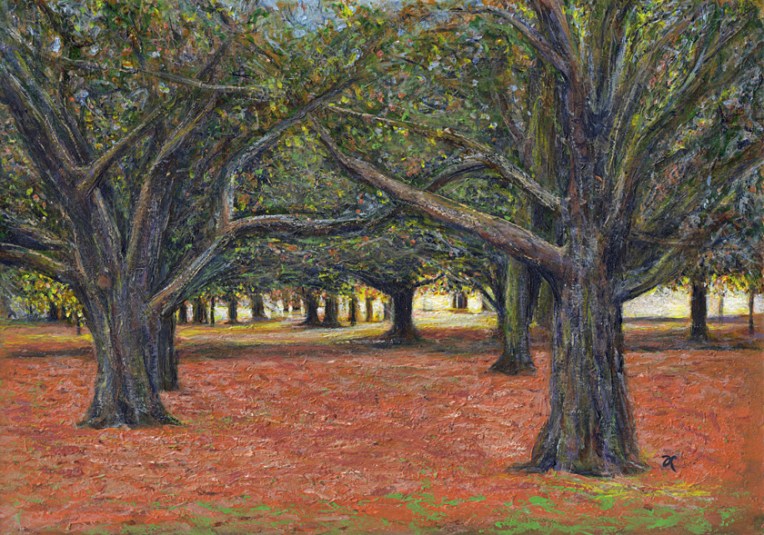
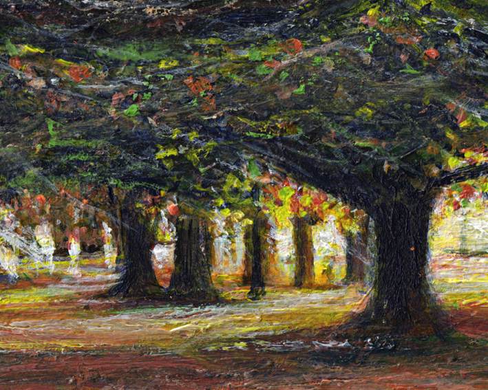
Sunlight is green – acrylic on watercolour paper, 205 x 295 mm, 2013.
Here, as promised, is my painting of the sunset in Hagley Park (taken from the same photo I sketched last week). If you’re wondering about the title, it was inspired by something I read in The Acrylic Artist’s Guide to Exceptional Colour by Lexi Sundell. Apparently there is research to suggest that sunlight is not yellow but pale green. Think about that for a minute. Green is a cool colour but sunlight is warm. Other research suggests it may be pale blue. Whatever it is, it seems sunlight is not a warm colour. I don’t know about you but that thought really messes with my head.
Sunlight is green – acrylic on watercolour paper, detail.
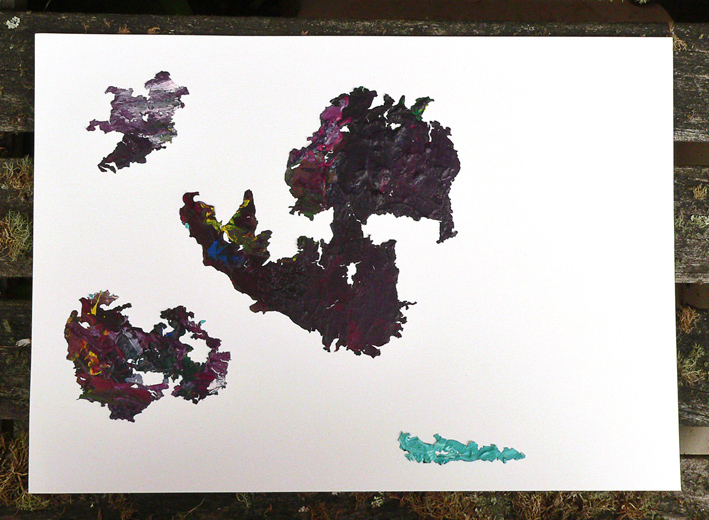
I ventured into unfamiliar territory to produce today’s Shoot it, Sketch it. Well, it’s really more of a Shoot it, Sketch it, Peel it, Shoot it, Sketch it!
My inspiration was the leftover paint from last week’s random texture. When I lifted the dry paint off the plate I use as a palette (it just seems a bit more environmentally friendly than rinsing it down the sink), I thought the blobs of acrylic paint (shown in the photograph) looked quite beautiful and wondered if they could be used in a kind of Rorschach inkblot kind of way to inspire a new painting. And the answer is yes. Yes, blobs of paint CAN be remote islands on an old map — if that’s what you want them to be.