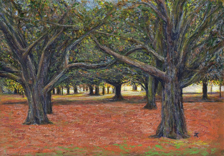
Here, as promised, is my painting of the sunset in Hagley Park (taken from the same photo I sketched last week). If you’re wondering about the title, it was inspired by something I read in The Acrylic Artist’s Guide to Exceptional Colour by Lexi Sundell. Apparently there is research to suggest that sunlight is not yellow but pale green. Think about that for a minute. Green is a cool colour but sunlight is warm. Other research suggests it may be pale blue. Whatever it is, it seems sunlight is not a warm colour. I don’t know about you but that thought really messes with my head.

Both of these are absolutely gorgeous! My favorite has to be the second one though. I love all the colors that you used on the trees and the paths. Love them both 🙂
Thank you! I prefer the acrylic over the ink/watercolour too… but then I did spend considerably longer painting it : )
Anna- your paintings are exceptional, thanks for sharing your process.
Cool or warm both paintings are “cool” and give a warm feeling! Nicely done and each painting has favorite things in it, most of all they bring memories and thoughts. Nicely done.
Love all the colors you use in your trees and your work in general! Thanks for visiting my blog…it’s so neat to see what artists are doing around the world!
They are beautiful. I prefer the first. The perspective effect is very accomplished. You care so the whole picture as the detail (the leaves of the trees).
A greeting
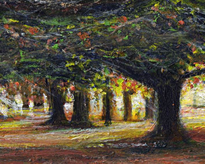
Thank you! Are you comparing the acrylic with the watercolour from last week or seeing the acrylic detail as a different painting? The bottom image in this post is an enlarged section of the top one. Either way, I’m really glad you like it/them : )
You’re right, they are the same painting. I’m sorry if I did not express well in your language. Anyway I love the perfect color combination. I like your painting more than photography.
A greeting from Spain
You express yourself very well. I’m glad you like the colours — colour is very important to me. Muchas gracias from New Zealand!
Amazing Anna!
I really love this one! I admit to having a tree bias. 🙂 The richness of the colors and the sense of depth is attractive. It makes me think of some of Van Goh’s paintings.
Oh wow! Thank you!!!
Love the second one the most, Anna.
BEAUTIFUL WORKS OF ART!
Thank you for visiting my blog today. I appreciate the time you took to stop by. May your day be filled with joy and peace.
BE ENCOURAGED! BE BLESSED!
So cool, Anna! This is really lovely work. : )
Wonderful work, Anna!