The way things are

Pen vs earthquake buildings in situ
Christchurch, looking northeast, December 2013

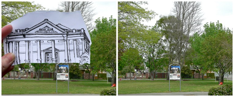
Following on from yesterday’s pen vs earthquake post, here are a couple of aerial photographs showing the location of three more buildings from the series. I’ve included Cathedral Square for context. Click on the photos for a closer look.

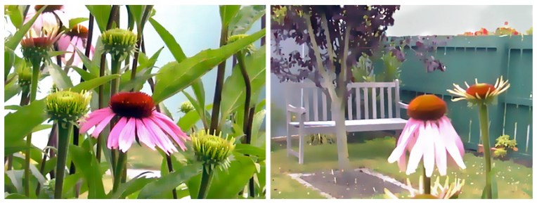
I wish I had a ‘before’ photo to show you that the landscape in these photos is just plain wrong ― beige and boxy and wrong…

Christchurch, looking southwest, December 2013

The Church is fine (pen vs earthquake)

Anna Cull Pen vs earthquake Oxford Tce

Built in 1881, the Oxford Terrace Baptist Church was one of the many buildings conspicuously absent from the landscape when we flew over Christchurch last month. I’ve circled the relevant piece of dirt in the photograph below (click on the photo for a closer look). The building was badly damaged by the September 2010 earthquakes and then completely collapsed in the February 2011 earthquake. It was famous for having a sign out the front which read: “Our building is cracked, the Church is fine!” Although the neoclassical structure (an unusual style for Christchurch) is not going to be rebuilt, there are reports that the damaged Oamaru stone is to be used in a sculpture ― what a wonderful way of honouring the spirit and tenacity of its congregation.

Where Oxford Terrace Baptist Church isn’t, Christchurch, 2013

Anna Cull Pen vs earthquake Oxford Tce comparison

The sketch is originally from this student project. Ben Heine’s ingenious Pencil Vs Camera images were my inspiration for this series.

Shoot it, Sketch it: Purple

Purple coneflowers, digitally edited photographs – Christchurch, 2003

I have no idea where my original photographs are but these are the arty versions (created quite a few years ago using Corel Photo-Paint) that inspired the diptych below. How I wish our garden still looked this good!

Purple coneflower diptych  – acrylic on textured card, 205 x 305 mm each, 2014
Purple coneflower diptych – acrylic on textured card, 205 x 305 mm each, 2014

A loose, sketchy style seemed the thing for these two studies. I also used less intense, more natural colours and resisted the urge to define all the edges. In some ways they feel a little unfinished, like a work still in progress, and yet I can’t bring myself to add any more paint.