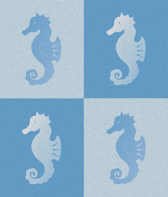
Another illustration from the vaults. This seahorse image was made using a stamp carved out of a rubber/eraser (see below) and then edited digitally.
As he is currently quite purple, I’d say the last time I used him was on the ‘breathing underwater’ pages of my Book without boundaries project in 2010.
Lake Taupo – graphite and charcoal, 205 x 255 mm, 2013Lake Taupo, 2013
Today’s In the style of… drawing was an excuse to test my Derwent tinted charcoal pencils. Some of the colours are VERY similar (especially the darker tints) but they do have lovely names: Driftwood, Glowing Embers, Ocean Deep, Sunset Pink). I wonder how they’d respond to water…
Roald Dahl’s classic story James and the Giant Peach has been illustrated a number of times. The original illustrations (and possibly my favourites) were by Nancy Ekholm Burkert in 1961.
In the style of… appears occasionally instead of my regular Shoot it, Sketch it posts. Using my own photographs as a starting point, I’m drawing inspiration from some of the world’s greatest illustrators. It’s not about slavishly copying someone else’s art; it’s an experiment in seeing things differently.
Star Trek (1966-1969): The original series of 79 episodes has become a cult classic. “Space: the final frontier. These are the voyages of the Starship Enterprise. Its five-year mission: to explore strange new worlds; to seek out new life and new civilizations; to boldly go where no man has gone before.” Numerous movies and spin-off series have followed, including The Next Generation, Deep Space Nine, Voyager and Enterprise.
My all-time favourite episode is The Trouble with Tribbles. I’m quite enjoying the movie prequels too.
The stamp design, poster and text are from one of my favourite student projects. Each stamp depicts an iconic science fiction TV series from the 1960s. For a recap on the project, click here.
Historic Empire Hotel, Ross – ink and watercolour, 200 x 255 mm, 2013Historic Empire Hotel – Ross, 2013
Fresh off the drawing board, here is a little sketch of the hotel we stayed at in Ross last weekend. The town was established in 1865 during the West Coast gold rush and once had a population of more than 3,000 ― now it’s closer to 300. We had a wonderful time at a friend’s ‘When I’m 64’ birthday party and jam night : )
On the way there, I took a few photos of the mountains which are looking positively picturesque at the moment (Christchurch to Ross via Arthur’s Pass). I’ve posted my absolute favourite shots on my Facebook page.
The Prisoner (1968-1969): The prisoner is a former British spy who, having abruptly resigned from the secret service, has been abducted and imprisoned in a strange village…and he has no idea who his captors are. “I am not a number, I am a free man” was the catchphrase of the series. The stamp depicts the prisoner being apprehended by a large, white, mysterious bouncing bubble called ‘Rover’.
Those bouncing bubbles used to give me nightmares!
The stamp design, poster and text are from one of my favourite student projects. Each stamp depicts an iconic science fiction TV series from the 1960s. For a recap on the project, click here.