In the style of… Evaline Ness

The convention – ink and watercolour, 205 x 255 mm, 2013
Seagulls at Lake Rotorua, 2013

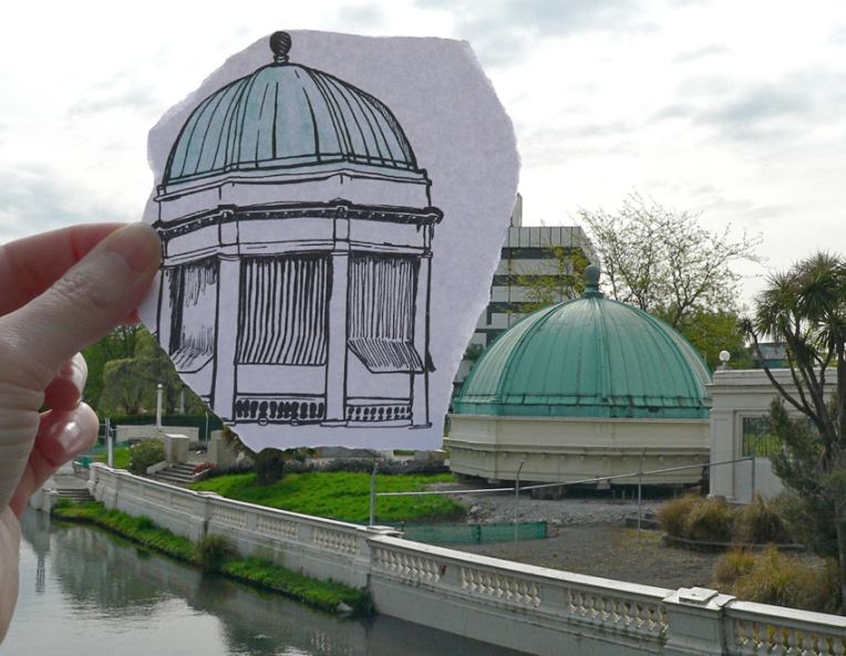
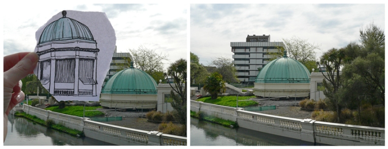
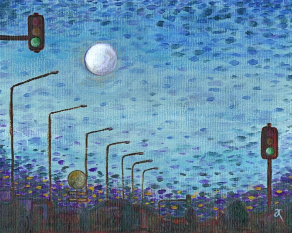
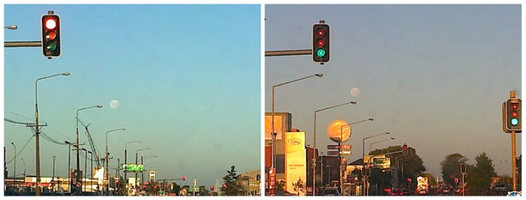
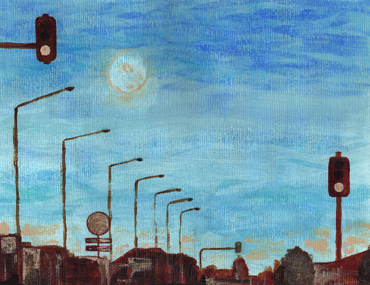
I’ve only recently discovered Evaline Ness (although the illustrations in Sam, Bangs and Moonshine do seem curiously familiar). Her work is delightful and quirky across a wide range of styles and mediums. I particularly like the bold lines and restricted use of colour in the illustrations below. The reference photo is yet another one taken using my nothing-special cellphone ― which explains the appalling quality ― but it’s still good enough for sketching purposes. I’ve said it before and I’ll say it again (and I’m quoting photographer Chase Jarvis here), the best camera is the one you have with you. I’m starting to think it may be time to invest in a better phone… or a smaller camera.

Evaline Ness

Evaline Ness — illustrations from Joey and the Birthday Present, written by Maxine Kumin and Anne Sexton (1971) Images from http://myvintagebookcollectioninblogform.blogspot.co.nz
Evaline Ness — illustrations from Joey and the Birthday Present, written by Maxine Kumin and Anne Sexton (1971)
Images from http://myvintagebookcollectioninblogform.blogspot.co.nz

American artist Evaline Ness (1911–1986) has several claims to fame. As well as being an extremely versatile illustrator and author of children’s books, she was also a fashion model, a fashion illustrator and was, at one time, married to FBI investigator Elliot Ness. It sounds like a movie just waiting to happen.

In the style of… appears occasionally instead of my regular Shoot it, Sketch it posts. Using my own photographs as a starting point, I’m drawing inspiration from some of the world’s greatest illustrators. It’s not about slavishly copying someone else’s art; it’s an experiment in seeing things differently.

Above and beyond

A little jaunt over Christchurch last week in a 1944 DC-3 has yielded quite a crop of new photographs… I’m really pleased with them, especially considering how small the window was and that we were basically right over one of the wings! Anna Cull DC3 Amy (officially ZK-AMY) is a fairly rare bird and will, sadly, be retiring early next year. The day of our flight was quite hazy and more than a little bumpy but the experience was pure magic. Amy will soon be on permanent display at the Ashburton Aviation Museum.Anna Cull DC3 flight The photos not only show Canterbury’s beautiful farmland in all its patchwork glory, they also show how altered Christchurch is ― earthquakes have removed many familiar landmarks and made the cityscape rather beige and boxy ― but perhaps that is a post better left for another day.

Shoot it, Sketch it: First impressions

Dunedin, photo montage, 2013
Work in progress # 1 – underpainting

I was so impressed with Dunedin’s gorgeous architecture when we were there on holiday last month that I went mad taking photographs ― but then I couldn’t decide which one to paint first… So I arranged a few favourites based on a nine-square grid (editing it in Photoshop and adding a few extra cabbage trees here and there). And now I’m painting it. This may take a while.

Re-tour (pen vs earthquake)

Pen vs earthquake #4 – Retour/Edmonds Band Rotunda, 2013

The iconic Thomas Edmonds band rotunda opened in 1929. It was converted into a restaurant in the 1980s and was operating as Retour Restaurant at the time of the Christchurch earthquakes. It was officially ‘deconstructed’ in 2012. The structurally sound dome has been removed and some of the less damaged columns, balustrades and steps have been salvaged. So at least that’s something.

My pen vs earthquake series is proving to be quite challenging. It’s taking me into parts of the inner city I haven’t seen for months and I’m never sure what I’m going to find… sometimes there is nothing left of the original building to photograph. How exactly do you photograph nothing? And why would you want to?

Anna Cull Pen vs earthquake Retour

The sketch is originally from this student project (click on the link and scroll down). The photographs were taken last month. Ben Heine’s amazing Pencil Vs Camera images were my initial inspiration. There are links below to more of my ‘pen vs earthquake’ images.

Pen vs earthquake #1 – Mona Vale, 2013

Pen vs earthquake #2 – The Octagon, Design & Arts College and the Hotel Grand Chancellor, 2013

Pen vs earthquake #3 – Shand’s Emporium, 2013

Shoot it, Sketch it: Go, moon. Go!

Moon over Moorhouse – acrylic on watercolour paper, 205 x 255 mm, 2013
Moon over Moorhouse, Christchurch, 2013
Moon over Moorhouse – Christchurch, 2013

The photographs were taken through our car’s dirty windscreen on my nothing-special cellphone (don’t worry, I wasn’t driving). Work in progress shown below.

Moon over Moorhouse, WIP – underpainting