This adorable little building is Shand’s Emporium. I remember it as a magical place packed floor to ceiling with antiques, collectables, jewellery and books. Built in 1860, it is one of Christchurch’s oldest commercial buildings. It was meant to be demolished in the late 1970s (to make way for a new telephone exchange) but was saved by petition and while the more modern buildings surrounding it have been taken out by earthquakes, somehow Shand’s has survived. It has had some repairs since then but it needs an estimated $250,000 to fully restore it. The building is going to be relocated to prevent it from being damaged by nearby construction work. The owner is, in fact, giving the building away in an attempt to preserve it ― and yes, I was a little bit tempted, but I didn’t think we’d get it down our driveway. Shand’s will probably be in its new home by Christmas.
P.S. There are plans to move Shand’s to the delightful suburb of Redcliffs (by the estuary) early next year. It has been reported that a local man is prepared to spend the best part of a year restoring the building ― although it will depend on the city council’s master plan for the area. Here’s hoping this story has a happy ending. December 2013
Update: Shand’s Emporium touches down on Manchester Street, Christchurch. June 2015

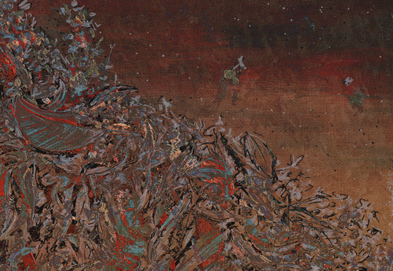
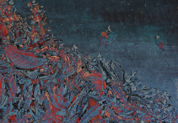
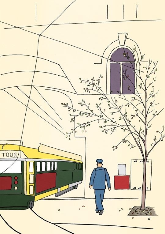
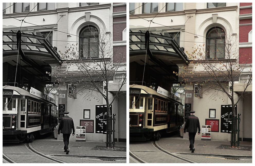
The sketch is originally from this student project (click on the link and scroll down). The photographs were taken last month. Ben Heine’s ingenious Pencil Vs Camera images were my inspiration. This is my third ‘pen vs earthquake’ ― below are links to the first two.
Pen vs earthquake #1 – Mona Vale, 2013
Pen vs earthquake #2 – The Octagon, Design & Arts College and the Hotel Grand Chancellor, 2013