
The green background texture is an acrylic painting. The images are ink drawings. I really do enjoy designing logos and business cards!
The green background texture is an acrylic painting. The images are ink drawings. I really do enjoy designing logos and business cards!


The influence of André François’ art (see below) on the way I painted this goldfish pond is subtle but it’s definitely there. I can see it in the brush strokes, the way the colours are applied and the black lines around the leaves and fish. I don’t think the online image has quite the same impact as the painting… because from a distance — despite the texture, bright colours and obvious outlines — the painted fish pond looks real. Really really real! Most peculiar.
André François

Hungarian-born French artist André François (1915–2005) is perhaps best remembered for his cartoons in Punch, Vogue and The New Yorker but I’m more interested in his graphic design work, such as these vintage advertising posters for Citroën and Kodak ― the brushwork, colours and humour are delightful.
In the style of… appears occasionally instead of my regular Shoot it, Sketch it posts. Using my own photographs as a starting point, I’m drawing inspiration from some of the world’s greatest illustrators. It’s not about slavishly copying someone else’s art; it’s an experiment in seeing things differently.

My little blog now has 400 followers! Thank you all so very much. You brighten my days here in the art cave : )
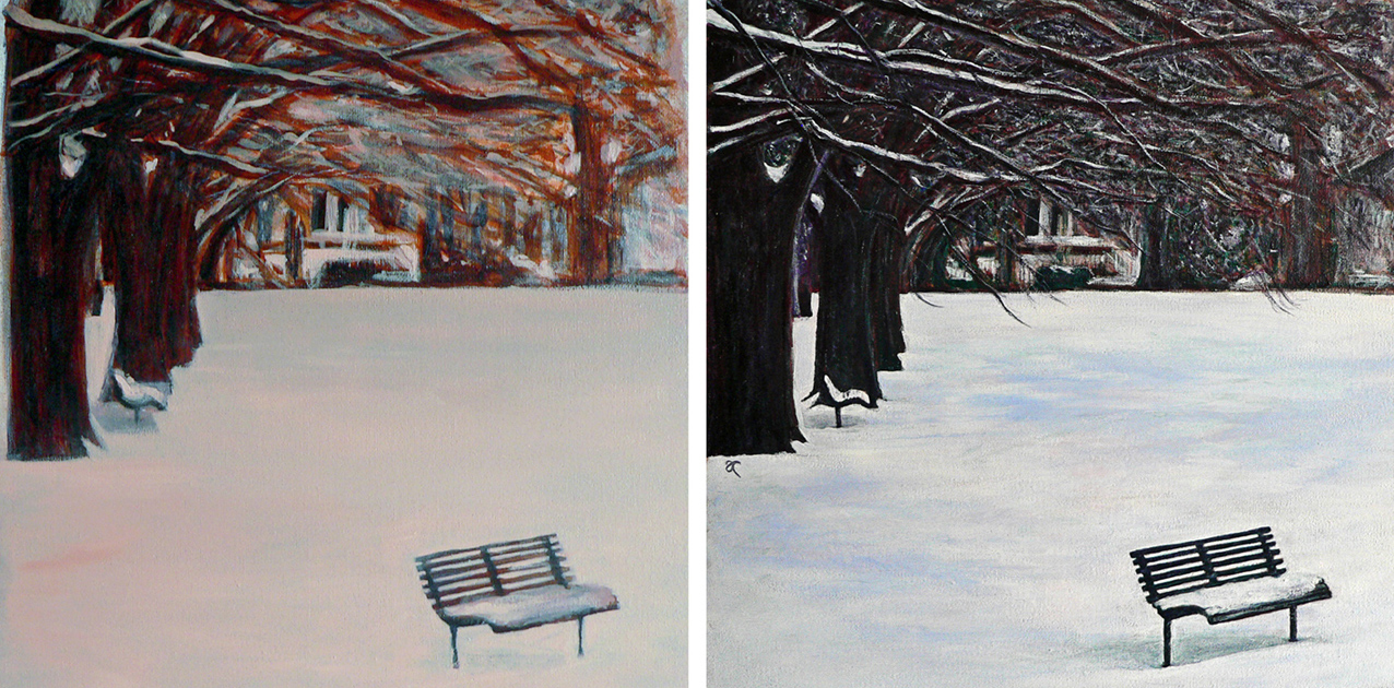
I started experimenting with underpainting a few weeks ago and I have to say I’m thrilled with the results. It’s given a beautiful depth and richness to my art. Colours seem to glow from within the picture making my acrylics look like oils. I wonder what oils would look like? I’ve been using the technique to establish my compositions (what goes where) and to work out the tonal values (light and dark) before building up the colour.
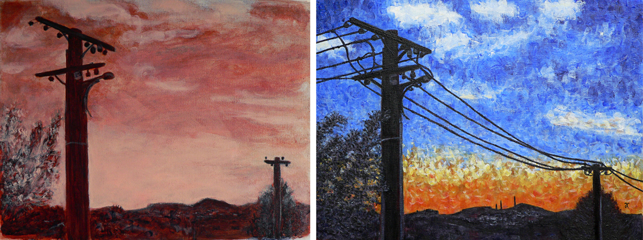
I read somewhere that underpainting can also make the final artwork more vibrant. The earthy orange I used gave a lovely warm glow to the trees in The colour of snow and helped to produce a wonderfully dramatic sky in Between the lines.
I haven’t put all of them to the test (yet) but these are the traditional underpainting colours:
Adding colour in transparent glazes allows the underpainting to influence the final colour while opaque colours can be used to obscure the underpainting. As far as I can see, there really is only one downside ― it takes a lot of time to build up the layers of colour. A LOT OF TIME. But I’m convinced it’s worth it.
My painting Between the lines has taken me on quite a journey over the last couple of weeks. Some time ago (at the end of posting Paradise), I asked: How CAN you tell when something is finished? Fellow blogger/artist Gabriel Garbow commented: ‘…at some point you have to say, “I’ve taken this as far as I can. I’ve learned all this painting has to teach me.” That’s when you sign it and *move on*.’
I’ve taken Gabriel’s words to heart. Asking if a painting has anything more to teach you really is a useful way of telling when something is finished (with the definition of ‘finished’ being ‘it’s okay to stop now’). I’m happy to declare that Between the lines is finished. And it has taught me a lot…
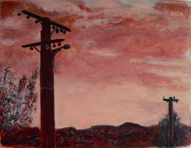
WIP #1 I used an earthy orange colour (a mixture of yellow ochre and naphthol red) for the underpainting because I wanted the sky to be dramatic and the sunset to glow. I added ultramarine blue (almost everywhere except the sky) and titanium white.
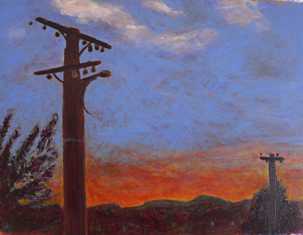
WIP #2 I was tempted to stop at this point because I really liked the simplicity of it and the colours looked stunning. But I felt there was more to learn, so I kept going…
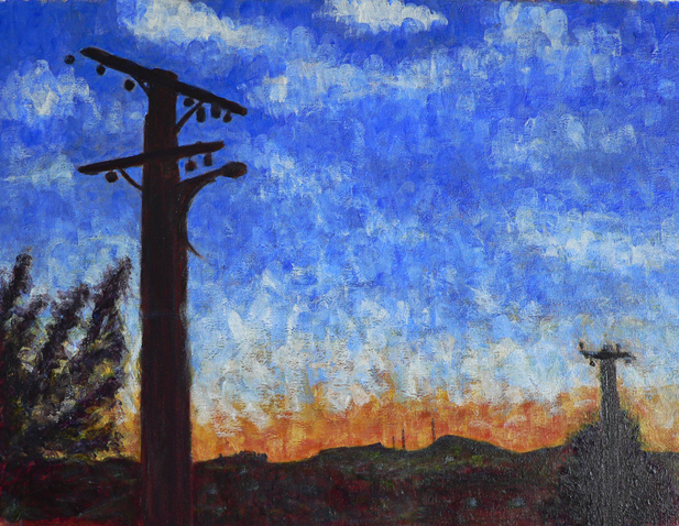
WIP #3 I added more layers ― experimenting with transparency/opacity ― and ended up adding so much white that I lost a large chunk of the sunset. I kept going…
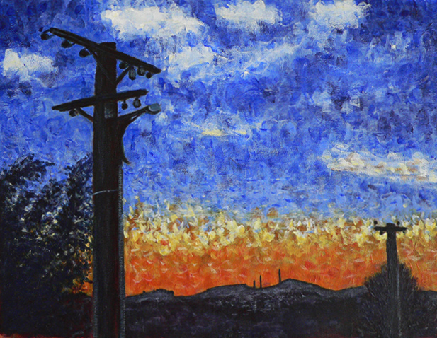
WIP #4 I began putting lights over darks and darks over lights ― which, rather predictably, kept turning the sky green and so it needed to be repainted ― and slowly, something magical began to happen. Encouraged, I went on to paint the power lines (thank you rigger brush #2), made a few adjustments to the trees and the cityscape… and signed it.
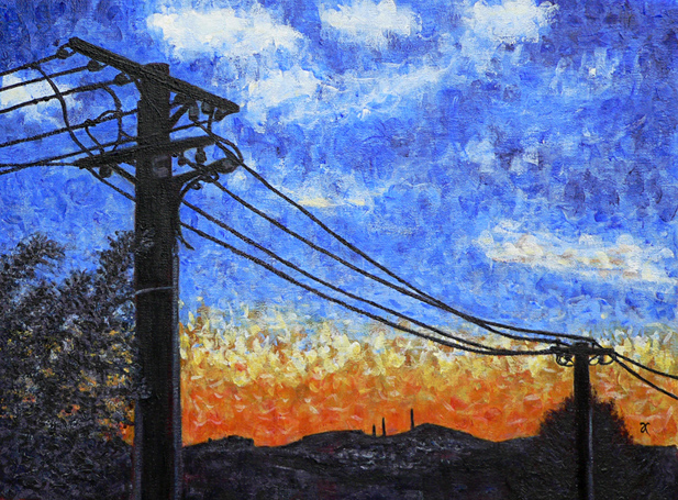
This is only the second time I’ve used an underpainting (the first was The colour of snow) and I love the results. The way the colours glow is not just a trick of the light coming from the computer screen. Underpainting really does add depth and luminosity.

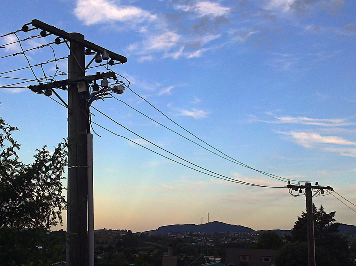
I have a thing for telephone poles ― I know I’m not the only one.
Painting this was a bit of a mission and took, on and off, nearly two weeks! I’ll post my work-in-progress photos later in the week to give you some idea of the to-ing and fro-ing this painting had to endure.
