Redwoods – acrylic on canvas, 255 x 305 mm, 2013 (sold)
I started my Shoot it, Sketch it posts a year ago today. Yes, a whole year has gone by! Some have been In the style of… posts, inspired by the work of some amazing illustrators, and in total there have been 50 of them. The only two weeks I missed were when I was away on holiday ― taking more photos to sketch, draw and paint : ) When Bec from Clouds of Colour and Alana from The Little Leaf started this feature, I had no idea that I’d still be going a year later. No wonder I’m running out of room in my little studio! Today’s painting was originally done with pastel on card and posted here.
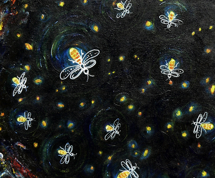
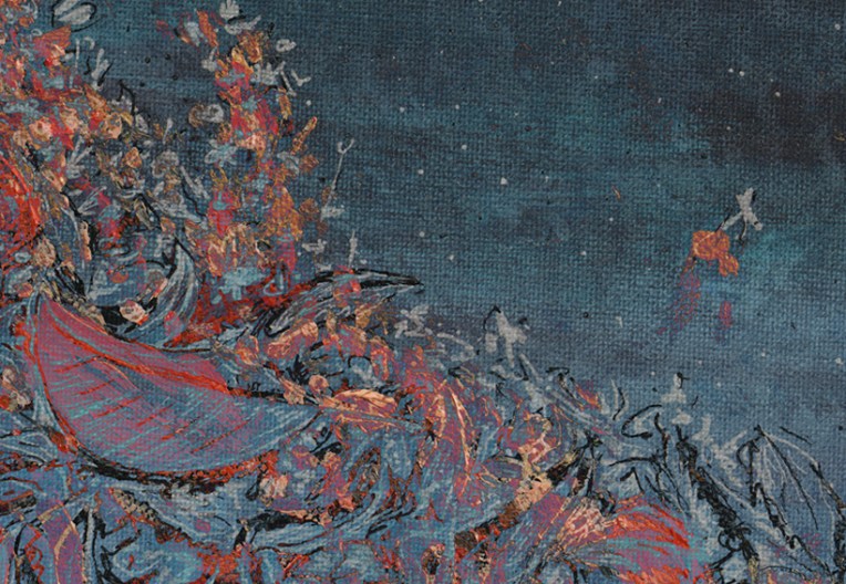
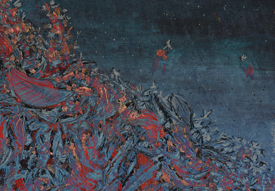
In the art cave – acrylic on canvas (detail), 2013
I’ve spent the last 18 months (and 200 posts) experimenting quite a lot with different styles and mediums, researching artists and illustrators, and stretching my creative wings. I completed my first commission a couple of months ago and now it seems the time has come to start putting my art ‘out there’ — for sale, I mean. So I’ve started to rework some of my earlier pieces with this in mind…
This firefly painting began life as a mixed media collage. Turning it into a painting proved to be a bit of a challenge but I got there in the end.
Housekeeping notes: as well as changing my WordPress header, I’ve also changed the title of my blog (just the name, not the URL/web address) from ‘Anna Cull ~ illustration & design’ to ‘in the art cave’ — oh and I’ve updated my About page too.
Stamp design, artwork – mixed media – student project, 2011
The future seems like only yesterday…
Voyage to the Bottom of the Sea (1964-1968): Set in the future of the 1970s/1980s, the series centres on the atomic submarine Seaview and its crew whose secret mission is to defend the Earth. It was based on the 1961 film of the same name.
The stamp design, poster and text are from one of my favourite student projects. Each stamp depicts an iconic science fiction TV series from the 1960s. For a recap on the project, click here.
Pen vs earthquake #2 – The Octagon, Design & Arts College and the Hotel Grand Chancellor, 2013
The beautiful building in the foreground, formerly the Trinity Congregational Church, was a restaurant and live music venue (Octagon Live) when this sketch was done. Built between 1873 and 1875, it sustained a lot of damage in the 2010/2011 earthquakes. There are plans to restore the timber interior and the 1871 pipe organ (thought to be one of only three of its kind left in the world).
The building to the right of the church was my old art school (you can’t tell from the photo but it’s in a very sorry state ― it was deemed unsafe following the February 2011 earthquake and put on the city’s ‘partial demolish’ list). The building on the left, the one on a bit of a lean, was the Hotel Grand Chancellor (now demolished). The hotel was built in 1986 and was Christchurch’s tallest building for more than 20 years.
The sketch is originally from this student project (click on the link and scroll down). The photographs were taken last week. Ben Heine’s ingenious Pencil Vs Camera images were my inspiration. This is my second ‘pen vs earthquake’ ― below is a link to the first one.
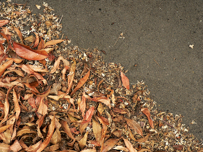
Today’s Shoot it, Sketch it is yet another experiment. The inspiration was a photograph taken at our back door last April. Something about the dry, curly leaves and the tiny, creamy white petals really appealed to me.
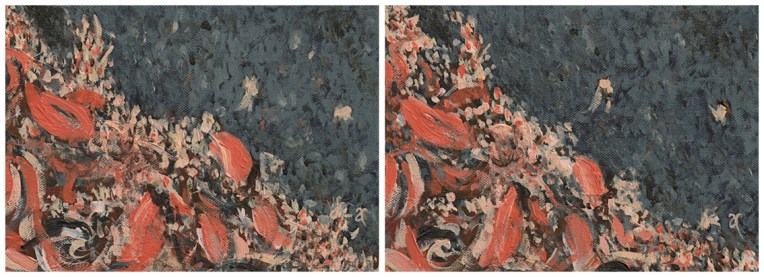
Autumn calling – acrylic on canvas, diptych: each panel 125 x 175 mm, 2013
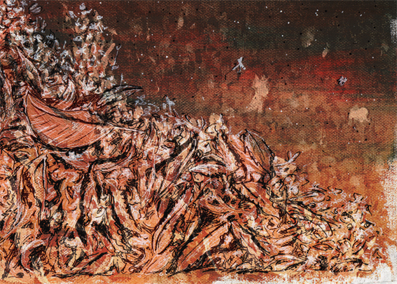
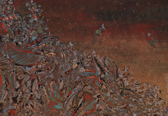
I painted it three times ― twice with brushes (above) and a third time with a palette knife (using the leftover paint for the background) and acrylic paint markers (below).
Autumn calling – acrylic on canvas, 165 x 215 mm, 2013
Then I combined the three paintings in Photoshop and tweaked a few filters to create the series below.