
The green background texture is an acrylic painting. The images are ink drawings. I really do enjoy designing logos and business cards!
The green background texture is an acrylic painting. The images are ink drawings. I really do enjoy designing logos and business cards!

Visual diary, two-page spread (student project, 2011)
Student project, 2011
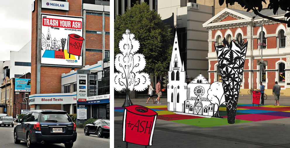
The brief for this project was to design an anti-cigarette-litter billboard and public installation for the city council’s ‘Future Vision of a Clean City’ campaign. The focus had to be on anti-not-thinking rather than anti-smoking. For the installation, I turned my drawing of Christchurch’s Anglican Cathedral and Chalice sculpture into a pop-up board game that could be played in public spaces around the city. It was a lot of fun putting my illustration into the photo ― I wonder why I don’t do that more often?
The diary pages are from a journal I designed for my Design & Arts College exhibition in 2012. Two years of research, ideas, word maps and sketches had to be reduced to a mere 72 pages. It was no easy task but it’s something I’ll always treasure.


The influence of André François’ art (see below) on the way I painted this goldfish pond is subtle but it’s definitely there. I can see it in the brush strokes, the way the colours are applied and the black lines around the leaves and fish. I don’t think the online image has quite the same impact as the painting… because from a distance — despite the texture, bright colours and obvious outlines — the painted fish pond looks real. Really really real! Most peculiar.
André François

Hungarian-born French artist André François (1915–2005) is perhaps best remembered for his cartoons in Punch, Vogue and The New Yorker but I’m more interested in his graphic design work, such as these vintage advertising posters for Citroën and Kodak ― the brushwork, colours and humour are delightful.
In the style of… appears occasionally instead of my regular Shoot it, Sketch it posts. Using my own photographs as a starting point, I’m drawing inspiration from some of the world’s greatest illustrators. It’s not about slavishly copying someone else’s art; it’s an experiment in seeing things differently.

Visual diary, two-page spread (student project, 2010)
Visual diary, two-page spread (student project, 2010)
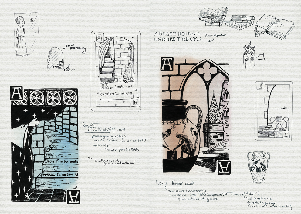
The design brief for this project was to create four playing cards based on the word ‘arcane’. And arcane is such a wonderful word:

The process went something like: figure out what to draw (using word maps and thumbnail sketches), find suitable reference material (photographs of pyramids, camels, medieval suns/moons, monks, castles…), and then sketch and arrange the elements to make a meaningful composition. You can see the final playing card designs here.
These pages are from the visual diary I designed for my Design & Arts College exhibition in 2012. Two years’ worth of research, ideas, word maps and sketches had to be edited to fit a single, professionally printed journal of only 72 pages. It was no easy task but it’s something I’ll always treasure.
Welcome to my first ever In the style of… which will be appearing occasionally instead of the regular Shoot it, Sketch it posts on Mondays. I plan to draw inspiration from some of the world’s greatest illustrators. It’s really Shoot it, Sketch it with a twist ― I’ll still be using my photographs as a starting point but I’ll be drawing/painting them with a particular style in mind. It’s not about slavishly copying someone else’s art; it’s an experiment in seeing things differently. My hope is that it will take my own art in different directions.
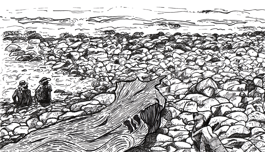

Drawing this week’s photograph was a bit of a challenge. The rocks and stones were straightforward enough (believe it or not) but it took several attempts before I was happy with the driftwood. And if you’re wondering who A. B. Frost is…

Images from http://www.gutenberg.org
American artist Arthur Burdett Frost (1851–1928) is famous for illustrating Mark Twain’s Tom Sawyer and Huckleberry Finn characters as well as Joel Chandler Harris’ Uncle Remus and Brer Rabbit stories but it’s these two illustrations from A Tangled Tale that inspired this week’s sketch. Frost’s compositions and linework are simply brilliant.

Visual diary, two-page spread (student project, 2010)
Visual diary, two-page spread (student project, 2010)
A recent blog post by graphic designer Becca Shayne about the value of keeping a sketchbook reminded me of the visual diary I put together for my Design & Arts College exhibition in 2012. All of my course sketchbooks (crammed full of research, ideas, inspirational quotes, word maps, doodles and sketches) had to be edited into a single, professionally printed journal of only 72 pages. It was no easy task but it’s something I’ll always treasure.
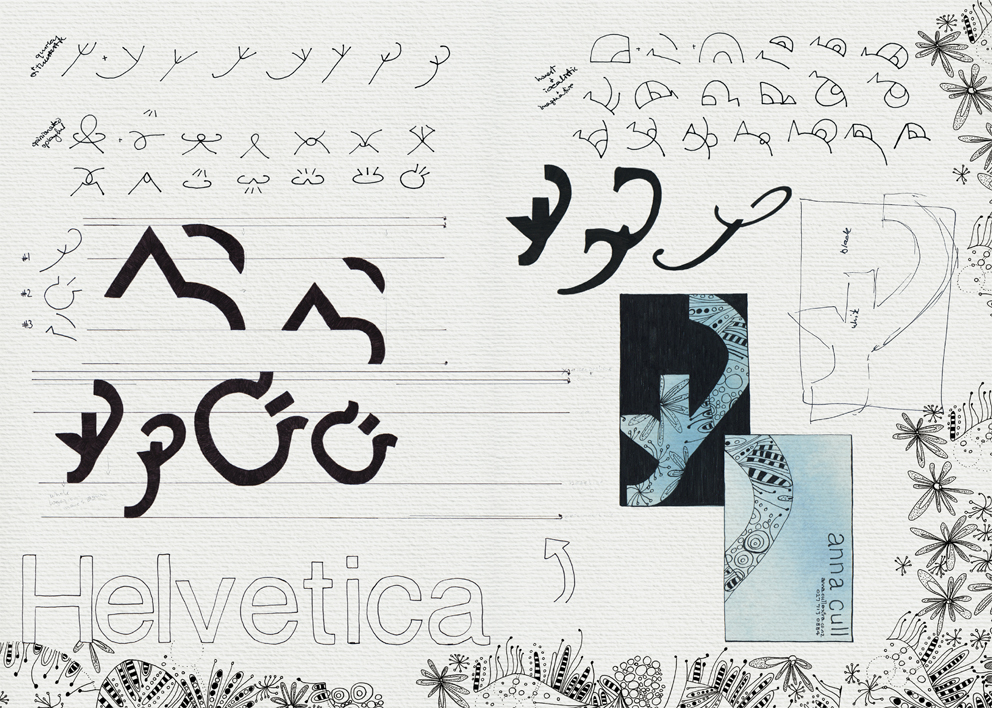
These are the diary pages of our very first project: to design our own logo and business card. I really enjoyed the process but I didn’t like the logo enough to use it. I’m still very fond of Helvetica though.
