Dear diary, part seven

‘Stagnant’ billboard design – word map and sketches Visual diary, two-page spread (student project, 2011)
‘Stagnant’ billboard design – word map and sketches
Visual diary, two-page spread (student project, 2011)
‘Stagnant’ billboard design – composition sketches and final illustration Visual diary, two-page spread (student project, 2011)
‘Stagnant’ billboard design – composition sketches and final illustration
Visual diary, two-page spread (student project, 2011)

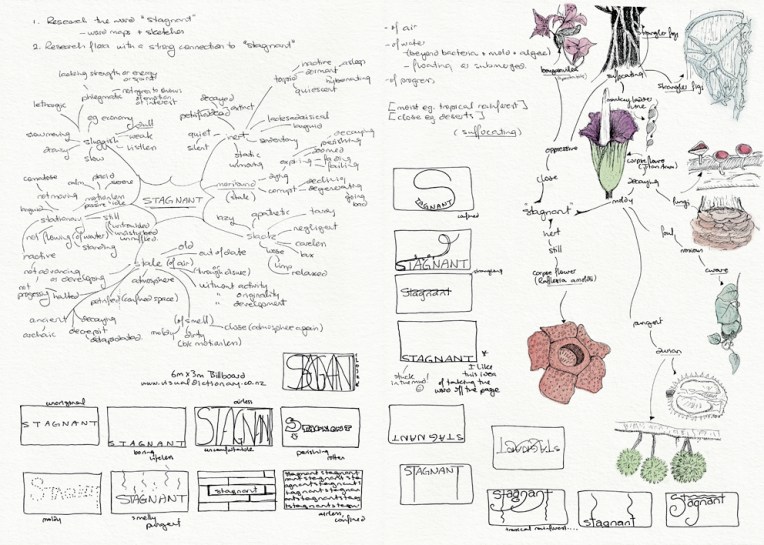
This was one of my favourite projects at design school: an illustration of flora depicting the word ‘stagnant’ (for a billboard advertising an online dictionary). It had to be linework only (no colour) which meant making the most of tone and texture. My word is deliberately stuck in the mud and claustrophobic. I’m especially fond of the strangler fig around the tree and the tiny mushrooms on the text. The final illustration is a 205 x 405 mm ink drawing and I have no idea how long it took to complete (so please don’t ask) ― the black background alone took about four hours. Madness. Utter madness.

These pages are from the diary I designed for my Design & Arts College exhibition in 2012. Two years of research, ideas, word maps and sketches had to be reduced to a mere 72 pages. It was no easy task but I now have a beautiful, professionally bound journal that I’ll always treasure.

What a wonderful gift

© Sandra Fleck, 2013
The best bag ever — was made for me by Sandra (bagirl)…
© Sandra Fleck, 2013
…looks great front and back…
...and has little bees hiding inside.
…and has little bees hiding inside.

Sadly, I do not have my family’s sewing gene. I can draw and paint and knit and cross-stitch… but I can’t sew. How wonderful, then, to have a friend who can! We have a lot of fun rummaging through her fabulous fabric stash and coming up with all manner of unique creations.

This bag was Sandra’s way of thanking me for helping with her blog (I’m photographer-in-chief ― I also designed her business cards/product labels). I chose the fabric as well as the bag design. Long live the barter system : )

In the style of… Louis Rhead

Rendezvous – acrylic and white gel pen, 280 x400 mm, 2013.
Rendezvous – acrylic and pigment gel ink, 280 x 400 mm, 2013.
Rendezvous – detail
Rendezvous – detail
Akaroa Harbour beachfront, 2012.

I had something specific in mind when I started painting the Akaroa Harbour beachfront photo… and this painting isn’t it. Initially I was going to create a highly stylised image using simple shapes and patterns and fairly flat colours ― but sometimes I just can’t help myself… the temptation to layer colours and add texture is just too great. With Louis Rhead’s turn-of-the-century posters in mind (see below), I exaggerated the shape of the trees and the curve of the shoreline. He has also influenced the overall composition, my choice of colours and the romantic styling of the women in the foreground (although mine look more medieval than Art Nouveau).

I may have another go at painting this scene for next week’s Shoot it, Sketch it

Louis Rhead

Images from http://commons.wikimedia.org

English-born artist Louis Rhead (1857-1926) made a career out of poster design and book illustration in the USA. I love the Art Nouveau influence in these posters dated 1896-1900. The sweeping curves and stylised trees are beautiful. The colours are fantastic too.

In the style of… appears occasionally instead of my regular Shoot it, Sketch it posts. Using my own photographs as a starting point, I’m drawing inspiration from some of the world’s greatest illustrators. It’s not about slavishly copying someone else’s art; it’s an experiment in seeing things differently.