Dear diary, part two

Playing cards ‘Sphinx’ and ‘Alchemy’ – refining the compositions and final illustrations  Visual diary, two-page spread – ink and digital, student project, 2010
‘Sphinx’ and ‘Alchemy’ – sketches, compositions and final illustrations
Visual diary, two-page spread (student project, 2010)
Playing cards ‘Secret Passageway’ and ‘Ivory Tower’ – refining the compositions and final illustrations  Visual diary, two-page spread – ink and digital, 2010
‘Secret Passageway’ and ‘Ivory Tower’ – sketches, compositions and final illustrations
Visual diary, two-page spread (student project, 2010)

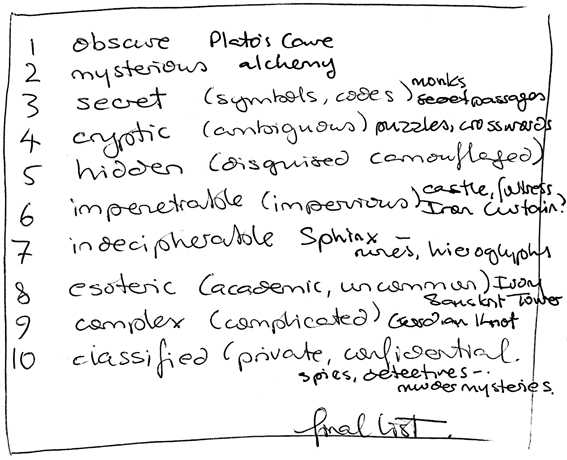
The design brief for this project was to create four playing cards based on the word ‘arcane’. And arcane is such a wonderful word:

Arcane – my top ten synonyms

The process went something like: figure out what to draw (using word maps and thumbnail sketches), find suitable reference material (photographs of pyramids, camels, medieval suns/moons, monks, castles…), and then sketch and arrange the elements to make a meaningful composition. You can see the final playing card designs here.

These pages are from the visual diary I designed for my Design & Arts College exhibition in 2012. Two years’ worth of research, ideas, word maps and sketches had to be edited to fit a single, professionally printed journal of only 72 pages. It was no easy task but it’s something I’ll always treasure.

Unexpected outcomes, part three

The colour of snow – underpainting and final.
The colour of snow – underpainting and final painting.

I started experimenting with underpainting a few weeks ago and I have to say I’m thrilled with the results. It’s given a beautiful depth and richness to my art. Colours seem to glow from within the picture making my acrylics look like oils. I wonder what oils would look like? I’ve been using the technique to establish my compositions (what goes where) and to work out the tonal values (light and dark) before building up the colour.

I read somewhere that underpainting can also make the final artwork more vibrant. The earthy orange I used gave a lovely warm glow to the trees in The colour of snow and helped to produce a wonderfully dramatic sky in Between the lines.

Between the lines – underpainting and final
Between the lines – underpainting and final painting.

I haven’t put all of them to the test (yet) but these are the traditional underpainting colours:

  • grey-green makes skin tones more vibrant
  • blue-grey works well for landscapes
  • a monochromatic underpainting, usually shades of grey, helps to achieve a more realistic painting
  • warm browns such as burnt umber or raw umber are good for high contrast

Adding colour in transparent glazes allows the underpainting to influence the final colour while opaque colours can be used to obscure the underpainting. As far as I can see, there really is only one downside ― it takes a lot of time to build up the layers of colour. A LOT OF TIME. But I’m convinced it’s worth it.

Shoot it, Sketch it collaboration

Harbour wall – graphite and watercolour, 255 x 205 mm, © Anna Cull 2013.
Harbour wall – graphite and watercolour, 255 x 205 mm © Anna Cull 2013
Newlyn Harbour Wall, Cornwall © Poppytump, 2013.
Newlyn Harbour Wall, Cornwall © Poppytump 2013

Last month, fellow blogger/artist/photographer Poppytump posted a wonderful photo of this wall (used with permission) ― and now it’s the world’s first ever Poppytump shot it, Anna sketched it. Thank you, Poppy : )

Harbour wall detail — the texture is a kind of ‘dry brush’ watercolour effect.
Harbour wall detail — the painted texture is a ‘dry brush’ watercolour effect.