Shoot it, Sketch it: Double rainbow

Double rainbow triptych – Christchurch, 2012.

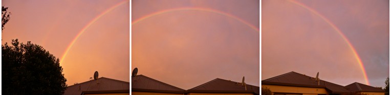
One evening last October I noticed a strange light coming in through the window. When I went outside to investigate, I was met with this beautiful sight: a double rainbow over the neighbouring rooftops. These are my three favourite shots.

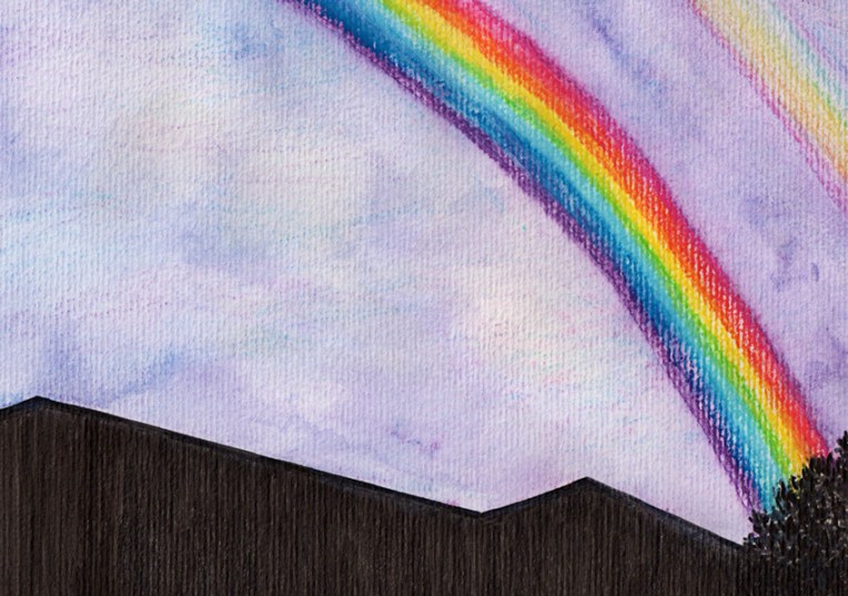
I drew the houses and trees with an Indian ink brush pen and the rainbows and sky were painted with my trusty Neocolor II watercolour pastels to give the rainbows a naïve, childlike quality. I really like the way they’ve picked up the corrugated texture of the watercolour paper.

Double rainbow #1 – ink and watercolour, 2012.
Double rainbow #2 – ink and watercolour, 2012.
Double rainbow #3 – ink and watercolour, 2012.

Others who have been participating in Shoot it, Sketch it are Clouds of ColourThe Little LeafLunch Sketch and Poppytump.

See you in the new year : )

Love Your Body campaign poster

Love the shape you're in – mixed media, 297 x 210 mm, 2012.
Love the shape you’re in – mixed media, 297 x 210 mm, 2012.

Here is my entry for a poster competition run by the NOW Foundation promoting the positive, healthy, inclusive portrayal of girls and women. Yes, another competition. It’s been a busy month.

My aim was to put a positive spin on the idea of body types and to create an image that would make people smile. All too often, we hear ‘pear’ and ‘apple’ shapes (et cetera) described as problems that require fixing in some way. Instead, celebrate your shape because it’s all natural and naturally beautiful. Love the shape you’re in!

The fruit characters are ink and acrylic — one is a self-portrait : )  The background collage was created using paper and gesso. I added the heart spotlight in Photoshop.

Shoot it, Sketch it: Leaf study

Leaf study – ink, watercolour and digital, 175 x 210 mm, 2012.

This week’s sketch was a bit of an experiment. I wanted to see how watercolour behaved when applied to art board. Now I know. The biggest surprise was just how much water I could wash over the surface without it buckling.

All it needed was a little poem to finish it off (so I wrote one).

Leaf study in Golden Bay, 2011.

Follow the links to see what Clouds of ColourThe Little LeafLunch Sketch and Poppytump have been doing for Shoot it, Sketch it.

It’s beginning to look a lot like Christmas

Poles apart – Christmas design, 2012.

Here is my entry for this month’s Tigerprint design competiton. The theme, Coming Together at Christmas, provided an opportunity to explore what Christmas means to me and to look at what things provide those “I love Christmas” moments.

For me, it’s about connecting with family and friends. When they are far away, coming together at Christmas also means sending handmade cards through the post (yes, the old-fashioned way). It’s one of my favourite things about the season.

My ‘Poles apart’ design features nine little scribble birds/animals (representing countries all around the world). I imagine them on wrapping paper, gift tags and bags. The design looks particularly festive in red but I’ve also made a bright green version and one using a brown paper background (see below).

Christmas design – penguin, 2012.

Christmas design – polar bear, 2012.

I think my two favourites (penguin and polar bear) would also work as cards. The ink drawings have been scanned and turned into vector images. The backgrounds are a mixed media and digital collage of vintage stationery. Sometimes it pays to be a magpie : )