
My friend Amy may have lost her fob watch. It’s not easy being a Time Lord if you can’t remember who you are. (Happy birthday, Amy.)
My friend Amy may have lost her fob watch. It’s not easy being a Time Lord if you can’t remember who you are. (Happy birthday, Amy.)

For this project we had to use found images and a limited colour palette to design the cover of a book about the beat poets. My cover is a paper collage of photographs, censored texts and deconstructed poetry. The background features excerpts from the works of Allen Ginsberg, Jack Kerouac and William S. Burroughs that I have retyped, rearranged, printed, torn into pieces and transferred on to paper using an acetone printing technique (the same technique I used for my book without boundaries). The acetone transfer produced a wonderful, imperfect, aged sort of effect which you can see in more detail below.

The diary pages are from a journal I put together for my Design & Arts College exhibition in 2012. Two years of research, ideas, word maps and sketches had to be reduced to a mere 72 pages. It was no easy task but I now have a beautiful, professionally bound diary that I’ll always treasure.

The green background texture is an acrylic painting. The images are ink drawings. I really do enjoy designing logos and business cards!

Visual diary, two-page spread (student project, 2011)
Student project, 2011
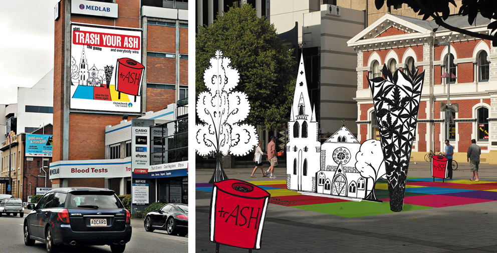
The brief for this project was to design an anti-cigarette-litter billboard and public installation for the city council’s ‘Future Vision of a Clean City’ campaign. The focus had to be on anti-not-thinking rather than anti-smoking. For the installation, I turned my drawing of Christchurch’s Anglican Cathedral and Chalice sculpture into a pop-up board game that could be played in public spaces around the city. It was a lot of fun putting my illustration into the photo ― I wonder why I don’t do that more often?
The diary pages are from a journal I designed for my Design & Arts College exhibition in 2012. Two years of research, ideas, word maps and sketches had to be reduced to a mere 72 pages. It was no easy task but it’s something I’ll always treasure.

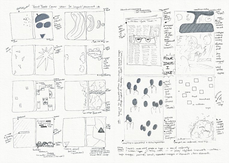
Visual diary, two-page spread (student project, 2010)
Visual diary, two-page spread (student project, 2010)
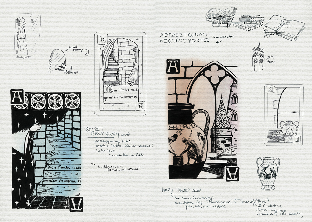
The design brief for this project was to create four playing cards based on the word ‘arcane’. And arcane is such a wonderful word:

The process went something like: figure out what to draw (using word maps and thumbnail sketches), find suitable reference material (photographs of pyramids, camels, medieval suns/moons, monks, castles…), and then sketch and arrange the elements to make a meaningful composition. You can see the final playing card designs here.
These pages are from the visual diary I designed for my Design & Arts College exhibition in 2012. Two years’ worth of research, ideas, word maps and sketches had to be edited to fit a single, professionally printed journal of only 72 pages. It was no easy task but it’s something I’ll always treasure.
Welcome to my first ever In the style of… which will be appearing occasionally instead of the regular Shoot it, Sketch it posts on Mondays. I plan to draw inspiration from some of the world’s greatest illustrators. It’s really Shoot it, Sketch it with a twist ― I’ll still be using my photographs as a starting point but I’ll be drawing/painting them with a particular style in mind. It’s not about slavishly copying someone else’s art; it’s an experiment in seeing things differently. My hope is that it will take my own art in different directions.
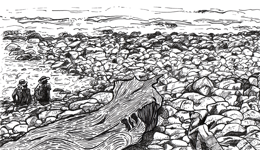

Drawing this week’s photograph was a bit of a challenge. The rocks and stones were straightforward enough (believe it or not) but it took several attempts before I was happy with the driftwood. And if you’re wondering who A. B. Frost is…

Images from http://www.gutenberg.org
American artist Arthur Burdett Frost (1851–1928) is famous for illustrating Mark Twain’s Tom Sawyer and Huckleberry Finn characters as well as Joel Chandler Harris’ Uncle Remus and Brer Rabbit stories but it’s these two illustrations from A Tangled Tale that inspired this week’s sketch. Frost’s compositions and linework are simply brilliant.
